
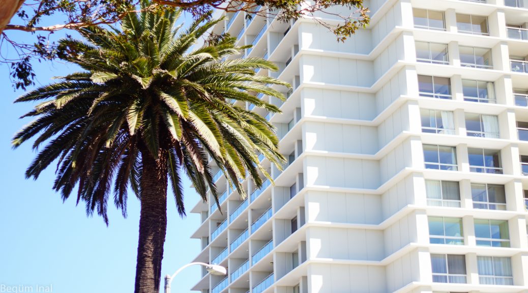
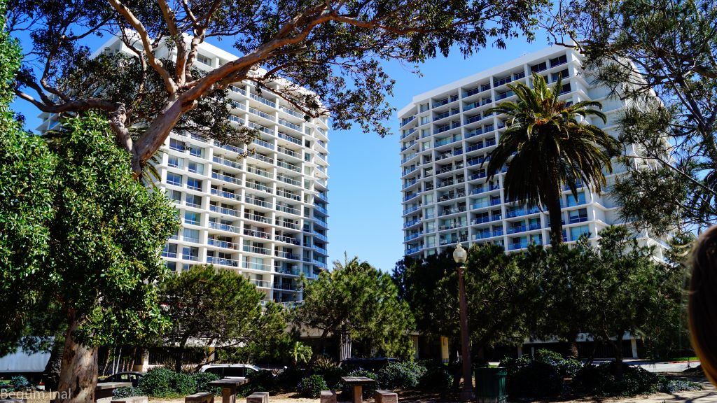
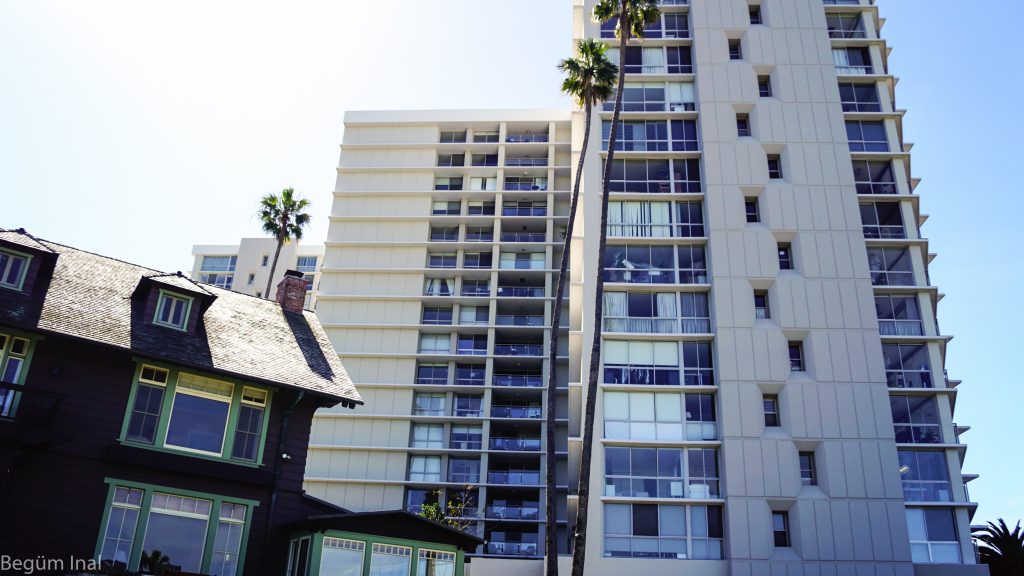
The Ocean Ave. Towers met all my expectations. The L-shaped high-rise twin condominium is easily to identify from the Santa Monica coastline. If you get closer to the building it really possesses a specific atmosphere of a huge block. It nearly looks like a massive cuboid which opens in the middle due to the connecting wing and the outreaching terrace on which the pool is placed on. The weald and flat environment of the building additionally leads to a monumental effect. The tilt angle of the ground on which it’s built is excitingly perceptible from the street at the backside of the building (to be seen on the first post). Also exciting are the falling lines of the building that exaggerate the tension of capturing the building.

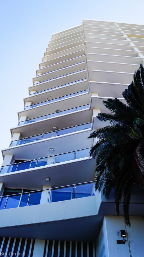
Fine details are hidden in the arrangement of the facade. The corners of the building are windowless and due to its angle and incline, each floor benefits from a similar view – either of the sea or of the vegetation of the hills. The cover panels between the apartments ensure more privacy. It seems that even though the buildings are l-shaped and positioned to each other, that the specific angle and the additional cover panels prevent the view from one apartment into another. Furthermore, an interesting observation of the facade composition were the string courses which separate each floor horizontal. They nearly enclose the whole building, even its windowless corners of the building. The only interruptions ensue at the corner pillars of the backside and outer side of the building where presumably the staircase is located.
At this point the light grid pattern of the building is dominated by the vertical proceeding opaque facade structure of the staircase, that includes small rectangular windows. All in all the whole facade is structured into a strong but minimalist grid pattern, that is formed by the horizontal containment of the string courses and the vertical formation of the continuous walls.
The embedded window panels are additionally punctuated with filigree white frames, that repeat the grid pattern of the building. The perception of movement was in that case unexpectedly exciting. The building is invested with spatial niches, that lead into shiftings.
In the perception these subtleties create an discreet accent, which is unfortunately too discreet. By regarding the whole condominium-complex these details don’t obtain enough validity. Our impression is dominated by the massiveness and repetitive pattern of the building.
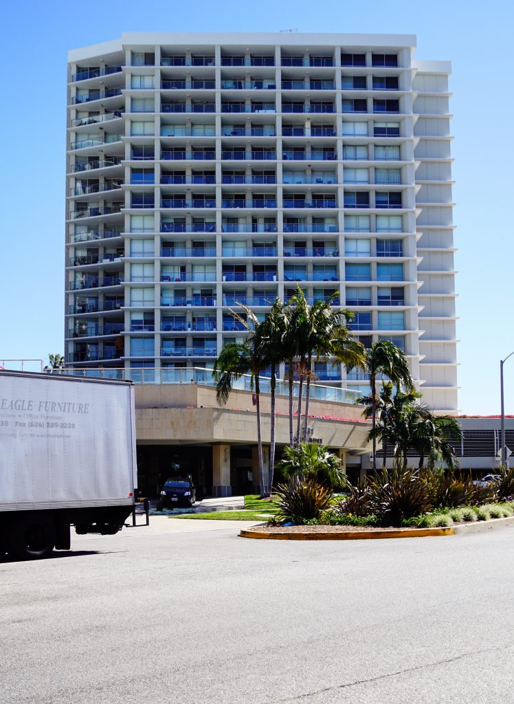
That’s why I can sadly retrace the fact that the building is highly featured on commercial websites for real estate agencies. If I didn’t know that this condominium-complex was built by William J. Krisel, I would have guessed that it’s part of a hotel chain or something similar. It really has a commercial touch, with its reproducible, basic signature look. Its environment and location feels exchangeable and anonymous. These impressions even more indurated as I walked into the lobby of the building. It possesses a reception with concierges. The lobby is quite spacious with a marble floor and warm lights. From outside the white facade cladding has a cheap look, it looks like some kind of synthetic material. These impressions lead to the perception of no overwhelming atmosphere, despite those interesting approaches for which you should step further towards the building.
All pictures taken by the author.
Begüm Inal