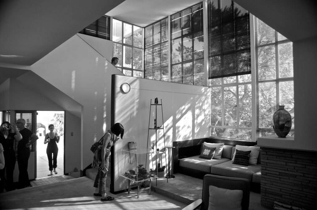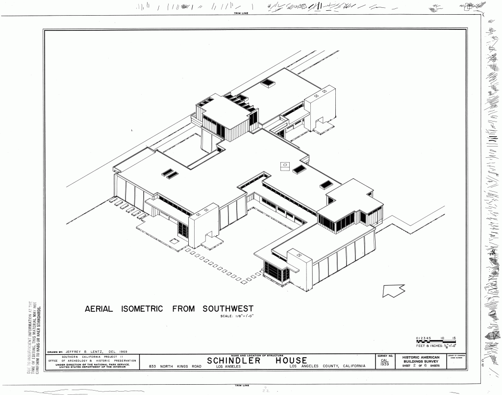
The first thing one notices when entering the building, is how chilly it is in comparison to the boiling Californian heat. Right after that, a feeling of constriction settles in, which is mostly caused by the low redwood ceiling. Only after passing a couple of rooms until one finally sees the first Shoji-Screens, this constrictive sensation eventually vanishes. Interestingly enough we’ve learned about Wright’s preference for a play of oppression and relief in context of his Hollyhock House just one day before, but I didn’t exactly understand its benefit until experiencing this sensation at his mate Schindler’s house.
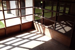
In addition to the low ceiling and it’s effects on the visitor, the strips of transparent and translucent glass actually were not capable of filling the place with daylight, causing the rooms to be quite dim. Both together these impressions intensified the feeling of relief, experienced after (finally) making it to the open walls, which let the gleaming daylight in. Furthermore, by creating this almost harsh contrast between light and dark, the alleged abolishment of the common partition of the inside and outside seemed less fluent than described in the literature.
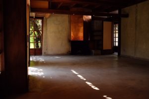
Also conflicting with the image created by the media – at least for me personally – was the lack of furnishings, causing the house to feel cold and almost dead. Staged as a residence for plenty of contemporary avant-garde people and a place of refined conversation, the current state of the Schindler House misses most of its previous liveliness. On the other hand though, the unfurnished rooms highlighted the architect’s intention to create universal spaces, being fully adaptable to the resident’s needs.

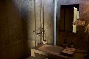
Besides the bathrooms and kitchen, the only piece of furniture that was left in the dwelling turned out to be a table-shelf-contraption with two chairs in Schindler’s room, which were both designed by him. In this light I wish there were more of his furniture to actually look at, as he devised quite a numerous amount for his buildings. Nonetheless, the concrete shower tub and sink were very impressive.
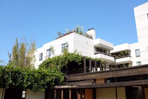
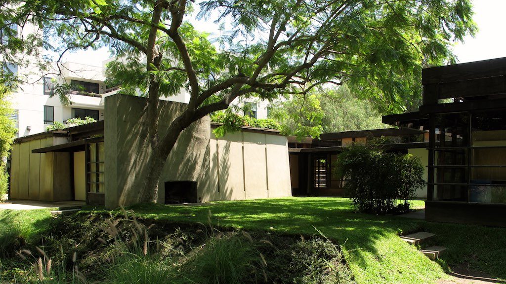
Likewise, the ’sleeping baskets‘ on the bungalow’s roof were worthwhile looking at. Overgrown with vines, which caused the most beautiful play of light and shade underneath, they lead to romanticised imaginations of sleeping under the nightly Californian sky, only emphasising the architect’s close relationship to nature and his abandonment of traditional room configuration.
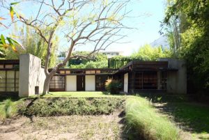
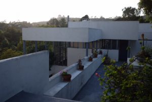
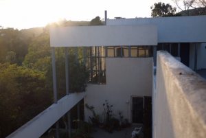
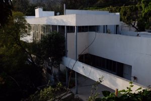
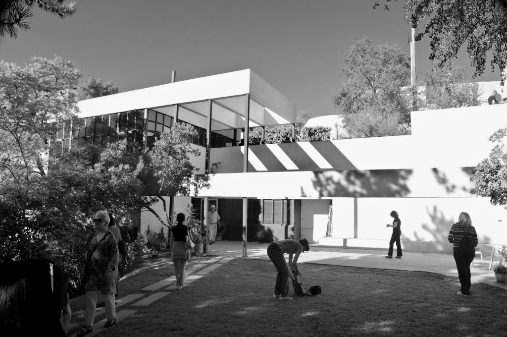
Owned by the Friends of the Schindler House organization, which partnered up with the MAK, the Kings Road House is claimed to be restored as nearly as possible to Schindler’s intentions. Sadly, the reality proves itself to be different: With plenty of cracks in the concrete walls, weathered window frames and a garden composed of patchy lawn and muddy ground the Schindler House seemed to urgently require general renovation works. Even though it is inherently acceptable to allow signs of aging, the overall look of the house appeared to be decay as opposed to persistence.
To conclude this revision of the Schindler House – and although it may not sound like I personally enjoyed the visit – I honestly think the building is worth spending your time at while staying in Los Angeles. Eventually the absence of furnishings and the noticeable signs of aging are unable to deprive the essence of the Schindler House, leaving it to be one of the most memorable stops on our fieldtrip for me.
M. E. N.

