Alle Beiträge von yannickbemtgen

Frank O. Gehry, Walt Disney Concert Hall, 2003, 111 S Grand Ave, Los Angeles


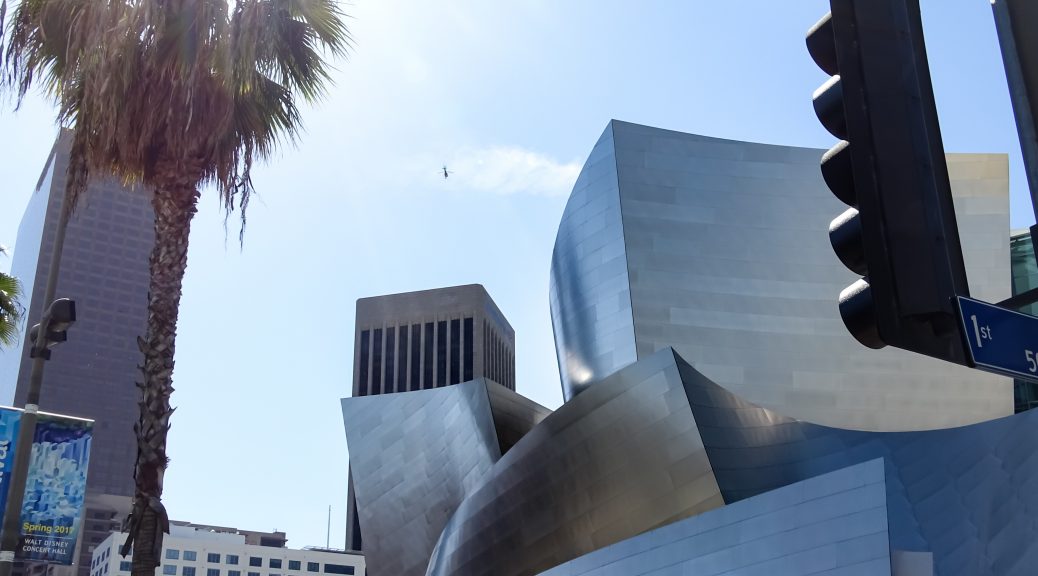
On March 28th, we visited the Walt Disney Concert Hall, designed by Frank O. Gehry. The very fact that the entry into the underground parking lot is part of the main experience, makes your visit much more interesting.

The first impressions about the building are connected with mixed feelings. On the one hand it`s really amazing to see this giant, round shapes which are harmonious flowing into each other, but on the other hand the building is too large to capture the total composition with the eyes. When you stand in front of the hall and follow with your eyes the wave-like curves you perceive this musical movement.
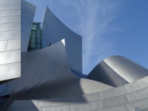
Walt Disney Concert Hall/ photo by the author

The Broad, another modern building, is located next to the concert hall. It is a contemporary art museum, designed by the architecture firm Diller Scofidio + Renfro. I notice, that these two buildings harmonize with one another, although the structures are completely differently. The Broad is, in contrast to the Walt Disney Concert Hall, clearly defined. Meanwhile the concert hall appear to be free of any rules. The geometric shapes harmonize with each other, like a symphony. The composition of its shapes seem unstructured and accidentally put together although there exists a well-ordered balance. It is true that this Gehry-Building fits appropriately in Downtown of Los Angeles. The concert hall harmonize with the other buildings in this area.
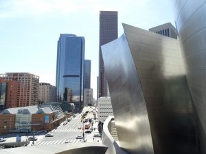
Walt Disney Concert Hall/ photo by the author

As we enter the lobby of the music hall, I immediately recognized this huge plastic clouds above the escalator. On the website of the Los Angeles Philharmonic they considered this clouds as a performance and sound installation, named Nimbus and realised by the team of The Industry with its artistic director Yuval Sharon.

With our private tour guide, we had the possibility to explore the inside of the hall. The inner space was painted white and had everywhere this red carpet. Such carpets were very modern in the nineties but today nobody uses this element anymore. The design inside was entirely different, from the outside. Inside you hadn`t much this feeling of standing in the middle of a typical building designed by one of the most famous architect ever. The whole interior seemed rather unsophisticated
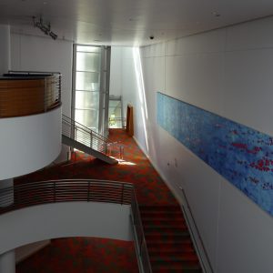
Inside the Walt Disney Concert Hall/ photo by the author

Another detail that we have seen, is the inner structure, in other words, the steelwork which shores the outside wall. It was a pity that we couldn`t enter the main auditorium. We were told that the Los Angeles Philharmonic were at practice.

At the end of our tour we went over to the garden of the Walt Disney Concert Hall. It is called the Blue Ribbon Garden. It is open to the public and is located on the roof. It is a beautiful place to calm down and to escape from the big city stress. The trees harmonize with the building. Some flow along the walls of the hall and the shapes of these trees are similar to the shapes of the building.
The reflected sunlight from the concert hall expose the whole garden in a beautiful shining. One highlight is the fountain A Rose for Lilly, designed by Gehry. It is a tribute to Lillian Disney and her love for porcelain vases and roses.
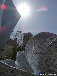
The backyard/ photo by the author 

After I have seen this amazing construction I must think of Philip Johnson, because when Sydney Pollack asks him in his documentary about Gehry, if it was possible to get his buildings in two dimensions on film, he responds: “Hopeless, you better give it up. Become an architect!”.

Yannick Bemtgen

Restaurant Swingers 1993, 802 Broadway, Santa Monica

On March 26th, after a long day of having explored some modernist buildings like for example the Sheats-Goldstein-Residence and the Chemosphere/Malin Residence, both designed by the architect John Lautner,  we had dinner at the Swingers Diners, a Googie-style Restaurant in Santa Monica.

It`s really amusing that our visits at these Lautner-Buildings coincide with a Googie-Restaurant due to the fact that John Lautner is also considered as the founder of the Googie-Architecture. Our professor came up with this great idea to combine the Googie-Restaurant with the Lautner-Buildings, because of its similarities.

One thing that strikes you immediately when you go along the front of the dining room is the red neon lettering. Neon signs are typical elements for the Googie-Architecture to catch driver`s attention and you also have an easy access with your car because of a huge parking lot in front of the restaurant.

Inside this retro coffee-shop one starts to feel like one is transported to a former time. The furnishings looks exactly like the interior equipment you know from a bar from the 50s/60s. I was very fascinating to notice how it was decorated with care in every detail. It is, in my opinion, a very well-done reproduction of a 50s/60s Diner restaurant. Inside the restaurant you have a continuous space, guaranteeing you a clear view through the saloon. The space is flooded with light because of the huge windows and the pitch of its roof. These are typical elements of the Googie-Architecture. The furniture, like for example the covers of the chairs reminds me of picnic blankets and the lamps have these futuristic shapes.

If you want to perceive this American way of life you must eat at one of these restaurants. They stand in a stereotyped, but also somehow true way for the American gastronomy.

All pictures taken by the author.

Yannick Bemtgen


Gehry, Walt Disney Concert Hall

Frank O. Gehry, Walt Disney Concert Hall, 2003

The Walt Disney Concert Hall (1987-2003) in Los Angeles designed by the architect Frank O. Gehry is worth seeing. With this new building Los Angeles became more attractive. In this instance we can relate to the „Bilbao-Effect“. It means that with the assistance of architectural and spectacular buildings, cities or districts will become a bigger revaluation. Like the Guggenheim Museum in Bilbao it is considered as a masterpiece.

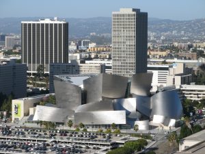
Walt Disney Concert Hall and surrounding area looking from Los Angeles City Hall.
Date: 16 December 2006
Source: Transferred from en.wikipedia to Commons.
Author: Photographed and uploaded by Geographer at en.wikipedia

The concert hall is conceived as part of the cultural hub in the center of downtown Los Angeles. It has its origins in May 1987, when Lillian Disney, Walt Disney`s eighty-seven-year-old widow, offered a gift of 50 million dollars for the city to build a new hall for the Los Angeles Philharmonic. The goal was to create a world-class concert hall with great acoustics. Today the Disney Hall is known as one of the best concert halls worldwide. Hans Scharoun’s Berlin Philharmonic Hall, one of the most renowned halls from the mid-century, played a big influence on Gehry`s design. Both buildings do not only look fascinating, but also function well.

Standing in front of the building you will recognize a morphology typical of Gehry. It looks like a ship with its giant, rounding shapes which remind us of sails. The shapes follow with their wave-like curves a musical and nautical pattern. Movement always plays an important role in Gehry’s buildings. Originally the exterior was to be covered by pieces of stone, but the ongoing pressure of costs as well as the success of Bilbao`s titanium exterior led Gehry to switch to stainless steel. The concert hall was built with the help of computer software – developed for the French aerospace industry – named CATIA. It had been invented to create construction documents for airplanes whose shapes had complex curves not unlike the ones Gehry was designing.

Walt Disney Concert Hall
Date: 14 April 2016
Source: https://unsplash.com/photos/3Ijt7UkSBYE/
Author: Ashim D’Silva

Disney Hall is expected to help revitalize the city`s downtown district and lift its cultural profile. This new concert hall helps to increase the cultural self-coincidence of Los Angeles. Walt Disney Concert Hall is widely regarded to be the most astonishing masterpiece of public architecture ever built in Los Angeles.
Frank Gehry is known for his deconstructive architecture.  He was the first architect to use cheap materials as plywood, corrugated metal and chain-link. His declared goal is to build something beautiful out of junk. He propagates this approach as ‘no-rules-architecture’ respectively ‘cheapscape architecture”.

His buildings always look as if they were unfinished or not from this world. Gehry said: “I guess I was interested in the unfinished – or the quality you find in paintings by Jackson Pollock, for instance, or de Kooning, or Cezanne. That look like the paint was just applied. The very finished, polished, every-detail-perfect kind of architecture seemed to me not to have that quality.” His architecture style is affiliated with the Deconstuctivism. Most of his buildings display an influence of the visual arts. But before Gehry starts to design the final three-dimensional construction with CATIA, he first draw all his ideas in a sketching book. One of these several sketches become then the essentially design, with which he begins to create models out of wooden bricks, cardboard, an other stuff.

Sources:

Ragheb, J. Fiona (ed.): Frank Gehry. Architect, New York 2001.
Goldberger, Paul: Building Art. The Life and Work of Frank Gehry, New York 2015.
Webb, Michael: Symphony. Frank Gehry`s Walt Disney Concert Hall, New York 2009.
Muschamp, Herbert: Architecture View; Gehry`s Disney Hall: A Matterhorn for Music, in: The New York Times 1992.
Taschen, Laszlo (ed.): Moderne Architektur A-L, Köln 2010.

Author: Yannick Bemtgen

Restaurant Swingers, Santa Monica (Googie-Architecture)

Restaurant Swingers, Santa Monica, 1993

Whenever you visit Los Angeles, you have to check out a Diner restaurant. These American Coffee-Snack-shacks are the hub of life by day and night. They personify the American way of life.
Quentin Tarantino, a well-known director, shot many sequences in such locations as for him the whole social life revolves around Restaurants.

Johnie’s Coffee Shop Restaurant on Miracle Mile in Los Angeles, famous for being used as a location for many movies.
Date: 21 January 2007
Source: http://www.flickr.com/photos/kungpaochicken/365232522/
Author: Michael Mooney

Primarily these Diners were developed from discarded railroad dining cars which were transformed into a takeaway or rather into a gas station. The Diner restaurants are an essential element of the
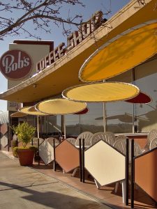
city of LA, like the freeways. L.A. is known for its culture of permanent movement. Therefore the Megalopolis is also nicknamed Autopolis. To catch motorists‘ attention, gas stations and coffee shops turned to eye-catching shapes and neon signs – an aesthetic style we now know as Googie, typical of Californian post-war culture. In this era, the coffee shop evolved into a popular building type in Los Angeles. John Lautner is considered as the founder of a new architectural language adopted to that development. In 1949, Lautner designed an iconic coffee shop which he named Googie in honour of the owner’s wife’s nickname. The mid-century architectural movement was heavily influenced by the nation’s Space Age infatuation with industrial progress, and so sweeping rooflines and hard, geometric shapes worked their way into buildings alongside neon signs with playful starbursts.

Patio tables at the Bob’s Big Boy restaurant in Burbank, California.
Date: 14 February 2013, 15:15:44
Source: Wikimedia Commons
Author: Junkyardsparkle

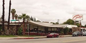
Today most of these Googie buildings don`t exist anymore, but a few you can still visit, for example right at your arrival at LA, stumbling into the Theme Building at LAX. However there exist a lot of retro-style Diners in Los Angeles where you can run across the Googie style.

Corky’s restaurant on Van Nuys Boulevard in Sherman Oaks, Los Angeles, California, viewed from the southeast. It was designed by Armet & Davis and built in 1958.
Date: 2 March 2014, 10:34:17
Source: Wikimedia Commons
Author: Junkyardsparkle

On our trip, we are going to have dinner at the Swingers Diners in Santa Monica. It is a Googie-style Restaurant which opened in 1993. On the official website of Santa Monica this restaurant is described as a retro-cool coffee shop with colourful cow murals, catering to a hip crowd with classic menu of American diner fare, open until 2am. For more information about the Swingers you can attend their website.

Sources:

Jahnke, Wolf: Los Angeles. Mit Hollywood durch LA, Marburg 2011.
Juliano, Michael: A guide to Googie architecture in Los Angeles, URL: https://www.timeout.com/los-angeles/things-to-do/googie-los-angeles (08.03.2017).
Gössel, Peter (ed.): Modernism rediscovered, Hong Kong 2009.
Vaughan, James: The world of Googie, URL: http://www.ultraswank.net/design/the-world-of-googie/ (08.03.2017).
Juliano, Michael: A guide to Googie architecture in Los Angeles, URL: https://www.timeout.com/los-angeles/things-to-do/googie-los-angeles (08.03.2017).
http://www.santamonica.com/restaurant/swingers-diner/.

Author: Yannick Bemtgen