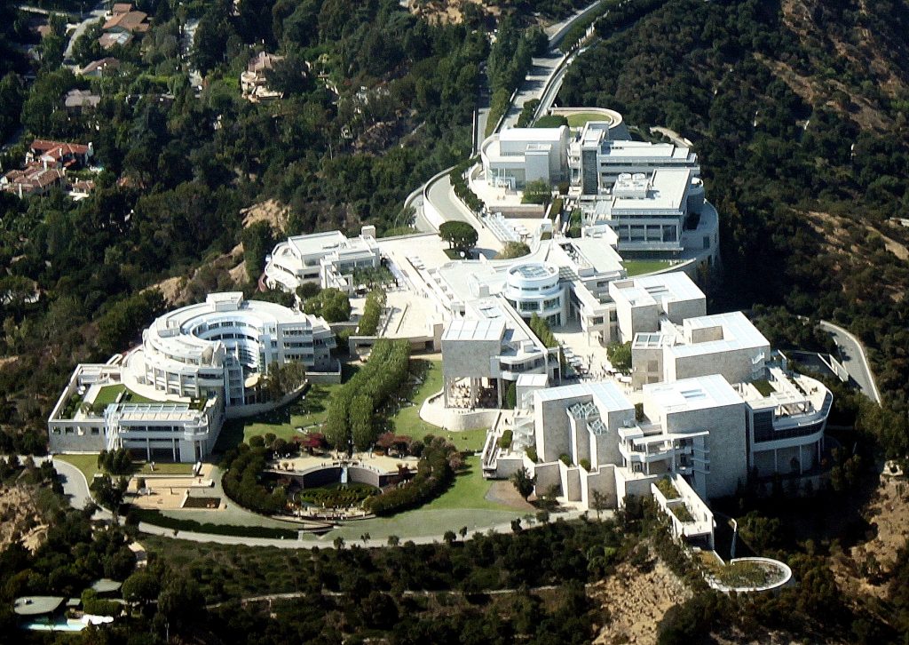
A World Famous Institution in An Iconic Building
The Getty Center opened to the public in December 1997 and has been a fascinating impression ever since. It has become a beloved refuge from monotony to many Angelenos as well as an internationally recognised architectural icon. Designed by the renowned architect Richard Meier the Getty Center grounds house the Getty Research Institute, the Getty Conservation Institute, the Getty Foundation, the J. Paul Getty Trust and the Getty Museum.
Situated on top of a hill in the Santa Monica Mountains the complex is highly visible. The land purchased by the Getty Trust sits right by the San Diego Freeway and is therefore ever present to many as they drive by on their daily commute. The campus itself consumes 24 acres on a 110-acre site, while the entire grounds occupy 742 acres to ensure the surroundings remain in its natural state. Through this, the Getty distinguishes itself from a multitude of other Art museums as it is embedded in a natural environment. Often Art institutions are set within an urban context and the museums architecture engages with, responds to the encircling buildings.
The Getty Center’s site was specifically decided upon in order to represent a grander vision. It was imagined to be easily accessible, visible, recognisable and unique in appearance. All attributes best associated with the Getty’s institutions.
The design of the Center was envisioned to correspond with its environment; for one the unique Californian landscape and secondly the tradition of Californian modernism, in awareness of the architectural design by Schindler, Neutra et al. Richard Meier created a building that is consistent with Californian modernism and partly, because of this it oozes permanence.
The hilltop site is crossed by two ridges which Richard Meier perceived as vector lines. The lowest parallels the freeway and faces Los Angeles downtown. Here the architect placed the museum, visible and approachable. The second ridge, slightly raised, may be read as the extension to the freeway after it bends, just a little further out of the city from where it runs parallel to the museum. Here Meier situated the various institutions united under the aegis of the Getty Trust. The design process of the Center influenced the shaping of the Getty Trust programs. Concurrently the programs impacted the design process of the Center. It was built from the inside out. The desire in the early 1980s was to unite the different initiatives in one location, to further and expand the already existent cooperation and collaboration. However, at the time none of the programs, besides the museum, were established enough to state their precise requirements in regard to a building that should house them. As it became apparent that the Getty Villa’s capacity no longer sufficed the collections space it was resolved to build a new, larger site. From the initial decision to the public opening the Getty Center has been a fourteen-year project: plan, design, build and occupy.
The construction developed as more complicated and long winding than originally anticipated. Difficulties arose by the nature of the land, edifice on a hilltop, manoeuvring the building materials to the construction site and no prior installation of sanitation by the municipality. Angelenos followed the progress of construction as they commuted on the freeway over almost a dozen years. The process was very unlike Los Angeles and served as another example of the Getty’s permeance.
At the same time, the complexities of the site provided a clean slate in regard to its shape and form. Therefore, the selection of the architect was of great importance to the Getty Trust. Instead of an open call for designs, architects were invited to participate. Richard Meier’s idea was chosen because his office was deemed capable to finish a large project like this and because of the museums he completed prior to the Getty in Barcelona, Frankfurt and Paris.
The scheme is dominated by a rhythmic repetition of curves, curvilinear elements and a natural garden – all to soften the grid created by the off-white travertine and white metal panels. The 1.2 million square feet of Italian stone, cleft-cut and textured, as well as metal panels clothe the Getty Center. The garden, central to the complex, is part of the Getty’s permanent collection, a land sculpture crafted by Californian landscape artist Robert Irwin. It extends the relation to the natural environment of the site.
The entire Center is permeated by space and light. This is integral to the design. Openings in the architecture as well as the garden create space. Filtered natural light, as not to damage the Art, was used in the top floor interior galleries. The galleries were modelled by Thierry Despont.
At the Center of the Campus sits the arrival hall. It is reached by two computer operated trams, elevating the visitors from street level and parking facilities to the Art. Installed as a solution to combat accessibility of the complex, the use of the trams implements the feeling of an adventure and the out of the ordinary. The Getty Center serves as refuge from the daily, a safe haven to experience Art and enjoy a view.
Bibliography
Ragsdale, J. Donald: American museums and the Persuasive Impulse. Architectural Form and Space as Social Influence, Newcastle upon Tyne 2009
Walsh, John and Deborah Gribbon: The J. Paul Getty Museum and Its Collections. A Museum for the New Century, Los Angeles 1997
Williams, Harold M. (et al): Making Architecture. The Getty Center, Los Angeles 1997
Author: Talitha Breidenstein

Very impressive and virtuous description, giving a nearly performative insight and description into the building process, intentions and effect to the observer.
Best view i have ever seen !
Wieder was mehr gelernt! Ein guter Beitrag welchen du geteilt hast.
Es ist nicht so einfach darüber auf google was zu recherchieren.