Alle Beiträge von Alexander Nebrass Eyber

John Lautner, Sheats-Goldstein Residence, 1963, Angelo View Drive, Los Angeles

John Lauter built the Sheats-Goldstein Residence in 1963 in order to demonstrate how private space could be included into the natural environment. The student of Frank  Lloyd Wright followed the tradition of his master by sticking with organic architecture. In comparison to Wright, he payed more attention to a unique style.

This purpose was realised not only by designing  main fitments like the furniture or windows,  he even created exclusive rugs for the house to do justice to the above demands.  As a matter of fact, he also worked on a light configuration on the remarkable steep slope, which might be the most iconic part of the building. He collaborated with the world-famous light artist James Turrell to create a separate light installation as a part of the midst of the artificially constructed jungle. But his Lautner’s unfortunate death prevented him from finishing this unique team play so that James Turrell had to finish it on his own. Nonetheless, we can grasp how important it was to him, creating an all around perfected way of modern living. He acquired the passion for detail from Wright but applied that principle to literally every detail to be found in a living space. By relating the outside to the inside with regard to the interior elements, he achieved an overall harmonious composition.

So what I expected before going to the site was perhaps the most impressive building of our field trip programme. When I saw parts of the house in the Coen brothers’ independent movie ‘The Big Lebowski (1998)’, I was impressed by the simple stony structures on the surfaces in the background. Furthermore, even in the film the furniture drew attention to itself because of its way of fitting into the interior. Everything seemed to be one piece. Every photograph that was taken from the in- and exterior confirms that impression.

Therefore, my focus during the visit had ought to be on the interplay between inside and outside, but also how Lautner mastered the claims of privacy and intimacy. If I were to interpret Sheats-Goldstein’s perfectionistic tendencies in a more pathological way it wouldn’t be too far-fetched to accuse him of having been a narcissist, due to evidence such as him leaving his shoes next to his bed for the guided tours. Moreover, one could argue, his ‚greed for power and privilege‘ would be satisfied thanks to his ability to see everything from his house without being seen by anyone from this.

Alexander Nebrass Eyber

Photos by the author.

Sources

Olsberg, Nicholas, Between Earth and Heaven. The Architecture of John Lautner, New York, 2008

John Lautner, Sheats-Goldstein Residence, 1963, Angelo View Drive, Los Angeles


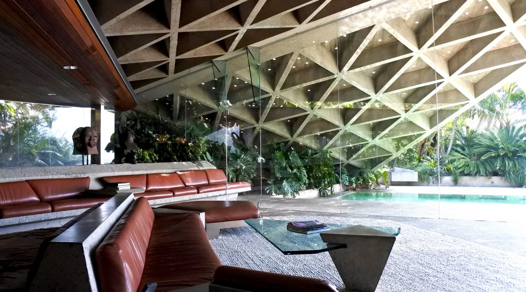
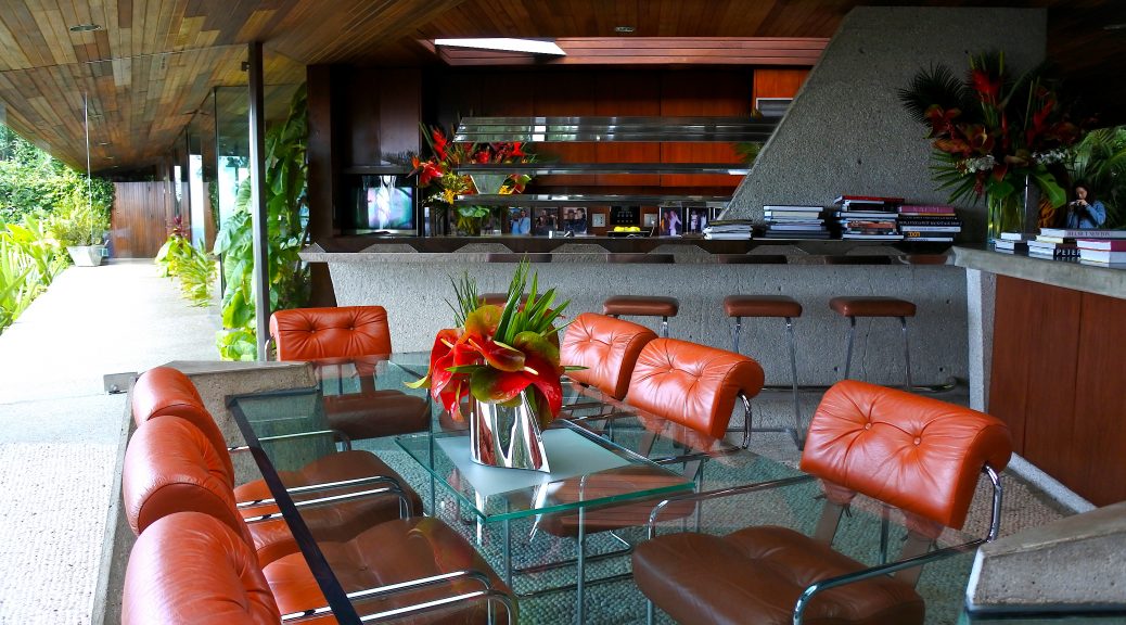
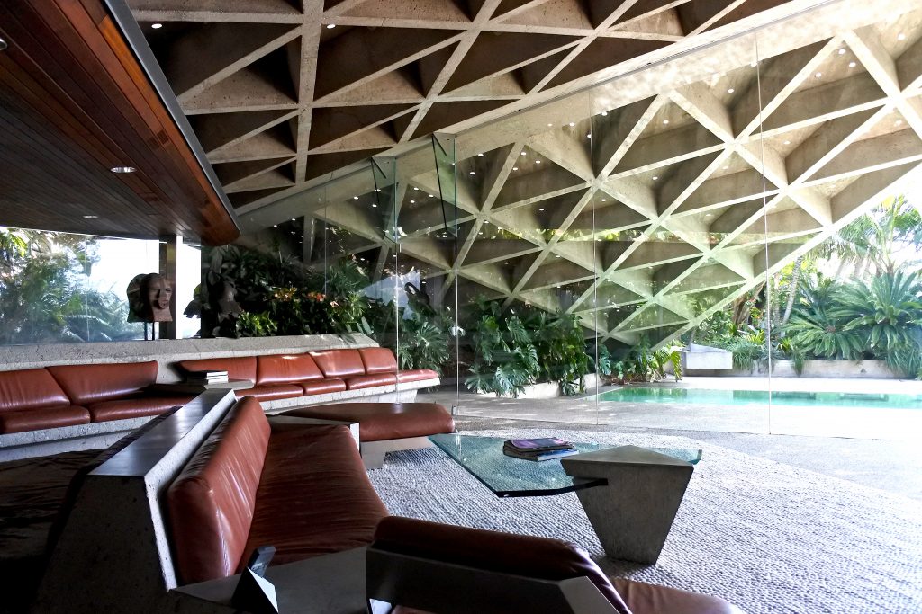
Actually, being at the site didn’t disappoint any of my expectations. Everything is readily identifiable of still having Lautner’s handwriting. The objects in the house — be it the entrance gate, the dining table or the ashtray — are all cornered and furnished with sharp endings. They appear to be constructivistically styled — like precisely designed splinters. The ceiling is the only part of the architecture in which not a lot of wooden materials are integrated. Nonetheless, everything just fits, the natural and technoid are perfectly synchronised. The most commonly used materials are concrete and high-grade steel. Cushions are bright-brown coloured, dividers between the inside and the outside are made of glass and also the ground is made of bright stone. This causes a clean and straight modernist appeal. Lautner succeeds in realizing the ideal of structural purity. Moreover, one could argue that the house clearly exposes baroque opulence due to its rich reference to expressive metaphors, as in the eye, or the connotation of the sky, or the cave.

Sheats-Goldstein Residence, photo by the author.


It is my intention to make clear how traditional ideas of buildups and aligning the house’s sides was completely diced. The simplest question concerning a private home cannot be answered easily: Where is the front? Where is the rear? I simply underestimated Lautner’s accomplishment to hide the house’s privacy completely in midst the botanical thicket. I looked for any perspective from which the house’s external shapes themselves are visible, in vain. Such a complex structure can merely be compared to the constructions of ancient Roman imperial villas.

To access the entrance of the house you have to follow a densely forested narrow driveway. At this point the feeling arises that you’ve reached the house’s back. But at the same time, it presents itself as the entrance with that distinctive American parking area to be found in front of every home. Moreover, there is no front. There is no noticeable front gate, only low and narrow walls outside which lead you into the building, creating a maze-like effect. After crossing a little fishpond there is a glass slide door, after having gone through which you’re inside. But there is no sentiment whatsoever that you’d associate with being inside a house. The huge glass walls permanently cause you to look outside. A multitude of ivy creeps along the sloping wall which is partly outside, partly inside, is placed on the top. At second sight, you realise the ivy merely crosses the glass divider unimpeded, ensuring a strikingly natural touch.

The Sheats-Goldstein Residence is an absolutely shy masterpiece, due to its struggle against denuding. Simultaneously, due to the owner’s known obsessions and strategies, the house is surrounded by an exhibitionistic aura. Even standing on its own tennis court, which is located on a slightly elevated level, one cannot catch a glimpse of any front. It’s a real cave, a social exile. It’s a safe haven for L.A.’s celebs who are drowning in attention during the day and thus escape into their private hideaway during the night. Sheats-Goldstein only allows us to have a proximal look at the iconic steep slope — the property’s décolleté — from the pool’s side, which we know thanks to the photos is the forefront — the media forefront, to be exact. The user forefront — where the entrance to the house is — is vis-à-vis with the latter. And as one can see, Lautner solved both issues, being the retention of the resident’s privacy on the one hand as well as the suspense between in- and outside on the other hand with a single solution: both aspects could be considered as crucial for modern outdoor living.

Alexander Nebrass Eyber

Photos by the author.

Sources

Lubell, Sam and Douglas Woods, Julius Shulman Los Angeles. The birth of a modern metropolis, New York, 2011, S. 20-29.

http://jamesfgoldstein.com/?page_id=881

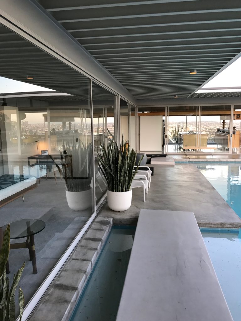
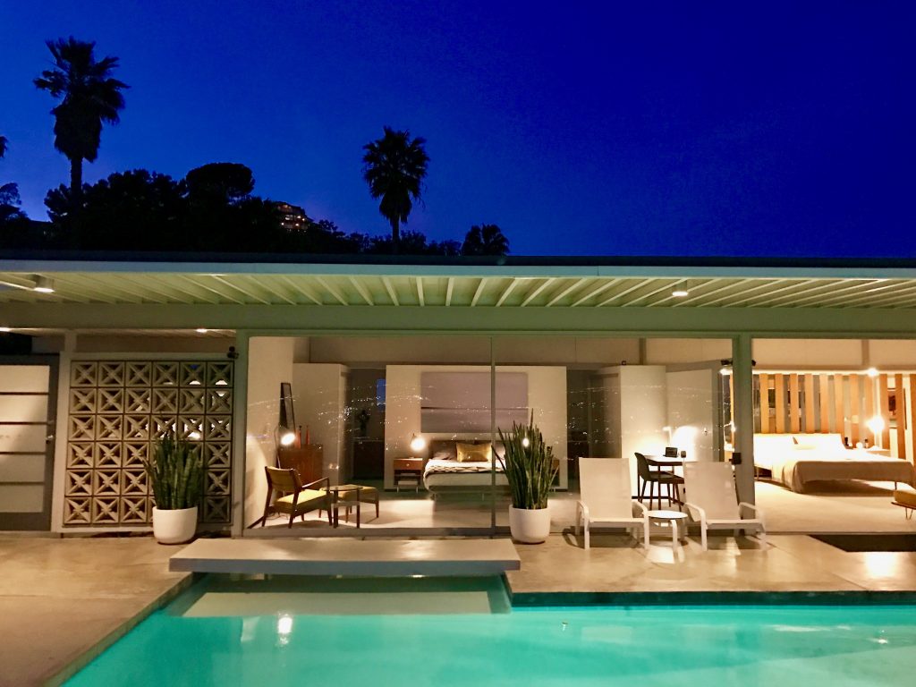
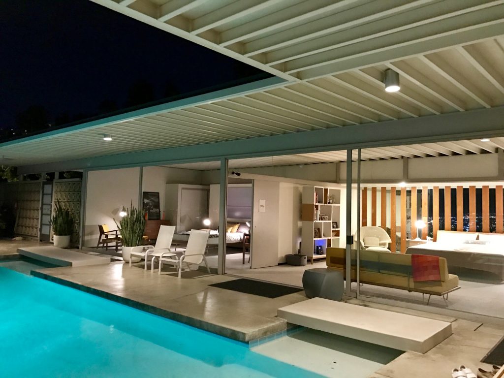
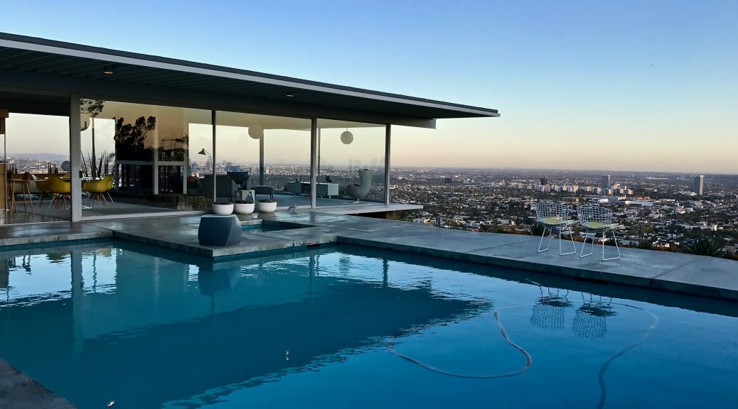
Pierre Koenig, Stahl House, 1959, Woods Drive, Los Angeles


I was lucky to have been the driver for that distance to Stahl House when we went to West Hollywood. The route to the site was full of tight serpentines and steep hairpin bends, making the ride to a real adventure. I needed this change after constantly having driven straight, monotonous roads within the huge signature grid pattern of LA. Melissa, our guide, was already waiting for us on the spot.

Stahl House, photo by the author.

However, I was curious what the front of the house would look like because it wasn’t possible to catch a glimpse on the web — for instance via Google Street View. I didn’t expect such a modest and plain entrance. The front was made of nothing except corrugated steel. If I hadn’t known that it’s the famous Stahl House I never would have paid any attention to it. In addition, the house is located on the outside edge of a sharp curve, one would not assume that there is a huge luxury home behind this presumed “construction site“. In comparison, Koenig used a slightly different method to guarantee privacy than Lautner did for the Sheats-Goldstein Residence. Koenig used the position of the house on the peak of a slope to prevent frontal prying eyes while Lautner took advantage of an artificial jungle which closes the property hermetically. Furthermore, Koenig allowed the rear exterior of the building to be obviously visible to the public area on the street, while ingeniously disguising the whole house as an ordinary building. The spectacular front side is hence only visible from Sunset Boulevard at the bottom of the hillside.

Stahl House, photo by the author.

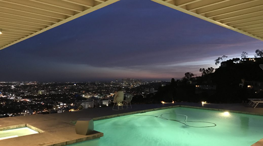
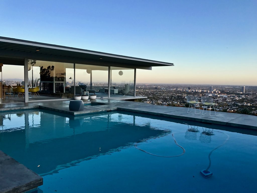
Let’s have a more theoretical look at this point: Perhaps even more interesting than the house itself is the effect-mechanism behind the photographic reproductions which were made of this architecture. Why could Shulman’s shots function so well as a representation of LA as a modern metropolis? What we know is that modern architecture pays attention to the use of  reduced geometric basic forms which merge into unornamented and asymmetric cubes, that unsupported constructions dominate the structural shell, which is why supporting and floating becomes an issue of modern transparent architecture. Pierre Koenig also knew this and he was aware of the increased application of glass. What classical-modern architecture initiated is raised to a whole new level by Stahl House in its usage of full-glass-walls. The developed outline is therefore structured thanks to the dematerialised relation between inside/outside and the disclosed construction. These features create an exhibition-like character of the house, which in turn evokes a clear atmosphere. Parts of the scenery are further brought to life by Shulman’s intelligent staging method. The view on the urban landscape through the vast glass panel is rendered highly iconic. It could basically be considered to be a new edition of the Classical superior gaze or the Romantic window view. And it is exactly this atmosphere two-dimensional images are capable of communicating. Stahl House is an Eldorado of vanishing lines, clean and open spaces, unhindered perspectives; Shulman’s skills and his visionary view on the one hand and the offensive pursued way of medialization on the other hand help reinforce the character of a pure and clean modernism — or perhaps evidence of an obsessive compulsive disorder.

Stahl House, photo by the author.


Alexander Eyber

Photos by the author.

Sources

Prigge, Walter: Ausgestellte Moderne, in: ders. (Hg.): Ikone der Moderne. Das Bauhausgebäude in Dessau, Berlin 2006, S. 24-34.

Lubell, Sam and Douglas Woods, Julius Shulman Los Angeles. The birth of a modern metropolis, New York, 2011, S. 20-29.

Pierre Koenig, Stahl House, 1959, Woods Drive, Los Angeles


Pierre Koenig built the Stahl House, situated in Hollywood Hills, in 1958 for C.H. „Buck“ Stahl, an ex-football player, before proposing the project to the Arts & Architecture Magazine’s Case Study House Program. When it was accepted a year later, the Case Study House No. 22 (as it was called now) was ready to be moved into. Koenig’s vision to use industrial materials such as glass and steel in order to evoke an aeronautic-like construct was a huge avant-gardist step in the architecture of the 50’s, although not completely original. To the contrary, it could be considered to be in line with the glass pavilion cult which had been practised during the pre-war modernity era. The siting of the house on a sloping site enabled a unique panorama lookout over the periphery of the city. It hovers above LA whilst providing a scenic view in three directions.

Later in 1999, the International Styled building was declared a Historic-Cultural Monument by the Cultural Heritage Commission of the City of Los Angeles. Well-deservedly declared as such, considering that the architecture manages to combine the industrial-style, slope-resembling structure with classical features.

It didn’t take long  for CSH #22 to arouse Julius Shulman’s attention. The world-famous architectural photographer then found a new playground to snap. He knew exactly how to stage LA from this site and as a result, he raised a new awareness about the higher middle-classes’ prosperity. Of course, I was very curious what this place looks like in real life. The aesthetic effects are massive, but such a photogenic place might prove disappointing once actually being there.

Another point is that the Stahls as an originally working-class family constituted a rare exception with regard to the ownership. It seems surprising that the scope of the CSH included materially less fortunate owners, thus allocating considerably unconventional inhabitants to an iconic Californian villa. In most of the other luxury private homes we visited, more or less upper-class societies had resided. Hence, in greater detail, we were about to visit a private family place where three small children were raised in. I was rather sceptical whether the environment would be child-friendly after all.

Alexander Nebrass Eyber

Photos by the author.

Sources

Lubell, Sam and Douglas Woods, Julius Shulman Los Angeles. The birth of a modern metropolis, New York, 2011, S. 20-29.

http://culturela.org


http://stahlhouse.com