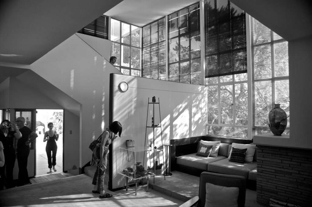
Archiv der Kategorie: Abstracts

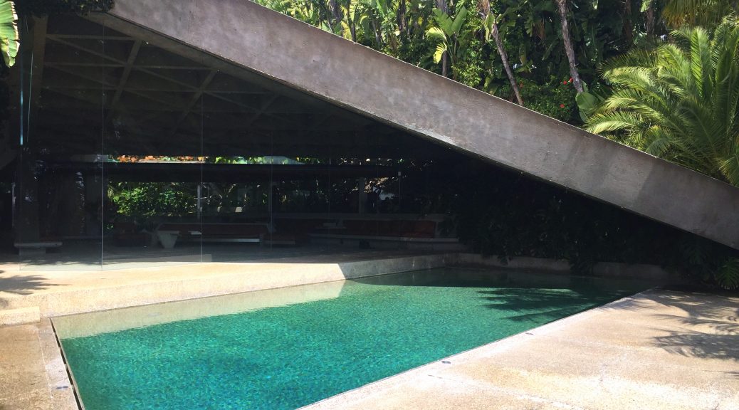
John Lautner, Sheats-Goldstein Residence, 1963, Angelo View Drive, Los Angeles

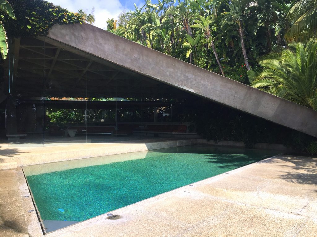
Sheats-Goldstein Residence, photo taken by the author

It is hard to imagine that the Sheats-Goldstein Residence ever belonged to anyone but fashion and basketball enthusiast James Goldstein who seems to be the human counterpart of his home. But in fact Goldstein is the mansion’s second owner. Originally the house was built for a family and their children. John Lautner designed the home that was commissioned by Helen and Paul Sheats in 1963. About a decade later James Goldstein purchased the property in 1972 from the previous owners and continuously commissioned Lautner with changes to the house.

The main entrance, which was supplemented with a waterfall, a koi pond, and a glass and stone walkway, provides a representative first impression of the spectacular home. Throughout the whole house the stucco work on the ceiling was replaced with redwood and the former steel window struts are now made of glass. Next to concrete, glass is the key element of the house. The master bathroom features an entirely transparent wash basin that lets you visually experience the water’s journey towards the sink. The theme of the river threads its way through the complete home. Goldstein had himself built numerous basins, fountains, and waterfalls that are organically included into the house. Built-in furniture that is completely related to the triangular shapes of the building creates a harmonious overall aesthetic.
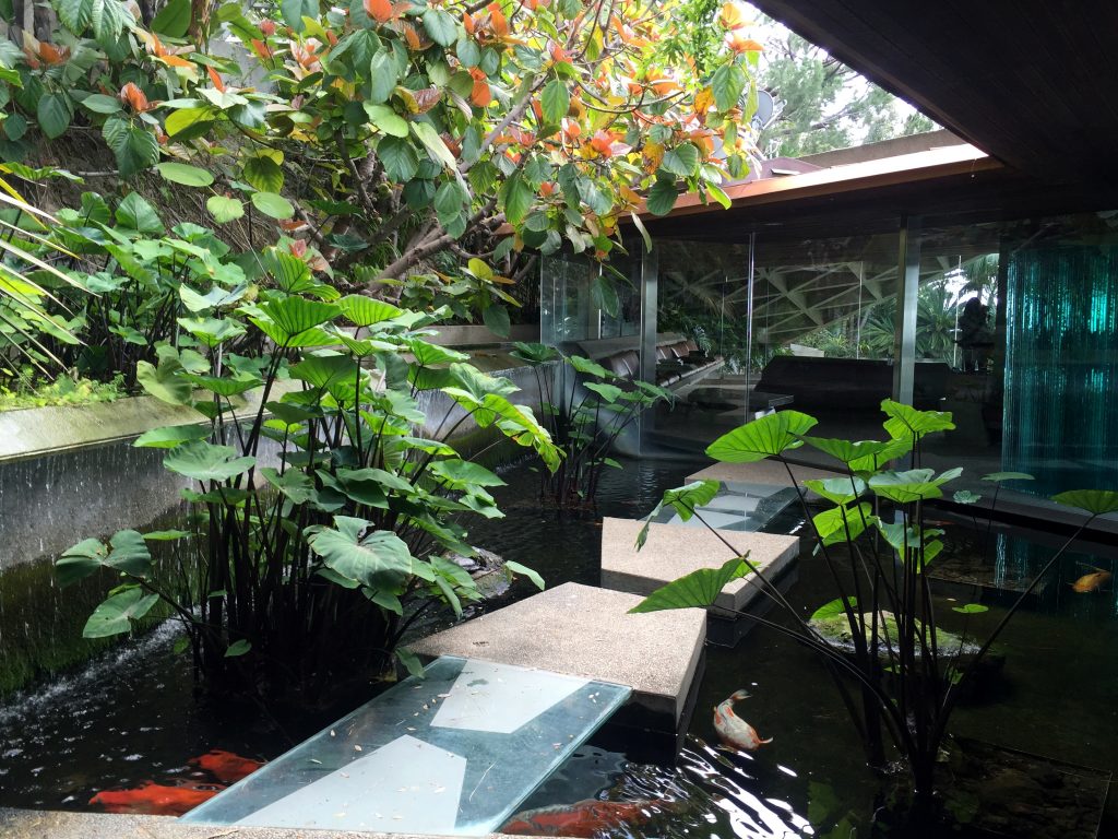
Sheats-Goldstein Residence, Entrance Area, photo taken by the author

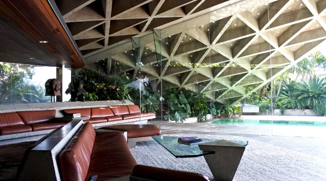
The residence features many operable built-ins that contribute to the home’s very unique character. The kitchen is just one of many rooms with a retractable skylight. Floor to ceiling windows with spectacular views over Los Angeles that open and shut at the push of a button are extending the natural environment of the house. High in the hills of Beverly Crest and surrounded by a tropical jungle, meshing inside and outside becomes a major stylistic element in this architectural piece. The living room’s corrugated concrete ceiling is punctuated with glass emits that create the effect of sunlight passing through the trees in a jungle. Incorporating outdoor landscapes with indoor elements is a signature characteristic of Lautner who was once working under Frank Lloyd Wright.
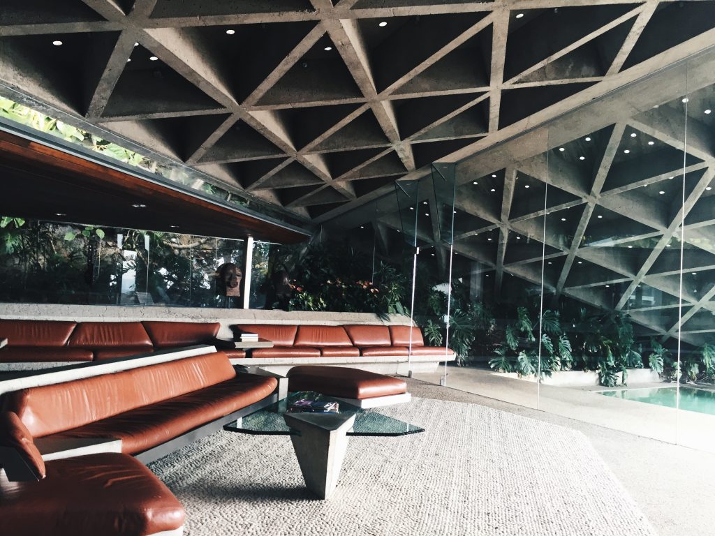
Sheats-Goldstein Residence, Living Room, photo taken by the author

Mr. Goldstein has acquired more land around the house and upgraded the surrounding property with an infinity tennis court, a night club, and an art installation designed by James Turrell. The entertaining facilities are built in the same style as the house, almost everything is made out of concrete and glass. Many things took years to implement and Goldstein is working on a nonstop basis to enhance his home. The Sheats-Goldstein Residence is characterized by steady dynamics as the house changes constantly. John Lautner and James Goldstein passed the ball to one another with their thoughts and ideas to perfect the home while Lautner was open to everything Goldstein had in mind. The constant improvements and changes to the house lasted until the architect passed away in 1994, this demonstrates a particularly close working relationship between architect and house owner. After 1994, Duncan Nicholson who used to be John Lautner’s associate took over as chief architect. Nicholson died in 2015 but Goldstein is still working on conversions today and has been revising and perfecting his home for 45 years now. Goldstein wants the house to be preserved and available to the public which he made sure in his will. In 2016 he promised the property to the Los Angeles County Museum of Art and thereby made the first gift of architecture to the museum’s collection.

Josefine Rauch

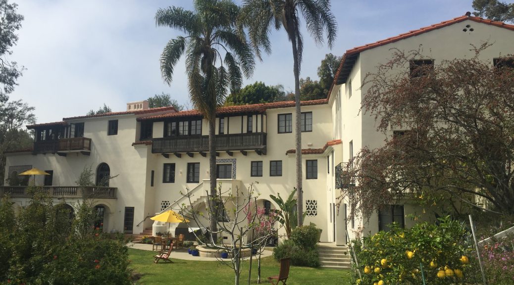
Mark Daniels, Villa Aurora, 1928, 520 Paseo Miramar, Pacific Palisades

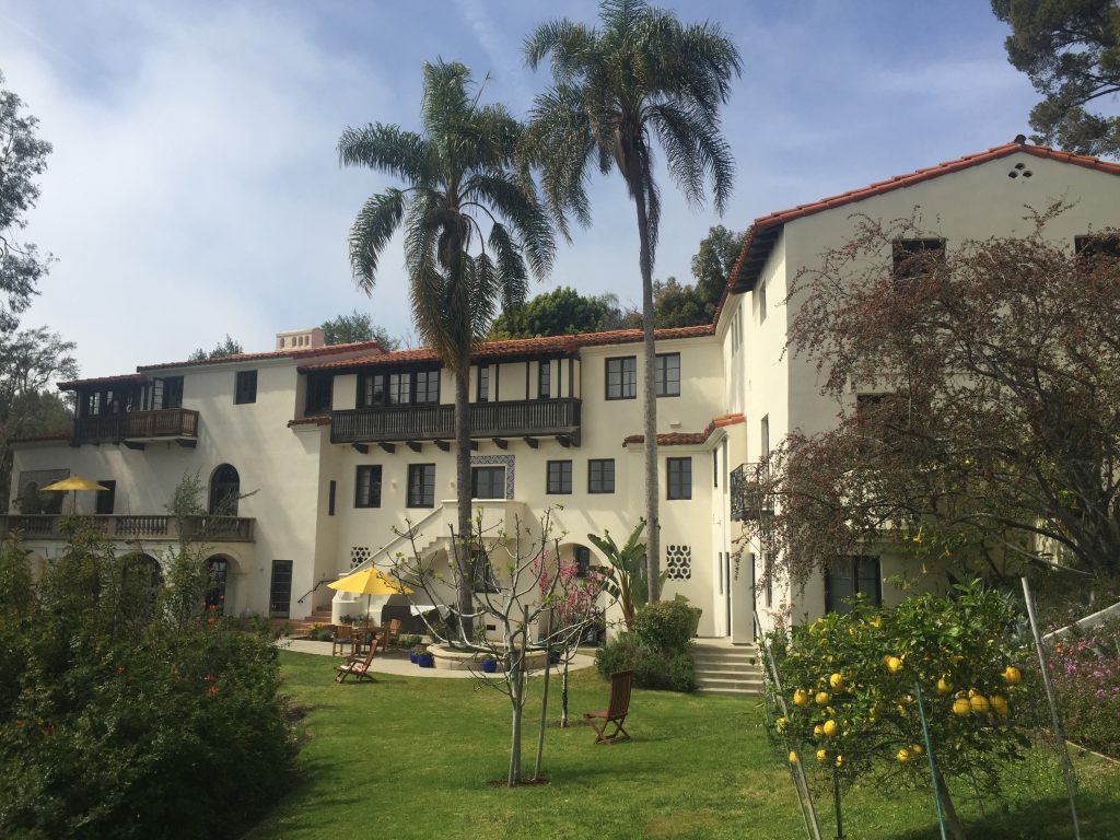
Villa Aurora, photo taken by the author

The Mediterranean-style structure of Villa Aurora stands in sharp contrast to the modernist architecture in Southern California. However, it is a representative example of an architectural style that plays an important role in the cityscape of Los Angeles – the Spanish Colonial Revival Style.

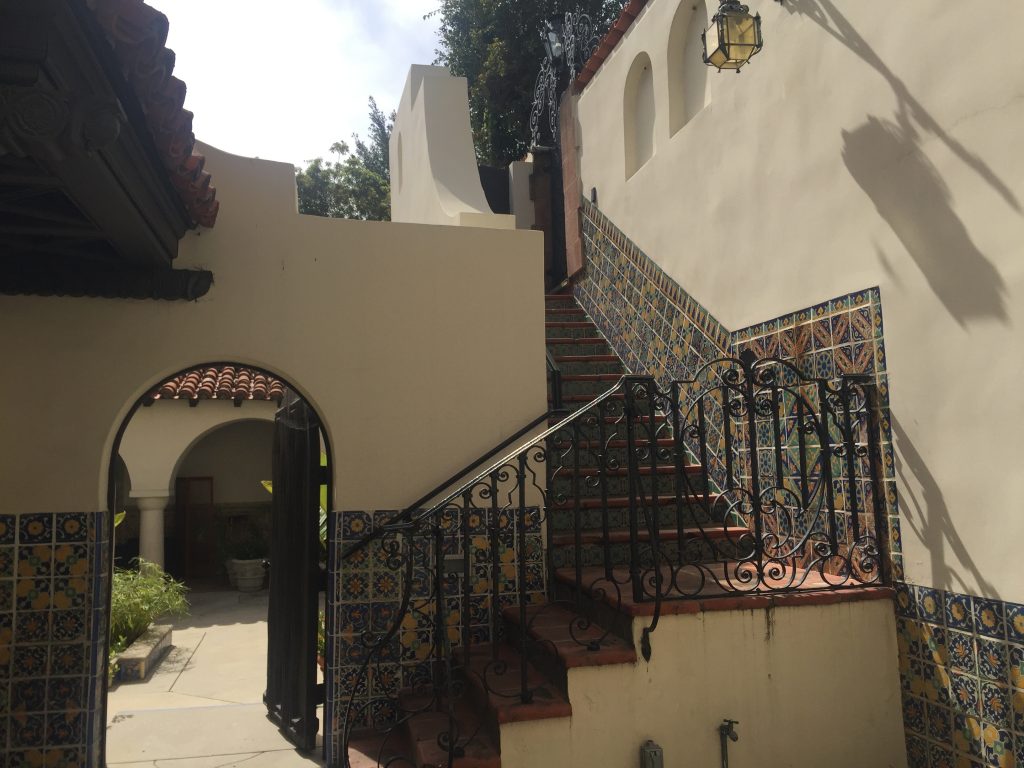
At about the same time as significant residences by modernists like Rudolph Schindler or Richard Neutra were built all over Los Angeles, the construction of Villa Aurora began in 1927 and was completed in 1928 by architect Mark Daniels. The villa was built in the hills of the Pacific Palisades and is inspired by a small Spanish castle that the contractor Arthur A. Weber had seen in Seville. Authenticity was expressed through imported wood for the ceilings from Spain and the patio fountain from Italy. Another central characteristic are the decorative majolica tiles that can be found throughout the entire house.

Villa Aurora, Entrance Area, photo taken by the author

Located on a challenging hillside the house served as a demonstration home for the Los Angeles Times with the intention to promote the still rather uninhabited location of the Pacific Palisades as a good residential area. Furthermore the home was featured with the latest innovations including electric garage openers, a gas range, and an electric dishwasher. The project offered another up-to-date amenity: a house organ with exceptionally large pipes that are comparable to organs used in cinemas or theaters. It was conceived as an enriching factor of social life. But the lack of basic infrastructure in the area combined with the consequences of the economic depression in 1929 led to failure. A slow development of the neighborhood and the impact of isolation made Arthur A. Weber and his family move out after a few years. Far from the city of Los Angeles, nobody felt like living on the steep and isolated hill at a time when gas was rationed and so the house fell into disrepair.

When German-Jewish novelist Lion Feuchtwanger and his wife Marta who were persecuted by the Nazis settled in Los Angeles, they bought the villa despite its poor condition. They felt reminded of Italy through the landscape of the Palisades and immediately bought the house in 1943 for the price of $9000. The Spanish-style mansion in this quiet area with direct access to the sea soon became a meeting point of artists, intellectuals, and fellow émigrés like Thomas Mann or Bertolt Brecht. The isolated location had a dominating influence for Lion Feuchtwanger and his guests. Due to a control program of the U.S. government during the Second World War, individuals of German ancestry were designated as “enemy aliens” and subject to curfews and other restrictions on their conduct. Many of the writers and artists accepted the 8 p.m. ban on going out the house and used long evenings productively to work on their projects.

Although more densely populated, the seclusion of the place still plays a central role. Today Villa Aurora serves as a retreat for artists and writers in residence and maintains a place for cultural encounters.

Josefine Rauch

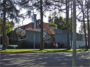
Frank O. Gehry, Residence, 1978, 1002 22nd St, Santa Monica, Los Angeles

Gehry Residence,
View from the street,
CC by IK’s World Trip, via Wikimedia Commons

Frank Gehry and his wife bought their private Santa Monica residence dating from the 1920s in 1977. It was a typical middleclass home in Los Angeles at the time it was build and did not differ much from the houses surrounding it. Gehry transformed the house into their home in a way that it was perceived as a strong statement at the time of its renovation.

According to Gehry, his wife Berta found and bought the house, already knowing that her husband would transform it into something new. But Gehry decided to keep the old house as it was and to add new elements to the exterior only, to clad it in a ‘Gehry-typical‘ manner, using characteristically ‘basic‘ materials like corrugated steel, glass, plywood and a chain-link fence. His strategy to destruct and break with the old forms of construction while still keeping it alive and visible by integrating it into his design is truly innovative.

Critics generally assume that he was deliberately trying to shock and provoke not only the critics, but the surrounding neighborhood with this ‘raw’ and ‘unfinished’ exterior – which he successfully managed. There were only few critics who appraised the building. Meanwhile most others, including the neighbors, were aggravated by the exterior Gehry aimed for, that just wouldn’t fit into the rather traditional surroundings, consisting of mostly one family houses with tidy front lawns inhabited by  middleclass residents and which appears to be a calm and idyllic neighborhood.

The seemingly chaotic look of the buildings outside hides a rather cozy house, offering shelter and a private space, not in a cold avant-garde like style, but in a comfortable living atmosphere. This mirrors Gehry’s strategy of appearing to be a regular middleclass man in a regular middleclass house, while being an eccentric architect with a nonstandard home who disrupts the peace of his neighborhood, all in one.

Nevertheless, one can see some parts of the house’s interior from the street. Through the windows, people on the street can get a glimpse of the garden as well as the kitchen. The same goes for the inside: Here one cannot primarily see the surroundings of the house and gardens on street level, but rather the sky through slits in the walls or the lights of cars going by, reflecting in the glass roof over the dining room table. But this, of course, attracts views of passersby.

The architect himself states that the viewers only see what he wants them to see in his architecture. While something might be visible from one angle or position, it cannot be seen from another. Gehry’s private house is an example of this design strategy. Depending on where one is standing in the house, different areas of the surroundings are visible. The connection between inside and outside is very fluent, creating the illusion of standing outside while actually being inside the house. Gehry composes a view for the people outside without revealing too much of the private interiors.

He used his private house as a deliberate provocation and an experiment on how critics and other recipients would perceive it. The house received plenty of attention and constitutes the breakthrough of his career as an architect, and hence achieves what Gehry wanted it to.

From 1991-92 a second renovation took place during which a lot of the earlier ‘unfinished’ parts got transformed into their ‘finished’ versions, without much public attention.

Beatriz Colomina explains that the house, like its owner, is in constant flux and development, in a way that the both of them build and form each other to what they are now. Furthermore, she highlights how Gehry uses architecture and views to change and create the perception of the recipients.


Sources:

  • Colomina, Beatriz: “The House That Built Gehry”, in: Frank O. Gehry, Mildred Friedman and Beatriz Colomina [i.a.]: Frank Gehry, Architect, New York 2001, p.300-320.
  • Movie: Pollack, Sydney: Sketches of Frank Gehry, 2005.


Viola Menzendorff

John Lautner, Sheats-Goldstein Residence, 1963, Angelo View Drive, Los Angeles

John Lauter built the Sheats-Goldstein Residence in 1963 in order to demonstrate how private space could be included into the natural environment. The student of Frank  Lloyd Wright followed the tradition of his master by sticking with organic architecture. In comparison to Wright, he payed more attention to a unique style.

This purpose was realised not only by designing  main fitments like the furniture or windows,  he even created exclusive rugs for the house to do justice to the above demands.  As a matter of fact, he also worked on a light configuration on the remarkable steep slope, which might be the most iconic part of the building. He collaborated with the world-famous light artist James Turrell to create a separate light installation as a part of the midst of the artificially constructed jungle. But his Lautner’s unfortunate death prevented him from finishing this unique team play so that James Turrell had to finish it on his own. Nonetheless, we can grasp how important it was to him, creating an all around perfected way of modern living. He acquired the passion for detail from Wright but applied that principle to literally every detail to be found in a living space. By relating the outside to the inside with regard to the interior elements, he achieved an overall harmonious composition.

So what I expected before going to the site was perhaps the most impressive building of our field trip programme. When I saw parts of the house in the Coen brothers’ independent movie ‘The Big Lebowski (1998)’, I was impressed by the simple stony structures on the surfaces in the background. Furthermore, even in the film the furniture drew attention to itself because of its way of fitting into the interior. Everything seemed to be one piece. Every photograph that was taken from the in- and exterior confirms that impression.

Therefore, my focus during the visit had ought to be on the interplay between inside and outside, but also how Lautner mastered the claims of privacy and intimacy. If I were to interpret Sheats-Goldstein’s perfectionistic tendencies in a more pathological way it wouldn’t be too far-fetched to accuse him of having been a narcissist, due to evidence such as him leaving his shoes next to his bed for the guided tours. Moreover, one could argue, his ‚greed for power and privilege‘ would be satisfied thanks to his ability to see everything from his house without being seen by anyone from this.

Alexander Nebrass Eyber

Photos by the author.

Sources

Olsberg, Nicholas, Between Earth and Heaven. The Architecture of John Lautner, New York, 2008

Pierre Koenig, Stahl House, 1959, Woods Drive, Los Angeles


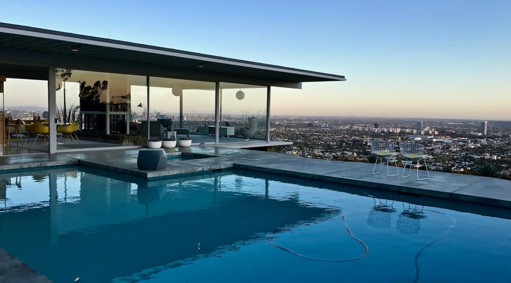
Pierre Koenig built the Stahl House, situated in Hollywood Hills, in 1958 for C.H. „Buck“ Stahl, an ex-football player, before proposing the project to the Arts & Architecture Magazine’s Case Study House Program. When it was accepted a year later, the Case Study House No. 22 (as it was called now) was ready to be moved into. Koenig’s vision to use industrial materials such as glass and steel in order to evoke an aeronautic-like construct was a huge avant-gardist step in the architecture of the 50’s, although not completely original. To the contrary, it could be considered to be in line with the glass pavilion cult which had been practised during the pre-war modernity era. The siting of the house on a sloping site enabled a unique panorama lookout over the periphery of the city. It hovers above LA whilst providing a scenic view in three directions.

Later in 1999, the International Styled building was declared a Historic-Cultural Monument by the Cultural Heritage Commission of the City of Los Angeles. Well-deservedly declared as such, considering that the architecture manages to combine the industrial-style, slope-resembling structure with classical features.

It didn’t take long  for CSH #22 to arouse Julius Shulman’s attention. The world-famous architectural photographer then found a new playground to snap. He knew exactly how to stage LA from this site and as a result, he raised a new awareness about the higher middle-classes’ prosperity. Of course, I was very curious what this place looks like in real life. The aesthetic effects are massive, but such a photogenic place might prove disappointing once actually being there.

Another point is that the Stahls as an originally working-class family constituted a rare exception with regard to the ownership. It seems surprising that the scope of the CSH included materially less fortunate owners, thus allocating considerably unconventional inhabitants to an iconic Californian villa. In most of the other luxury private homes we visited, more or less upper-class societies had resided. Hence, in greater detail, we were about to visit a private family place where three small children were raised in. I was rather sceptical whether the environment would be child-friendly after all.

Alexander Nebrass Eyber

Photos by the author.

Sources

Lubell, Sam and Douglas Woods, Julius Shulman Los Angeles. The birth of a modern metropolis, New York, 2011, S. 20-29.

http://culturela.org


http://stahlhouse.com

John Lautner, Silvertop, 1957, 2138 Micheltorena St; Richard Neutra, Neutra Colony, 1948-1961, Silver Lake Blvd, Neutra Place, Earl St; Rudolf M. Schindler, Droste House, 1940, 2025 Kenilworth Ave, Los Angeles, CA


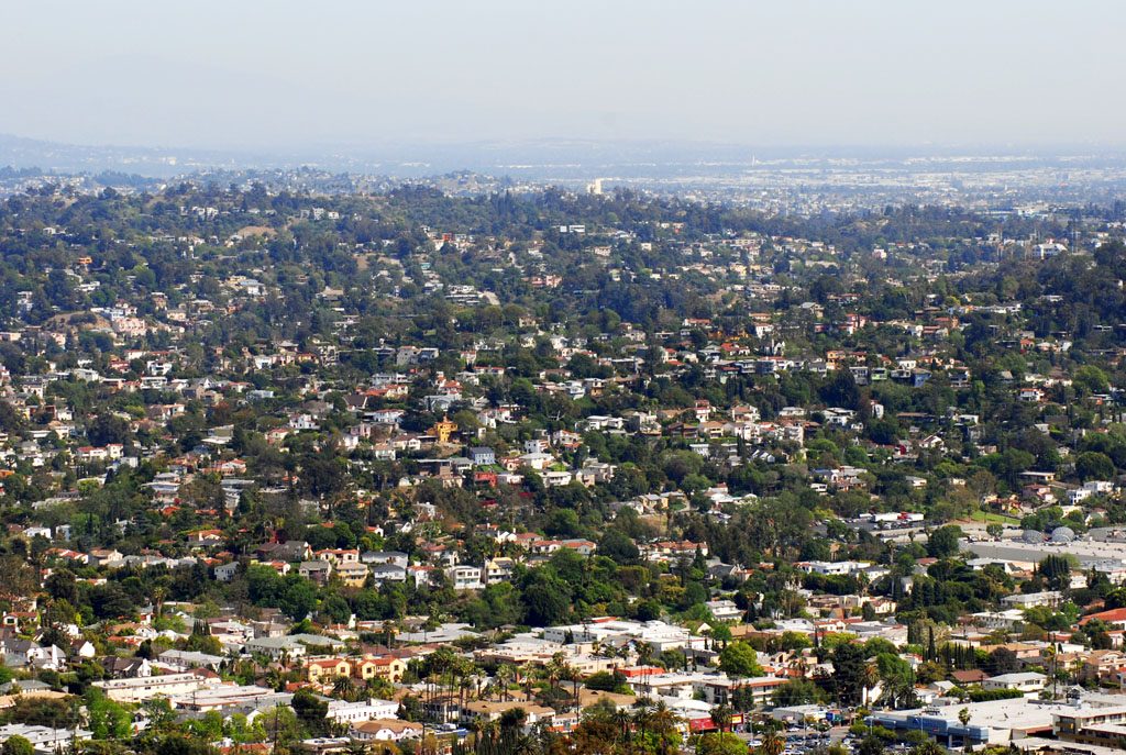
View of Silver Lake neighbourhood
View of Silver Lake neighbourhood, image from Wikimedia Commons

The Silver Lake area in Los Angeles takes its name from one of the expansive water reservoirs five miles northwest of downtown Los Angeles, the historic core of the city. Herman Silver was a member of the first city’s water commission who lend his name to the reservoirs. Silver Lake reservoir was constructed in 1906 and integral to William Mulholland’s plan to support LA’s water system. In 1989, it was declared a cultural monument by the cultural heritage commission. Sites are awarded these titles based on their architectural, historic and cultural merit.
In the beginning of the 1900s Silver Lake started to draw a bohemian crowd. Writers, architects and political activists flocked to this area. Visionary modernists started moving to this part of Los Angeles after Frank Lloyd Wright designed the Hollyhock House for Aline Barnsdall, a socialist and oil heiress. Silver Lake began to appeal to the creatives after it became home to a number of movie studios: The Mack Sennett Studios, The Mixville Studios, Talmadge, Monogram Studios and even the first official Disney Studio. Because of this, many screenwriters, set designers and cartoonists decided to move to Silver Lake. The population of artistically inclined people grew with time. And many were highly receptive of new architectural ideas. The ideal soil for avant-garde architects to build upon.

Silver Lake today includes architecture designed by Richard Neutra, Rudolf M. Schindler, Gregory Ain, John Lautner and Lloyd Wright among others. Neutra as well as Lautner decided to build their own homes in this neighbourhood. Now, the area displays a great number of Mid-Century Modern architecture as well as popular Spanish Colonial Revival, Spanish Mediterranean, French Normandy, English Tudor, Gothic, and Post-modern styles.
An accumulation of Neutra designed houses, colloquially known as ‚Neutra Conlony‘, sits on the East shore of Silver Lake. Right on Silver Lake Boulevard to the right of Earl Street one finds, from North to South: Sokol House (constructed in 1948), Inadomi House (1960), Kambara House (1960) and Yew House (1957). One street up the hill, parallel to the shore, runs Neutra Place. The cul-de-sac was officially renamed in the 1990s during a ceremony held by the city of LA. It now is the proud address to, from North to South, Reunion (1949), Flavin (1958), Ohara (1961) and Akai House (1961). On the opposing side of Earl Street Richard Neutra designed the Treweek House in 1948. All homes in the colony are characteristic examples to the architects’ style. Rectangular outlines, the lack of ornament, flat roofs, sliding glass walls and outdoor decks are overall present. Indoors and outdoors are intertwined, to enjoy the Californian weather in all aspects. Not far from the colony, on Glendale Boulevard, Richard and Dion Neutra set up their original office. The city of Los Angeles listed the building as a Historic-Cultural Monument.
On the Western hills of Silver Lake John Lautner built one of his masterpieces, the Silvertop. The grounds of the home include an infinity pool and a tennis court. Never inhabited by the original owners its design became well known thanks to the shimmering, arched roof. Ingenious engineering enabled a spacious interior with glass walls suspended from the ceiling. Hence enabling stunning views across Silver Lake and the mountains.
On the same side of the water reservoir Schindler constructed a three-story home for the Droste family in 1940. It boasts a two-story picture window as well as features all the elements of classical modern design.
With the resurge of interest in Californian modernism all of the houses accomplish large sums on the real estate market. For example, the Kambara House listed for the first time in 2014 for $2.3 Million. Today the entire Silver Lake area is a highly sought after neighbourhood and continues to thrive. Residents thoroughly enjoy the views, hip cafes and dog parks.

BIBLIOGRAPHY
• Hines, Thomas S.: Architecture of the Sun. Los Angeles Modernism 1900-1970, New York 2010
• Smith, Laura Massino: Architecture Tours L.A. Guidebook. Silver Lake, Atglen, PA 2007
• http://www.silverlake.org/about_silverlake/aboutsilverlake.htm (accessed last 16.03.2017)

Talitha Breidenstein

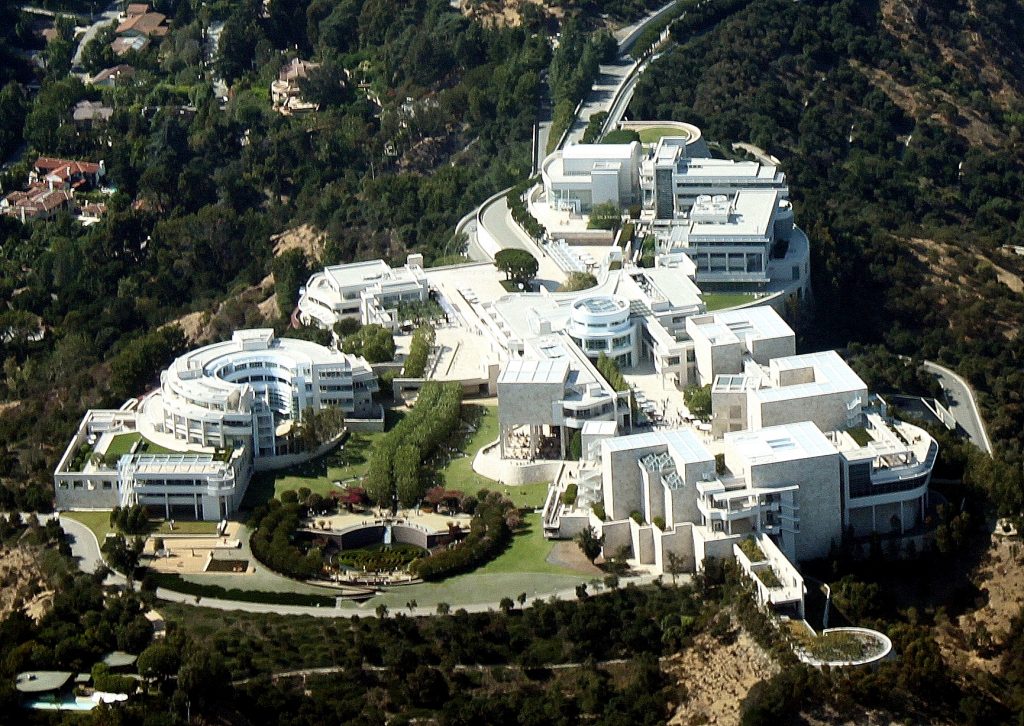
Richard Meier, The Getty Center, 1997, 1200 Getty Center Drive, Los Angeles, CA 90049, USA

Getty Center arial view, image by Wikimedia Commons

A World Famous Institution in An Iconic Building

The Getty Center opened to the public in December 1997 and has been a fascinating impression ever since. It has become a beloved refuge from monotony to many Angelenos as well as an internationally recognised architectural icon. Designed by the renowned architect Richard Meier the Getty Center grounds house the Getty Research Institute, the Getty Conservation Institute, the Getty Foundation, the J. Paul Getty Trust and the Getty Museum.
Situated on top of a hill in the Santa Monica Mountains the complex is highly visible. The land purchased by the Getty Trust sits right by the San Diego Freeway and is therefore ever present to many as they drive by on their daily commute. The campus itself consumes 24 acres on a 110-acre site, while the entire grounds occupy 742 acres to ensure the surroundings remain in its natural state. Through this, the Getty distinguishes itself from a multitude of other Art museums as it is embedded in a natural environment. Often Art institutions are set within an urban context and the museums architecture engages with, responds to the encircling buildings.
The Getty Center’s site was specifically decided upon in order to represent a grander vision. It was imagined to be easily accessible, visible, recognisable and unique in appearance. All attributes best associated with the Getty’s institutions.
The design of the Center was envisioned to correspond with its environment; for one the unique Californian landscape and secondly the tradition of Californian modernism, in awareness of the architectural design by Schindler, Neutra et al. Richard Meier created a building that is consistent with Californian modernism and partly, because of this it oozes permanence.
The hilltop site is crossed by two ridges which Richard Meier perceived as vector lines. The lowest parallels the freeway and faces Los Angeles downtown. Here the architect placed the museum, visible and approachable. The second ridge, slightly raised, may be read as the extension to the freeway after it bends, just a little further out of the city from where it runs parallel to the museum. Here Meier situated the various institutions united under the aegis of the Getty Trust. The design process of the Center influenced the shaping of the Getty Trust programs. Concurrently the programs impacted the design process of the Center. It was built from the inside out. The desire in the early 1980s was to unite the different initiatives in one location, to further and expand the already existent cooperation and collaboration. However, at the time none of the programs, besides the museum, were established enough to state their precise requirements in regard to a building that should house them. As it became apparent that the Getty Villa’s capacity no longer sufficed the collections space it was resolved to build a new, larger site. From the initial decision to the public opening the Getty Center has been a fourteen-year project: plan, design, build and occupy.
The construction developed as more complicated and long winding than originally anticipated. Difficulties arose by the nature of the land, edifice on a hilltop, manoeuvring the building materials to the construction site and no prior installation of sanitation by the municipality. Angelenos followed the progress of construction as they commuted on the freeway over almost a dozen years. The process was very unlike Los Angeles and served as another example of the Getty’s permeance.
At the same time, the complexities of the site provided a clean slate in regard to its shape and form. Therefore, the selection of the architect was of great importance to the Getty Trust. Instead of an open call for designs, architects were invited to participate. Richard Meier’s idea was chosen because his office was deemed capable to finish a large project like this and because of the museums he completed prior to the Getty in Barcelona, Frankfurt and Paris.
The scheme is dominated by a rhythmic repetition of curves, curvilinear elements and a natural garden – all to soften the grid created by the off-white travertine and white metal panels. The 1.2 million square feet of Italian stone, cleft-cut and textured, as well as metal panels clothe the Getty Center. The garden, central to the complex, is part of the Getty’s permanent collection, a land sculpture crafted by Californian landscape artist Robert Irwin. It extends the relation to the natural environment of the site.
The entire Center is permeated by space and light. This is integral to the design. Openings in the architecture as well as the garden create space. Filtered natural light, as not to damage the Art, was used in the top floor interior galleries. The galleries were modelled by Thierry Despont.
At the Center of the Campus sits the arrival hall. It is reached by two computer operated trams, elevating the visitors from street level and parking facilities to the Art. Installed as a solution to combat accessibility of the complex, the use of the trams implements the feeling of an adventure and the out of the ordinary. The Getty Center serves as refuge from the daily, a safe haven to experience Art and enjoy a view.

Bibliography
Ragsdale, J. Donald: American museums and the Persuasive Impulse. Architectural Form and Space as Social Influence, Newcastle upon Tyne 2009
Walsh, John and Deborah Gribbon: The J. Paul Getty Museum and Its Collections. A Museum for the New Century, Los Angeles 1997
Williams, Harold M. (et al): Making Architecture.
The Getty Center, Los Angeles 1997

Author: Talitha Breidenstein

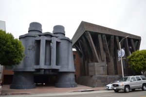
Frank O. Gehry , Binoculars Building, 2001, 340 Main Street, Venice, Los Angeles

Located in the Venice neighboorhood of Los Angeles, is the Binoculars Building which is a commercial office building.

Binoculars Building
By YaGeek (Own work) [CC BY-SA 3.0 (http://creativecommons.org/licenses/by-sa/3.0)], via Wikimedia Commons
https://upload.wikimedia.org/wikipedia/commons/7/70/Binoculars_Building.jpg
It was designed by Frank O. Gehry a Canadian-born American architect who is residing in Los Angeles, in collaboration with his longtime friends Claes Oldenburg and his wife Coosje van Bruggen. The couple who Gehry collaborated with are famous for their large-scale projects in which they turn everyday objects in huge sculptures. They first made a small model for an academic project in Italy in the form of binoculars but it was built in Gehry’s office instead.

This building was constructed in 1991 until 2001 for the advertising agency Chiat/Day as one of its headquarters and was originally called the Chiat/Day Building.

Materials such as steel, concrete and cement plaster and gypsum plaster in the inside were used for this building.

The black standing pair of binoculars are only one part of a three-part complex of buildings. Gehry designed two different buildings for this project, one is boat-like and the other one is tree-like. We can see that the building on the left side does look like a piece of a white colored yacht with long cabin windows. The building on the right gives the appearance of trees because of the brown color and branches like roof pillars.

Since you can’t gain inside access to the building without having connections, you can still see how this kind of architecture is definitely an eye-catcher. The massive binoculars which are normally considered as an everyday object ties the complex together as a third structure. It turns into an unique and spectacular work space, which functions as pedestrian entrance and car gate as we can already see in videos which are posted online. You can drive through the center of the binoculars in order to get into an underground parking garage.

Today TBWA\Chiat\Day moved out of this building and the public relations group “Ketchum Inc.“ was renting a part of this building. Nowadays this place is more known for its current tenant, as one of many Google buildings.

Lien Liane Nguyen

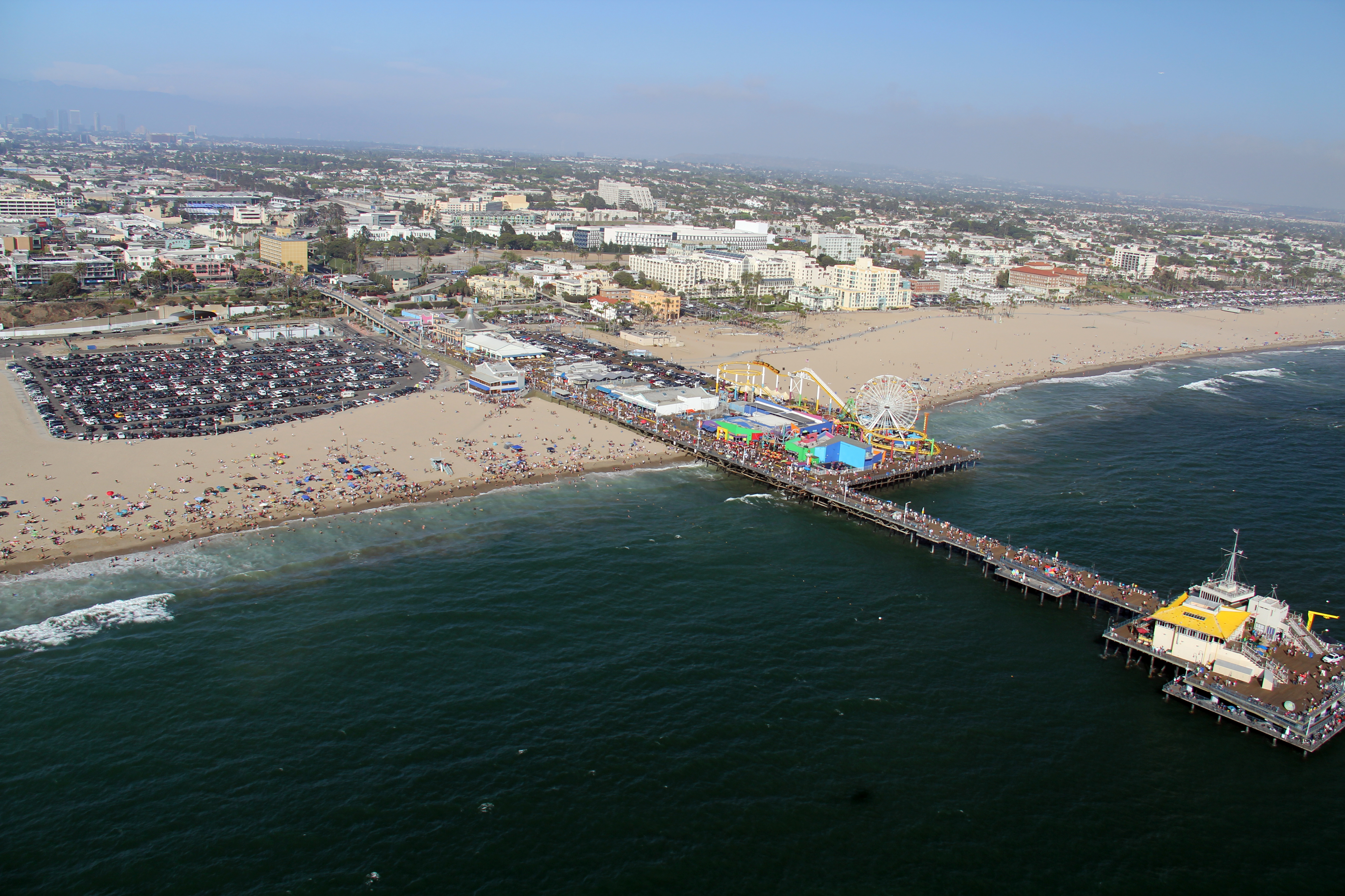
Santa Monica

Foto: © JCS / Wikimedia Commons / , via Wikimedia Commons

Santa Monica is a renowned beach city in Los Angeles with a mediterranean climate. During our field trip at the end of March we can mainly expect to have moderately warm weather. We will stay at the „Hostelling International Los Angeles in Santa Monica“, which is situated in downtown Santa Monica and only a few blocks from the beach.

Aside from the beach, the famous Santa Monica Pier which used to be the western end of Route 66, at the end of Colorado Avenue contains an aquarium and a little amusement park with a red and yellow ferris wheel, a roller coaster, a historic carousel and more.

Movies, TV series and music videos that have been set in the Santa Monica Pier as well as the beach, show that this place is one of Southern California’s most popular filming locations. Some movies already gave us a slight insight in the lively, expensive atmosphere of this city. In combination with free time activities, Santa Monica offers shops, cafes, restaurants, farmer markets, theatres, cultural events and entertainment which attracts a wide variety of locals as well as tourists.

In order to explore the city we will not have to rely on a car too much to get around, since the city is rather small. Public transportation such as the „Big Blue Bus“ also provide bus service to the westside of the Los Angeles basin if you don’t have a car. Furthermore it might be more convenient to rent bicycles to get to the car-free 3rd Street Promenade where you can go shopping.

Another option is the 26-Mile Bike Path that parallels Santa Monica Beach and that might give you the chance to enjoy the beautiful scenery. The Santa Monica Yacht Harbor Sign at the entrance of the Pier and the sign at the end of the Santa Monica Pier which marks the end of the legendary American highway, have become an additional must-visit place to take obligatory pictures or selfies for many travelers.

Route 66 – End of the Trail -Santa Monica
from Prayitno, Los Angeles, USA (ROUTE 66) [CC BY 2.0 (http://creativecommons.org/licenses/by/2.0) oder CC BY 2.0 (http://creativecommons.org/licenses/by/2.0)], via Wikimedia Commons

During our trip we are going to take the chance to take a look at the architecture of a Googie-styled restaurant called “Swingers Diners“ and o have dinner there at the same time.

Furthermore another place in Santa Monica, that we’re going to visit is the world-renowned Gehry Residence which was redesigned to its owners liking. It was bought by Frank Owen Gehry and his wife Berta Gehry and looks like a house that is still under construction.

If you want to explore other beach towns which are nearby, you can go to Malibu, Venice, Beverly Hills, Pacific Palisades and many other places with different attractions.

Lien Liane Nguyen

Richard Neutra: Lovell Health House, 1927-29, 4616 Dundee Lane, Los Angeles, CA

Lovell Health House

When looking at Richard Neutra’s Lovell Health House, built from 1927 – 29 for Philip Lovell and his family, the wildly used “machine in the garden” motif becomes easily comprehensible. As it raises above one of the Hollywood Hill’s precipices, with its spiderleg steelwork and the light concrete walls contrasting the roughness of the seemingly untouched subsoil, there is something truly futuristic about it’s appearance. But even more than the houses’ exterior, the construction technique turned out to be pioneering. Settled on subsoil this difficult – impossible even – Richard Neutra not alone was to design a dwelling for an avant-garde client, but furthermore had to come up with the actual way of construction to implement his vision into reality (Lamprecht, p. 23).

Lovell Health House (overview)

For the first time in (Western) American residential building Neutra  exclusively used prefabricated structural steelwork, which enabled the base framework to be set-up within only four days (Wandel-Hoefer, p. 188). Additionally, by tying the steelwork to the escarpment and adjusting it to the uneven surface, Neutra was able to leave most of the subsoil untouched (Lamprecht, p. 23). Because of the use of prefabricated elements the actual quantity of material used for the dwelling could be minimised drastically (Sack, p. 13). Altogether Neutra did not only work out the most economic method for his clients, but also found a way to represent both the Lovell family’s ecologic mindset and the general health and hygiene reformation found particularly in the Californian Modernism in his project.

Especially this last point is crucial in describing Richard Neutra’s architectural approach: As part of his cutting-edge methods, he analysed the Lovell’s behaviour and lifestyle patterns; for planning the kitchen he even talked to their chef, all in order to gear the residence to their individual needs, as his overall aim was creating a harmonic habitat; ideally with some sort of “psycho-physiological and therapeutic depth effect” (Exner, p. 7) on his clients. Retrospectively Neutra’s so-called “biorealism”, “his own […] philosophy, a mixture of psychology and physiology, of biology and ecology” (Sack, p. 25) assorted incredibly well with Dr. Lovell’s nature-oriented mindset, revealing them to be a perfect match for one another.

Inside the Lovell Health House, view on the famous staircase with Ford automobile headlight

Turning towards the structural steelwork for one last time, it is important to add that Neutra was not primarily about showcasing it as an aesthetic element. By mostly hiding it behind concrete panels and balustrades and additionally not visibly including it in the interiors, it is easily observed that he was prioritizing modularity, regularity and a puristic simplicity (Wandel-Hoefer, p. 188f.).

Now to conclude this short perfunctory overview, looking back at the Lovell Health House, what is there to expect from the real-life experience in contrast to the reception of images? As Richard Neutra said himself, the documentation of an architectural phenomenon through photography reveals itself to be a restriction to the sense of vision (Wandel-Hoefer, p. 172). Precisely because photographers like Shulman manage to create remarkably aesthetic sceneries, architecture – just like sculptures – can only be fully experienced in person. Consequently by visiting the Lovell Health House I hope to not only gather impressions differing from Shulman’s quite specifically staged ones but to also develop a closer apprehension of Neutra’s “biorealism” philosophy. Additionally I’m interested to see if there have been any major changes since Shulman’s photographs were taken and to conclude with the most obvious, if what we can actually see of the Lovell Health House is in any way comparable to what we’ve previously seen in the media.


Sources:


Exner, Hermann: Einleitung. In: Richard und Dion Neutra: Bauen und die Sinneswelt. Berlin und Hamburg 1980, S. 6 – 21

Lamprecht, Barbara: Richard Neutra 1892 – 1970. Gestaltung für ein besseres Leben, Köln 2016

Sack, Manfred: Richard Neutra. Zürich 1992

Wandel-Hoefer, Rena: Zur Architektur Richard Neutras. Eine Analyse seines theoretischen Werkes und der Umsetzung in seinen Bauten, Darmstadt 1989

– M. E. N.