Archiv der Kategorie: Abstracts

Rudolph M. Schindler: Schindler House (Kings Road House), 1921/22, 833 North Kings Road, West Hollywood, Los Angeles, CA

The Schindler House

“A Cooperative Dwelling for Two Young Couples” (E. Smith, p. 29) is what Rudolph Schindler described the Kings Road House as. Interested in exploring alterative ways of shared housing, Rudolph and Pauline Schindler allied themselves with Clyde Chase – an engineer working for Irving Gill, who was an architect that among others was  known for his tilt up beton method, which has also been used in the construction process of the Schindler house – and his wife Marian, who Pauline was friends with, to realize the architect’s first independent building (K. Smith, p. 30).
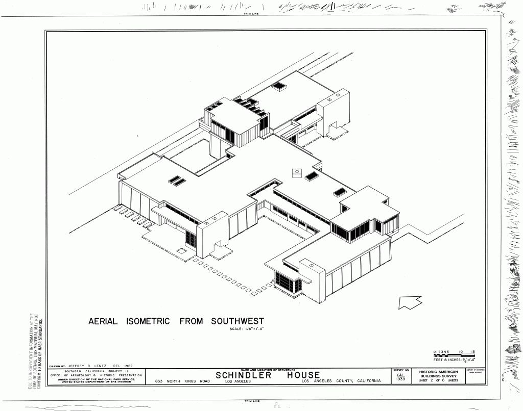
Image courtesy of Library of Congress, Prints & Photographs Division, CA-1939
The Schindler House (overview)

After spending some time at Wright’s Taliesin and being enthusiastic about “its organization as an artist’s studio where buildings and landscape were in harmony” (ibid.), Schindler embraced the studio scheme for the Kings Road House. Going hand in hand with his perception of “the family as a group of independent individuals with common goals” (K. Smith, p. 21), Schindler not only gave each of the members their own studio, but also arranged them around the corporately used utility room, which combined the functions of a kitchen, laundry, storage and sewing-room at once (K. Smith, p. 30). Additionally, in order to discard traditional concepts of room configuration, “sleeping-baskets” on the bungalow’s flat roof were used instead of actual bedrooms (Wilson, p. 124). Simultaneously, even though this relationship with nature is a recurring motif in Schindler’s architectural approach, it is especially highlighted in the Kings Road House: By replacing one of each of the studios walls with translucent sliding doors, made of glass and redwood-frames, the strict partition of interior and exterior was abolished (ibid.). Combining privacy and openness at once, the sliding doors not only optically resemble Japanese Shoji Screens, but also funcitoning sliding doors.

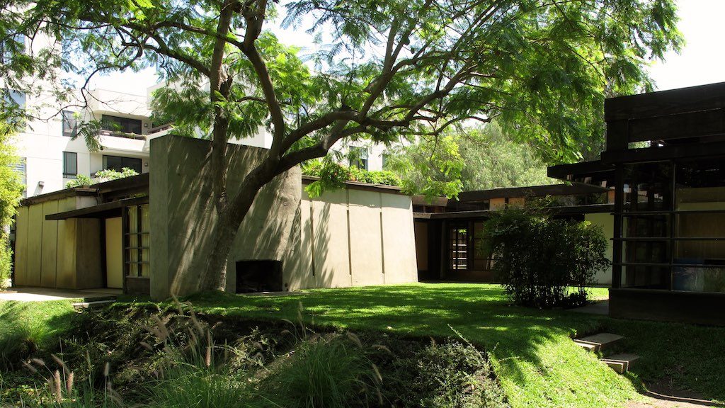
Regarding the dwelling’s construction, Schindler – with economic intensions – turned towards concrete as a well-priced material. By pouring the concrete into a mould, Schindler and Chase received even slabs to serve as walls, which easily were tilt up by the two men. For additional cost-reduction, the slabs narrow in direction of the ceiling. To separate the concrete panels, strips of transparent and translucent glass were inserted (K. Smith, p. 32).

Due to the mix of mostly untreated materials and the abandonment of traditional room configuration, the Kings Road House “looked completely different from any other house in the neighbourhood” (K. Smith, p. 7). Consequently after the Chases left, various kinds of people – mostly avant-gardists and people with influence – were interested in living with Schindler in his bungalow (i.e. Sweeny, p. 109).

When looking at images of the Kings Road House the first thought that comes to mind is how soothing it appears to be. Probably because of its fluent transition of interior and exterior, the house can easily be imagined as a place of harmony and serenity. Additionally the houses reduced furnishing may seem appealing to some and even though the concrete walls and floor in combination with the emptiness may appear cold to some people, it actually appears to be very warm and welcoming to me. With these underlying sentiments in mind, my expectations on visiting the Schindler House are accordingly high. As it is one of my favourites I’m eager to see if the reality lives up to the expectations generated by the consumption of media. Particularly the emotional effects (harmony, serenity, calmness, etc.) created through the photographs are interesting to examine – is it actually the houses energy or simply great photography skills? Generally, like with most three dimensional objects, real life experience is expected to vary from small to great extents from perception through photographs, but with Kings Road House especially, I’m hoping for the best and preparing for the worst.


Sources:

Smith, Elizabeth A. T.: R.M. Schindler. Eine Architektur der Fantasie und Intuition, in: Elizabeth A. T. Smith und Michael Darling (Hgg.): R.M. Schindler. Architektur und Experiment. Ostfildern-Ruit 2001, S. 12 – 85

Smith, Kathryn: Schindler House. Santa Monica, 2010

Sweeny, Robert: Realität in der Kings Road. 1920 – 1940, in: Elizabeth A. T. Smith und Michael Darling (Hgg.): R.M. Schindler. Architektur und Experiment. Ostfildern-Ruit 2001, S. 86 – 115

Wilson, Richard Guy: Die Metaphysik von Rudolph Schindler. Raum, Maschine und Moderne, in: Elizabeth A. T. Smith und Michael Darling (Hgg.): R.M. Schindler. Architektur und Experiment. Ostfildern-Ruit 2001, S. 116 – 143


– M. E. N.

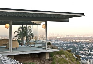
Pierre Koenig, Stahl House, 1959-1960, West Hollywood

Stahl House, via Wikimedia Commons

The Stahl House was built between 1959 and 1960 by the American architect Pierre Koenig for Buck Stahl and his family. The structure is also known as CSH #22, after its number as part of John Entenza’s ‚Case Study House Program’ and is one of Koenig’s most well-known designs. 1

The bungalow is situated in the hills above West Hollywood and is invisible from street-level viewing, thus making the house the epitome of privacy – despite its walls being made mainly of glass, a typical feature of most Case Study Houses.

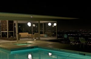
The one-story metal, glass and concrete structure builds an L-shaped frame for the house’s outdoor swimming pool – a typical feature of California ‚living’. All bedrooms as well as the living rooms face the pool, the main focal point of the building. When excluding pool and outdoor deck, the building harbors only six rooms on it’s approximately 204,4 square meter space.

Arguably most well-known for its portrayal in the architecture photography of the late Julius Schulman 2, the house is a prototype for modern living. From it’s high placement on the hillside, it features a prominent bird’s-eye view of the city’s lights below. The resident of the Stahl House thereby seems removed from the remaining inhabitants of the city – watching from a distance rather than taking part.

Stahl House at Night, via Wikimedia Commons

The view and it’s implications of grandeur and spectacular views have made the Stahl House a popular site for Hollywood movie productions and music videos, a house similar in style to the Stahl House was also used in an episode of the popular cartoon TV show ‚The Simpsons’ (Season 21, Episode 1 – ‚Homer the Whopper’)3.

The architect, Pierre Koenig, was born and grew up in California. The Stahl House is his second project for the Case Study House Program, the first being CSH #21, in West Hollywood.

Today the house is still in possession of the Stahl family, who allow guided tours through the building. This is a possibility we will be taking advantage of on our trip to L.A.


Sources:

1. Smith, Elizabeth A. T., Blueprints for Modern Living. History and Legacy of the Case Study Houses, Ausst. kat., Los Angeles 1989/1990, Cambridge (Mass.) u.a. 1989, S. 69

2. http://stahlhouse.com/

3. http://archive.blog.modernica.net/inspire-me-monday-architecture-of-the-simpsons/

Katharina Marie Steins

Frank Lloyd Wright, George Sturges House, 1939, 449 North Skyewiay Road, Brentwood, Los Angeles

Geoge Sturges House

In times of great changes in the 1930s, driven by internationalization and industrialization, Frank Lloyd Wright (1867-1959) conceived the ‘Usonian Home’ (as for ‘United States-ian’). This era was dominated by interest in the technical side of structural solutions for architecture and cantilevering. The idea of the Usonian House concept was to build typically small, single-story housings which should bring modern architecture to the American middle-class. According to Wright, the nation’s greatest achievement was the formation of a broad middle-class. He believed that his Usonian houses, characterized by an open plan and ‘native’ materials like brick, stone and wood, would be the ideal model for simple, healthy and especially affordable dwellings for the common man. The Usonian houses have certain features in common: They are often L-shaped and equipped with solar heating and natural cooling. Furthermore, they often display overhanging roofs or balconies as well as a natural lighting through clerestory windows.

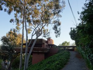
George Sturges House

The Sturges Residence was, like Wright later said, ‘one of the simplest things we have done and one of the best’ regarding the Usonian House idea. The story of the George Sturges Residence began in 1938, when the engineer George Sturges and his wife Selma read the magazine ‘Architectural Forum’ whose January issue discussed Frank Lloyd Wright’s work. They were particularly interested in the low-cost houses, including the plan of the Jacobs Residence in Madison, Wisconsin. The Jacobs Residence is considered by most to be the first Usonian house. For the future home of Herbert and Katherine Jacobs Wright conceived a modest single-story structure measuring 140 m2 inside. The exterior appears in a combination of red brick, horizontal wooden boarding and glass doors citing the Prairie school that is usually marked by the integration with the landscape through horizontal lines, natural materials like brick or wood and flat or hipped roofs.

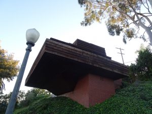
George and Selma Sturges decided to send Wright a letter of inquiry, and within a few months the designs for their future home were finished. Wright built the house in 1939 with the help of his apprentice John Lautner, who later became a renowned architect himself. The George Sturges Residence is the only example of a Usonian house in Los Angeles and is located in the Brentwood Heights neighbourhood of Brentwood. With a living space of about 110 m², the house is rather small, but well organized. Featuring a rectangular ground plan the living room with a dining area takes about one third of the living space. Two bedrooms, a kitchen, a bathroom and a small storage room  take the two other thirds. A cantilevered terrace extends the space broadly, since the terrace circuits almost the whole sphere. The balcony emphasizes the dramatically situated house, since it seems to be soaring over the hillside. In combination with the panoramic deck on top of the house the long horizontal lines of the terrace give the building the look of a ship or an aircraft in motion which symbolizes the then-fascination with speed and machines.

Wright chose concrete, steel, brick and redwood as materials. The wooden siding and the wooden trellis hanging over the terrace are remnants of Wright’s Prairie style period of the early 20th century, noticeable also in the Jacobs Residence. The Sturges house’s interior is dominated by redwood walls, including the ceiling leading to nautical associations, too.

Apart from creating an affordable and fitting house for the middle-class, it was Wright’s aim to establish the features of industrialization on the construction site. He believed that the use of machines should transform architecture. He recommended the full use of the new technologies, but at the same moment he rejected the idea of machinistic aesthetics renouncing pure concrete surfaces or steel frames. Instead, he concentrated on the native materials like wood or brick with warm tints emanating homely feelings.

Elena Schmidt


All pictures are taken by the author.


Sources:

Twombly, Robert C.: Frank Lloyd Wright. His Life and his Architecture, New York 1971.

Zevi, Bruno: Frank Lloyd Wright, Zürich 1981.

http://fortune.com/2016/02/04/frank-lloyd-wright-sturges-house/

https://la-confidential-magazine.com/frank-lloyd-wrights-sturges-house-goes-up-for-auction

http://www.lasavvytours.com/georgesturgeshouse.htm

https://lamodern.com/frank-lloyd-wright-sturges-residence/frank-lloyd-wright-and-the-making-of-the-george-d-sturges-residence/


John Lautner, Garcia House, 1962, Mulholland Drive, Los Angeles

Garcia House

“Standing on a site, I seek its particular and unique expression with all the senses … until the natural setting, the character of the owners, and the design harmoniously become a single idea.” – John Lautner

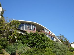
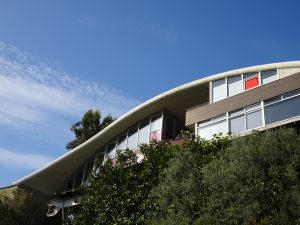
It must have been a similar situation when John Lautner got the commission to build the Garcia House. A scenic road like the Mulholland Drive in Los Angeles offers barely spacious and ground-level lots. For the Garcia House Lautner had to cope with a site that was probably not much more than an area expiring into a canyon – hence, not very bearing. But Lautner had already created some outstanding and gravity-defying residences such as the Chemosphere House. Since a real construction site was not given he again decided to build a stilt house. In this case, he created an eye-shaped building sitting on V-shaped beams 18 meters above the ground.

The residence was originally designed in 1962 for composer and musician Russell Garcia and his wife Gina. In 2002, after decades of unconscious and inappropriate modifications by several owners, the new proprietors Bill Damaschke and John McIllwee invested a considerable sum on an extensive renovation supervised by Marmol Radziner, a design and interior firm specialized on mid-century houses. They succeeded in both preserving the unique character of the house and updating it technically.

The Garcia House stands out due to its special form. The parabolic roof over solitary placed colored stained glass windows led to the colloquial name ‚Rainbow House‘. It fits perfectly into the neighbourhood since the Mulholland Drive features numerous exceptional residences.

Garcia House

Lautner had the intention to create a space in which it is necessary and common to alternate between indoors and outdoors. Below the arch the sphere splits into two parts that are interconnected by a sweeping outdoor spiral staircase in the middle which leads from the street into the living area downstairs. Glass walls shut both sides of the house, whereby a view through the house onto the street and over Los Angeles is commanded. Obviously a house like this widely open to the outdoors can only exist in a clement climate like that of Southern California.

The architect believed that a building should arouse a transcendental understanding of ambience. For Lautner, it had to enter a dialogue with the site, especially with the nature. The ‚Rainbow house‘ is a unique work and can easily be identified from far away by the unmistakable lines of its arched roof. The house sits on spider leg stilts, being uplifted 18 meters above the canyon beyond. Lautner advanced the idea to play with the dialectic of fragility and technology in one building. The stilts need to be stable enough to carry the weight of the house. Since those beams are reduced to a minimum diameter they need to be high tech and of the best material. Being uplifted the house offers spectacular views. Lautner plays with the eye motive in two different ways. On the one hand the eye shape is in full view from the other side of the hill, on the other hand the resident of the Garcia House can see everything as well, being somehow invisible at the same time due to his position above the ground.

Despite the impressiveness of the setup it is a modest-sized home being characterized by a great practicality of everyday living with a glimmer of luxury, regarding the spectacular view and the recently built swimming pool, inspired by Lautner’s original, yet unbuilt, design.

The eye shape of the house echoes in the swimming pool. Hereby the architect created a formal unity between the house and the pool, even though some decades lay in between the two projects.

Elena Schmidt


All pictures are taken by the author.

Sources:

Olsberg, Nicholas: Between Earth and Heaven. The Architecture of John Lautner, New York 2008.

http://www.angelenoliving.com/blog/garcia-residence-by-john-lautner-in-hollywood-hills

http://www.arcspace.com/exhibitions/unsorted/between-earth-and-heaven/

http://marmol-radziner.com.s213106.gridserver.com/wp-content/uploads/2016/07/belle-aug-sept-2009.pdf

https://www.mimoa.eu/projects/United%20States/Los%20Angeles/Garcia%20House/?abvar4&utm_expid=3171585-1.iHYMNB23QCiOMIk1Kk8dAQ.4


John Lautner, Segel House, 1979, 22426 Pacific Coast Highway, Malibu


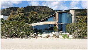
Segel House, View from the Beach, CC by Wapster, via Wikimedia Commons

Interior

John Lautner’s main interest has always been the interaction between nature and technology. Since his childhood where he lived in a fully equipped log house that he planned and constructed with his family in Michigan, the architect was directly confronted with his rural surroundings. In his architecture, he adapts the building to the site he is working on, by combining the material and form of the house with its environment, hence making the architecture fit in to its surroundings.

Lautner always tried to directly bring nature into his architecture. He achieved this through glass windows and doors creating a fluent transition between the interior and exterior of the house. Although he used a lot of concrete for his architecture, he also incorporated natural materials, such as stone and wood. These were often left unfinished, with the raw stone and wood serving as parts of the shell or the floor of the house, so that these natural features were visible in the interior.

Lautner used all these techniques in his design of the Segel House. The shell roof of the house protects it from the rough and rocky environment. At the same time Lautner mirrors this environment through integrating natural stone in the building. Like with his other works, the architect plans the building so that it adapts to the surrounding. The Segel house is set in scene by the beach and sea in front of it and the hills as a backdrop. The form of the house which can be compared to a shell or a cave with its opening directed at the sea, is a reference to its natural scenery.

The architect plays with the connection of exterior and interior by creating rooms that are partly inside and partly outside in the nature. Through huge glass façades one gets a good view of the surroundings from the inside. The Segel House features a patio roofed by the concrete, allowing one to be outdoors while still being sheltered. He used wood as casing for a lot of the walls in the house. Wood is also used as part of the roof, allowing beams of light to shade the floor where slits were cut into it. This creates a feeling of being outdoors.

Most of Lautners houses are constructed to offer their inhabitants shelter and an escape from the environment – in the Segel Houses case the harsh sea climate and a nearby noisy street. The inhabitants should feel protected and the house should provide the space to match their needs. The patio could be used as a car park or a party room for the dance therapist Joan Segel who commissioned the house.

In the works of this time, John Lautner was more concerned with the contrarieties “of simultaneous safety and expansiveness, groundedness and flight,” as Strickland described it. The house should offer enough shelter, but still leave room for the inhabitants to unfold themselves in their private spheres. The architect himself described the Segel House as a “breakthrough” in this regard.

Sources:

Campbell-Lange, Barbara-Ann: John Lautner: 1911 – 1994; der aufgelöste Raum, Köln 2005.

Olsberg, Nicholas (ed.): Between Earth and Heaven: The Architecture of John Lautner, New York [i.a.] 2008.

Film: Grigor, Murray: Infinite Space, The Architect John Lautner, USA 2008.

Picture: CC by Wapster, via Wikimedia Commons

Exterior

From the street level a visitor to the house is first confronted with the view of a brick wall, partially obstructing the entrance of the building. Above the wall one can discern the roof and large upper story window of the house rising up towards the sky. The form of the roof, as seen from the street, is triangular and seems as if someone placed a triangle on top of the building.

Upon entering the courtyard, the building opens up towards the visitor, allowing him or her to fully see the form of the roof which curves toward the ground. From the outside the Segel House seems smaller than it is in fact – the long stretch of the house from street to beach isn’t really imaginable from outside.

The most unobstructed view of the Segel House is that from the beach onto which the back of the house opens. Here the building looks almost as if the individual floors weren’t constructed together, but rather separate geometric forms placed on top of each other and are connected invisibly.

The form of the roof has a wavelike look which connects it seamlessly with the adjacent ocean. Lautners chosen materials do not attempt to mimic the natural surroundings the large glass slates reflect the beach and rocks onto the house. In this building as in other buildings, Lautner exhibits interest in the topic of natural shelter. The roof on the Segel House is visually inspired by architects such as Felix Candela (Mexico) or Jean-François Zevaco (Morocco). Both architects used curved concrete forms to construct their intricate roofs. The use of concrete is a logical choice, since the Segel house is exposed to the elements constantly.

Lautner’s affinity to a connection of building and nature works perfectly in the Segel house. It fits into the surrounding landscape, connecting the inhabitants to the land they live on.

Sources:

Campbell-Lange, Barbara-Ann: John Lautner: 1911 – 1994; der aufgelöste Raum, Köln 2005

Cohen, Jean-Louis: Perspective. John Lautner’s Luxuriant Tectonics, in: Olsberg, Nicholas: Between Earth and Heaven. The Architecture of John Lautner, New York 2008

Viola Menzendorff and Katharina Steins

Gehry, Walt Disney Concert Hall

Frank O. Gehry, Walt Disney Concert Hall, 2003

The Walt Disney Concert Hall (1987-2003) in Los Angeles designed by the architect Frank O. Gehry is worth seeing. With this new building Los Angeles became more attractive. In this instance we can relate to the „Bilbao-Effect“. It means that with the assistance of architectural and spectacular buildings, cities or districts will become a bigger revaluation. Like the Guggenheim Museum in Bilbao it is considered as a masterpiece.

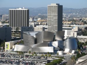
Walt Disney Concert Hall and surrounding area looking from Los Angeles City Hall.
Date: 16 December 2006
Source: Transferred from en.wikipedia to Commons.
Author: Photographed and uploaded by Geographer at en.wikipedia

The concert hall is conceived as part of the cultural hub in the center of downtown Los Angeles. It has its origins in May 1987, when Lillian Disney, Walt Disney`s eighty-seven-year-old widow, offered a gift of 50 million dollars for the city to build a new hall for the Los Angeles Philharmonic. The goal was to create a world-class concert hall with great acoustics. Today the Disney Hall is known as one of the best concert halls worldwide. Hans Scharoun’s Berlin Philharmonic Hall, one of the most renowned halls from the mid-century, played a big influence on Gehry`s design. Both buildings do not only look fascinating, but also function well.

Standing in front of the building you will recognize a morphology typical of Gehry. It looks like a ship with its giant, rounding shapes which remind us of sails. The shapes follow with their wave-like curves a musical and nautical pattern. Movement always plays an important role in Gehry’s buildings. Originally the exterior was to be covered by pieces of stone, but the ongoing pressure of costs as well as the success of Bilbao`s titanium exterior led Gehry to switch to stainless steel. The concert hall was built with the help of computer software – developed for the French aerospace industry – named CATIA. It had been invented to create construction documents for airplanes whose shapes had complex curves not unlike the ones Gehry was designing.

Walt Disney Concert Hall
Date: 14 April 2016
Source: https://unsplash.com/photos/3Ijt7UkSBYE/
Author: Ashim D’Silva

Disney Hall is expected to help revitalize the city`s downtown district and lift its cultural profile. This new concert hall helps to increase the cultural self-coincidence of Los Angeles. Walt Disney Concert Hall is widely regarded to be the most astonishing masterpiece of public architecture ever built in Los Angeles.
Frank Gehry is known for his deconstructive architecture.  He was the first architect to use cheap materials as plywood, corrugated metal and chain-link. His declared goal is to build something beautiful out of junk. He propagates this approach as ‘no-rules-architecture’ respectively ‘cheapscape architecture”.

His buildings always look as if they were unfinished or not from this world. Gehry said: “I guess I was interested in the unfinished – or the quality you find in paintings by Jackson Pollock, for instance, or de Kooning, or Cezanne. That look like the paint was just applied. The very finished, polished, every-detail-perfect kind of architecture seemed to me not to have that quality.” His architecture style is affiliated with the Deconstuctivism. Most of his buildings display an influence of the visual arts. But before Gehry starts to design the final three-dimensional construction with CATIA, he first draw all his ideas in a sketching book. One of these several sketches become then the essentially design, with which he begins to create models out of wooden bricks, cardboard, an other stuff.

Sources:

Ragheb, J. Fiona (ed.): Frank Gehry. Architect, New York 2001.
Goldberger, Paul: Building Art. The Life and Work of Frank Gehry, New York 2015.
Webb, Michael: Symphony. Frank Gehry`s Walt Disney Concert Hall, New York 2009.
Muschamp, Herbert: Architecture View; Gehry`s Disney Hall: A Matterhorn for Music, in: The New York Times 1992.
Taschen, Laszlo (ed.): Moderne Architektur A-L, Köln 2010.

Author: Yannick Bemtgen

Restaurant Swingers, Santa Monica (Googie-Architecture)

Restaurant Swingers, Santa Monica, 1993

Whenever you visit Los Angeles, you have to check out a Diner restaurant. These American Coffee-Snack-shacks are the hub of life by day and night. They personify the American way of life.
Quentin Tarantino, a well-known director, shot many sequences in such locations as for him the whole social life revolves around Restaurants.

Johnie’s Coffee Shop Restaurant on Miracle Mile in Los Angeles, famous for being used as a location for many movies.
Date: 21 January 2007
Source: http://www.flickr.com/photos/kungpaochicken/365232522/
Author: Michael Mooney

Primarily these Diners were developed from discarded railroad dining cars which were transformed into a takeaway or rather into a gas station. The Diner restaurants are an essential element of the
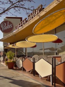
city of LA, like the freeways. L.A. is known for its culture of permanent movement. Therefore the Megalopolis is also nicknamed Autopolis. To catch motorists‘ attention, gas stations and coffee shops turned to eye-catching shapes and neon signs – an aesthetic style we now know as Googie, typical of Californian post-war culture. In this era, the coffee shop evolved into a popular building type in Los Angeles. John Lautner is considered as the founder of a new architectural language adopted to that development. In 1949, Lautner designed an iconic coffee shop which he named Googie in honour of the owner’s wife’s nickname. The mid-century architectural movement was heavily influenced by the nation’s Space Age infatuation with industrial progress, and so sweeping rooflines and hard, geometric shapes worked their way into buildings alongside neon signs with playful starbursts.

Patio tables at the Bob’s Big Boy restaurant in Burbank, California.
Date: 14 February 2013, 15:15:44
Source: Wikimedia Commons
Author: Junkyardsparkle

Today most of these Googie buildings don`t exist anymore, but a few you can still visit, for example right at your arrival at LA, stumbling into the Theme Building at LAX. However there exist a lot of retro-style Diners in Los Angeles where you can run across the Googie style.

Corky’s restaurant on Van Nuys Boulevard in Sherman Oaks, Los Angeles, California, viewed from the southeast. It was designed by Armet & Davis and built in 1958.
Date: 2 March 2014, 10:34:17
Source: Wikimedia Commons
Author: Junkyardsparkle

On our trip, we are going to have dinner at the Swingers Diners in Santa Monica. It is a Googie-style Restaurant which opened in 1993. On the official website of Santa Monica this restaurant is described as a retro-cool coffee shop with colourful cow murals, catering to a hip crowd with classic menu of American diner fare, open until 2am. For more information about the Swingers you can attend their website.

Sources:

Jahnke, Wolf: Los Angeles. Mit Hollywood durch LA, Marburg 2011.
Juliano, Michael: A guide to Googie architecture in Los Angeles, URL: https://www.timeout.com/los-angeles/things-to-do/googie-los-angeles (08.03.2017).
Gössel, Peter (ed.): Modernism rediscovered, Hong Kong 2009.
Vaughan, James: The world of Googie, URL: http://www.ultraswank.net/design/the-world-of-googie/ (08.03.2017).
Juliano, Michael: A guide to Googie architecture in Los Angeles, URL: https://www.timeout.com/los-angeles/things-to-do/googie-los-angeles (08.03.2017).
http://www.santamonica.com/restaurant/swingers-diner/.

Author: Yannick Bemtgen

William Krisel, Ocean Ave. Towers, 1972, 201 Ocean Ave, Santa Monica

My research on the Ocean Towers turned out to be an unexpectedly exciting experience. As usual I began with a research in our university library – unfortunately with no satisfying result. The next step was a inquiry in established magazine search engines – again with no satisfying result. So I was forced to continue my research in a common search engine – Surprisingly, I was confronted with countless results which redirected me to real estate agency pages. I did not expect to come across the architecture of a famous architect in a highly popular region like Santa Monica, still to take place in an advertising/commercial context. This kind of represantation leads to questions: Why is this building is mainly featured in commercial-oriented settings or does the architecture possess a lack of quality to be represented autonomously in the literature? Perhaps the architect himself did not wanted to give priority to the building.

Ocean Ave. Towers, view from the 1st Ct, photograph by author

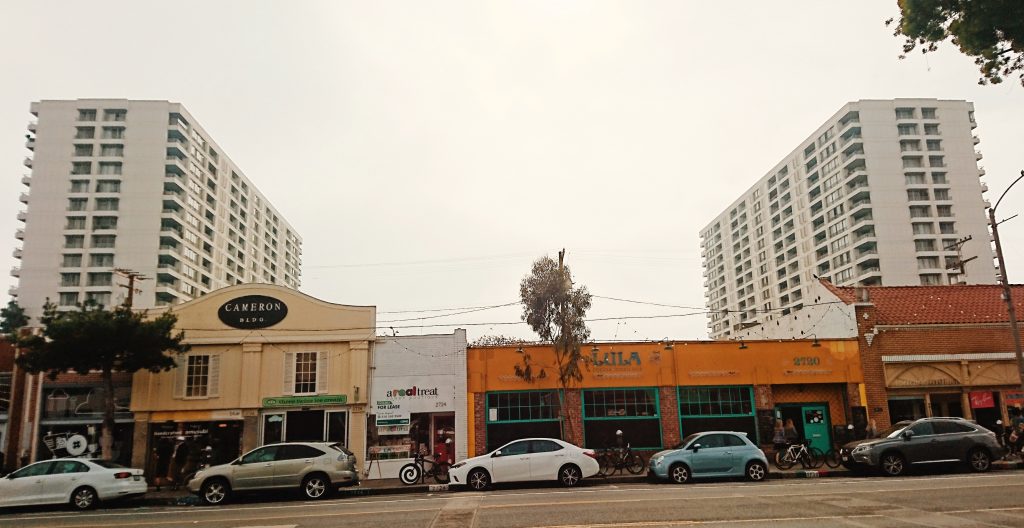
The literature on Krisel does not represent or analyse the Ocean Ave. Towers architecture as an independent work. It is mostly mentioned as a comparison to other buildings without any deeper information concerning the Towers themselves.[1] The Ocean Avenue Towers were designed as luxurious residential apartment buildings under the partnership of Krisel/Shapiro & Associates in 1971.[2] The towers consist of two identical steeples which were built symmetrically to each other and an attached building, which serves as a connection between the two Towers. The high-rise condominium is quite untypical for the horizontal orientated area of Los Angeles. Marketed on real estate pages as the tallest residential building in Santa Monica[3] with a total height of 160 ft, the Ocean Ave. Towers contain 17 floors.[4] Located on an elevation right in front of the beach of Santa Monica, the Towers benefit from a gorgeous view which is used as an advertising preference.[5]

Author: Begüm Inal


[1]Creighton, Heidi/Menrad, Chris, William Krisel’s Palm Springs. The Language of Modernism, Layton 2016, p. 135

[2]Creighton/Chris 2016, p. 32

[3]https://therealdeal.com/la/2016/03/01/apartment-portfolio-hits-market-at-santa-monicas-201-ocean/ (7.3.2017)

[4]http://www.highrises.com/los-angeles/ocean-towers/ (7.3.2017)

[5]William Krisel, Architect. R.: Jake Gorst. USA 2010. TC: 01:09:43 – 01:12:10

Richard Neutra, VDL Research House I / II, 1932/1966, 2300 Silver Lake Blvd, Los Angeles

Located in proximity of the popular Silver Lake, the house benefits from a tranquil and nature-bound location inside the city. [1]
The VDL house is named after Richard Neutra’s Dutch benefactor, Dr. Van der Leeuw. At the same time, the building is an embodiment of the architectural perception of his architect. The architectural concept combines living with working space in one building serving as the residence and office of Austrian-born architect.

Richard and Dion Neutra VDL Research House II, 2300 Silver Lake Blvd. Silver Lake

VDL House, via Wikimedia Commons

The VDL Research House (I) was the first architecture which Neutra conceived after his return from Europe in 1931 [2]. European influences are obvious: Neutra, who had worked for the Austrian Werkbund in Vienna the same year, was strongly inspired by the Dutch industrial architecture of Brinkman & Van der Flugt. The two architects of the Rotterdam Van Nelle Fabriek had been employed by the Van der Leeuw-family [3]. Their avant-gardist concept of space permits daylight to flood into the factory building. A continuous filmstrip-like window penetrates the facade and allows the sunlight to brightly illuminate the inner space of the building.

Rotterdam van nelle fabriek

Van Nelle Fabric, via Wikimedia Commons

This parallelism is often interpreted as an honouring gesture of Neutra to C.H. Van der Leeuw who advanced a considerable sum to the architect so that he could build his house. [4] According to certain sources, Van der Leeuw was horrified after visiting Neutra’s former residence in Echo Park. So he pulled out his check-book and wrote down a sum of $3000 as an inducement to build a new, more suitable home. [5] Neutra completed the remaining sum to cover the total costs of $8000. [6] The VDL Studio and Residences (I and II) comprise in fact of three phases of construction: The first original constructing phase of 1932, a second phase of 1939 – 1944 in which a smaller construction the garden or guest house, and the rooftop ’solarium‘ were added. [7] The third (re)construction phase became necessary because of a devastating fire in 1963 which broke out in absence of Richard Neutra. The house burnt down to its foundation. Luckily the construction and soil of the ground floor was made of concrete beams with suspended floor structures which prevented the fire from burning through right into the cellar where the essential archive of Neutra’s work was located. [8]

On a lot of 18 x 21 m, the VDL Research House occupies a space of 214m² spreading over three floors. The H-shaped building consists of two parallel main buildings, a private building and a guest house. As an attachment, a narrow connecting building is placed between them which include a rarely used room and two children bedrooms. The free space between the two main buildings was used as an enclosed patio garden. The ground floor of the private tract was mostly used as an office including rooms for the secretary and employers. The first floor was where the private rooms were located. [9] The bright, former known as ‘solarium’ completes the building with a third floor. Over time it was converted into an ordinary bright room. [10]

A special feature of the building is the use of new materials, for example aluminum, rock wool, solid insulation boards, [11] cork floors, e.g.. They were sponsored and produced according to Neutra’s demands. [12] He also imitated materials: Neutra tried, for example, to evoke the effects of steel construction which was too expensive to afford. He used painted wooden frames instead of steel window frames. The wooden frames were joined continuously like a filmstrip and were fitted with steel windows to achieve the desired visual effect of the modern European steel constructions. Other remarkable features of the house were sliding steel doors saving indoor space. The functional modern European aesthetics was quite uncommon by that time in the U.S. For Neutra, it included theoretical aspects as well. He investigated the aesthetic or sensual effect of the combination and apparition of materials in building. He also meditated or the benefits of architecture for the human-being by involving nature in the planning and realization of architectural landscapes. [13]

Barbara Lamprecht describes the sensual effects of the VDL House as follows: The characteristics and the combination of the used materials, rooms painted in dark and silver tones and the low sill height affect the sensual perception with lustrous moments which evoke a unique so-called ‚honeymoon experience‘. [14]

VDL studio staircase

VDL House, via Wikimedia Commons

Neutra used illusionist elements like mirrors or glass panels to enlarge the space and play with the theoretical contrast pair of inside and outside. [15] He focused on creating an innovative and experimental kind of a residence combined with an office. The architecture should be flexible to adapt to varying circumstances like the changing constellations of the inhabiting families. [16] The interior of the building with its built-in furniture was conceived to be offer a maximum of functionality and to be easily maintained – perhaps another tribute to the Werkbund colonies. A residence which offers his inhabitants such flexibility and function-oriented comfort seems obviously familiar to the 1920’s/1930’s Werkbund and Neues Wohnen movements. Acting in a time with economic and social grievances, politicians and architects began to build small but functional and affordable residences in colonies for the middle and lower class to stop their exclusion from the social and economic system. [17] Neutras articles were also often featured in the journals “Die Form” and “Das Neue Frankfurt”. They delivered information on those modernist movements including topics of architecture and design. Neutra surely applied the modernist aesthetics not only because of his low budget, but also as a proponent of the idea of functionality and flexibility in architecturally enclosed space. [18]

Author: Begüm Inal

[1]Lamprecht, Barbara, Richard Neutra. 1892-1970. Gestaltung für ein besseres Leben, Köln 2016, p. 29

[2]Hines, Thomas S., Architecture of the Sun. Los Angeles Modernism 1900-1970, New York 2010, p. 367

[3]Hines 2010, p. 367

[4]Lamprecht 2016, p. 29

[5]Hines 2010, p. 367

[6]Lamprecht 2016, p. 29

[7]http://www.neutrahistory.org/home/what-is-this-building (10.3.2017)

[8]Lamprecht 2016, p. 30f

[9] Lamprecht 2016, p. 29f

[10]http://www.neutra-vdl.org/site/about-04.asp?31120177853 (7.3.2017)

[11]Lamprecht 2016, p. 31

[12]Hines 2010, p. 368

[13]Lamprecht 2016, p. 30f

[14]Lamprecht 2016, p. 31

[15]Lamprecht 2016, p.31

[16]Hines 2010, p. 370

[17]Landmann, Ludwig. Zum Geleit, in: Das Neue Frankfurt 1 (1926), p. 1f

[18]Hines 2010, p. 370