Schlagwort-Archive: Frank O. Gehry

Frank O. Gehry, Residence, 1978, 1002 22nd St, Santa Monica, Los Angeles


As a private residence the Gehry residence in Santa Monica is not open to the public. Hence it was not accessible to our group during our stay in Los Angeles.

It is situated in a nowadays wealthy residential area in Santa Monica and surrounded by mostly smaller single-family houses. The house is assimilated into the neighborhood while standing out simultaneously. One can sense why it must have been a source of turmoil at the time it was built. It stood out because the architect covered parts of the original house dating from the 1920s with pre-fabricated materials, such as corrugated metal and chain-link fences. Today, however, it appears rather integrated into its surrounding.

The architects’ desire was to construct a home that was expressive and conspicuous whilst still being a private and cozy hideaway for his family and himself. Therefore, the house seems private and open to the public at the same time.
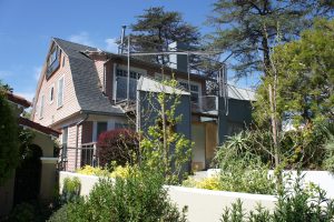
Gehry Residence, Main entrance from the street, CC by Viola Menzendorff

He made sure passersby could not look inside the house by inserting windows higher than eyelevel. A high wooden fence, which is slotted by square cutouts, reveals insight to the garden, while protecting the house and its inhabitants from curious looks.

Gehry wanted to influence what the viewers see of his architecture and how they see it. He wanted the outside of the house to be eye-catching and achieved this by using mostly ‘basic’ materials, such as corrugated steel, glass, plywood and a chain-link fence for its casing. The striking façade construction is additionally supported by the placement of the site at the very peak of an intersection. We experienced this effect of a salient outside while driving down the street by car. Already from far away the house is clearly noticeable.

We parked the cars at the side of the road and walk across the street to the house to find out what we could see up close.
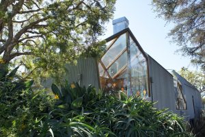
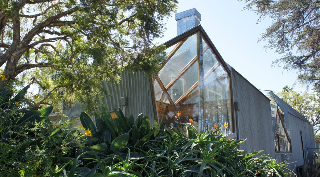
Gehry Residence, View of the corner to the intersection with plants from the front lawn, CC by Viola Menzendorff

The walls coated with corrugated steel and the high windows make the house look uninviting and more like a fort to offer its inhabitants shelter from the people on the street.
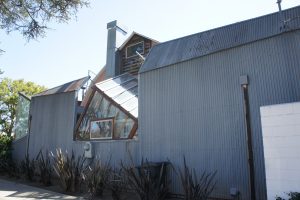
Gehry Residence, View from the side of the house with corrugated steel casing, CC by Viola Menzendorff

The chain-link seems to keep the people from the inside away from the outside as well. The main entrance is hiding behind high growing plants in the front lawn. But those plants have not always been there. They grew higher over time but could not have shielded the house from views when Gehry bought it.
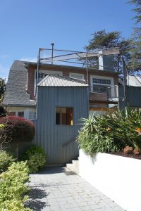
Gehry Residence, View of the main entrance hidden behind plants, CC by Viola Menzendorff

Gehry definitely reached his goal to provide shelter for the inhabitants. However, the fort-like exterior not only keeps nosey onlookers away, but also makes the viewer curious of the inside of the house. Is it really as comfortable and cozy as the 1920s house peeking out underneath the covers suggests?

We could not get a glimpse of the interior without jumping or climbing the walls, perfectly illustrating the control over what Gehry wants the viewer to see that he has achieved with this construction. We did not find any reliable information about the current ownership and use of the house. It is said that the Gehry family moved out of the house and sold it to someone else but we do not know if that is only a rumor. We could – from our location on the sidewalk – not make out if the house was being lived in at the moment, and if so by whom. Only a package next to the front door, visible from the street suggested someone was inhabiting the place. Members of our group tried to decipher the label on the package and we speculated if it was addressed to Mrs. Gehry.


Viola Menzendorff

Frank O. Gehry, Residence, 1978, 1002 22nd St, Santa Monica, Los Angeles

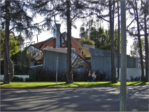
Gehry Residence,
View from the street,
CC by IK’s World Trip, via Wikimedia Commons

Frank Gehry and his wife bought their private Santa Monica residence dating from the 1920s in 1977. It was a typical middleclass home in Los Angeles at the time it was build and did not differ much from the houses surrounding it. Gehry transformed the house into their home in a way that it was perceived as a strong statement at the time of its renovation.

According to Gehry, his wife Berta found and bought the house, already knowing that her husband would transform it into something new. But Gehry decided to keep the old house as it was and to add new elements to the exterior only, to clad it in a ‘Gehry-typical‘ manner, using characteristically ‘basic‘ materials like corrugated steel, glass, plywood and a chain-link fence. His strategy to destruct and break with the old forms of construction while still keeping it alive and visible by integrating it into his design is truly innovative.

Critics generally assume that he was deliberately trying to shock and provoke not only the critics, but the surrounding neighborhood with this ‘raw’ and ‘unfinished’ exterior – which he successfully managed. There were only few critics who appraised the building. Meanwhile most others, including the neighbors, were aggravated by the exterior Gehry aimed for, that just wouldn’t fit into the rather traditional surroundings, consisting of mostly one family houses with tidy front lawns inhabited by  middleclass residents and which appears to be a calm and idyllic neighborhood.

The seemingly chaotic look of the buildings outside hides a rather cozy house, offering shelter and a private space, not in a cold avant-garde like style, but in a comfortable living atmosphere. This mirrors Gehry’s strategy of appearing to be a regular middleclass man in a regular middleclass house, while being an eccentric architect with a nonstandard home who disrupts the peace of his neighborhood, all in one.

Nevertheless, one can see some parts of the house’s interior from the street. Through the windows, people on the street can get a glimpse of the garden as well as the kitchen. The same goes for the inside: Here one cannot primarily see the surroundings of the house and gardens on street level, but rather the sky through slits in the walls or the lights of cars going by, reflecting in the glass roof over the dining room table. But this, of course, attracts views of passersby.

The architect himself states that the viewers only see what he wants them to see in his architecture. While something might be visible from one angle or position, it cannot be seen from another. Gehry’s private house is an example of this design strategy. Depending on where one is standing in the house, different areas of the surroundings are visible. The connection between inside and outside is very fluent, creating the illusion of standing outside while actually being inside the house. Gehry composes a view for the people outside without revealing too much of the private interiors.

He used his private house as a deliberate provocation and an experiment on how critics and other recipients would perceive it. The house received plenty of attention and constitutes the breakthrough of his career as an architect, and hence achieves what Gehry wanted it to.

From 1991-92 a second renovation took place during which a lot of the earlier ‘unfinished’ parts got transformed into their ‘finished’ versions, without much public attention.

Beatriz Colomina explains that the house, like its owner, is in constant flux and development, in a way that the both of them build and form each other to what they are now. Furthermore, she highlights how Gehry uses architecture and views to change and create the perception of the recipients.


Sources:

  • Colomina, Beatriz: “The House That Built Gehry”, in: Frank O. Gehry, Mildred Friedman and Beatriz Colomina [i.a.]: Frank Gehry, Architect, New York 2001, p.300-320.
  • Movie: Pollack, Sydney: Sketches of Frank Gehry, 2005.


Viola Menzendorff

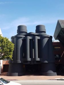
Frank O. Gehry , Binoculars Building, 2001, 340 Main Street, Venice, Los Angeles

Binoculars Building, photo by the author

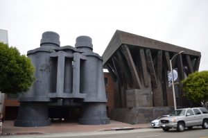
On our Frank Gehry day, right after going to the private Gehry Residence, we luckily got to see the iconic Binoculars Building with two adjacent buildings, that are used as office space on each side. The building is located in the Venice neighbourhood of Los Angeles. It is a building that you cannot overlook when you are driving by it. On that day, we were the only tourists to take a closer look at the building while other people casually were walking by. After we had parked on the side of the road across the street we took the chance to observe the exterior of this building to take pictures. From the other side of the street it was a lot easier to take picturesshoot of the whole complex.

Binoculars Building, photo by the author

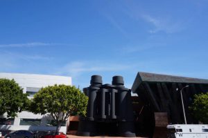
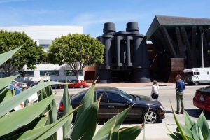
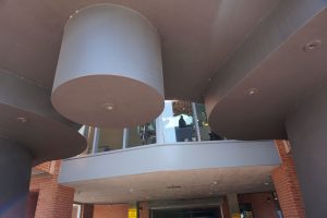
The centerpiece is the entrance with a pair of matte black binoculars which is symmetrical compared to the other parts of this building since we are not used to see something that we use daily in this size. In my opinion it is not easy to guess that there is a parking lot behind the entrance from afar. It is a creative entrance that looks surreal in person as well as in pictures. The shape and size of this building, makes it an eyecatcher that you can instantly recognize.

Binoculars Building, photo by the author

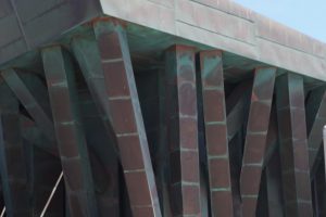
On the right side of the binoculars is a brown and green building which is asymetrical. It doesn’t have any similarities to the other buildings. To me it looks like something it is randomly built together, which is not really done yet. Most of the beams look disarranged which make these look like branches of a tree but at the same time like antique columns which give support or serve decorative purposes. The building that we are seeing in these pictures, make it seem like it is reddish brown and green. Since the paint of this building looks like it is not evenly distributed, it gives the building something natural. As I got closer to the right part of the building, I noticed that the reason for it is assumedly corten steel or rust, which spread and gave it a green colour.

Binoculars Building, photo by the author

Whereas on the left side I would confirm that the white building does look like a ship or even yacht. It is slightly curved and the first storey only has long cabin like reflecting window panes. The other stories have balconies that are also similar to those of ships and yachts.

Binoculars Building, photo by the author

Behind the binoculars we can see a brick wall which is not as noticeable on the pictures, which I found in the internet before our trip. This is probably an office, music room or lounge. It is possible to look through the windows as you are nearing the gigantic Binoculars. Unfortunately we didn’t get the chance to enter the building.

Binoculars Building, photo by the author

Lien Liane Nguyen

Frank O. Gehry , Binoculars Building, 2001, 340 Main Street, Venice, Los Angeles

Located in the Venice neighboorhood of Los Angeles, is the Binoculars Building which is a commercial office building.

Binoculars Building
By YaGeek (Own work) [CC BY-SA 3.0 (http://creativecommons.org/licenses/by-sa/3.0)], via Wikimedia Commons
https://upload.wikimedia.org/wikipedia/commons/7/70/Binoculars_Building.jpg
It was designed by Frank O. Gehry a Canadian-born American architect who is residing in Los Angeles, in collaboration with his longtime friends Claes Oldenburg and his wife Coosje van Bruggen. The couple who Gehry collaborated with are famous for their large-scale projects in which they turn everyday objects in huge sculptures. They first made a small model for an academic project in Italy in the form of binoculars but it was built in Gehry’s office instead.

This building was constructed in 1991 until 2001 for the advertising agency Chiat/Day as one of its headquarters and was originally called the Chiat/Day Building.

Materials such as steel, concrete and cement plaster and gypsum plaster in the inside were used for this building.

The black standing pair of binoculars are only one part of a three-part complex of buildings. Gehry designed two different buildings for this project, one is boat-like and the other one is tree-like. We can see that the building on the left side does look like a piece of a white colored yacht with long cabin windows. The building on the right gives the appearance of trees because of the brown color and branches like roof pillars.

Since you can’t gain inside access to the building without having connections, you can still see how this kind of architecture is definitely an eye-catcher. The massive binoculars which are normally considered as an everyday object ties the complex together as a third structure. It turns into an unique and spectacular work space, which functions as pedestrian entrance and car gate as we can already see in videos which are posted online. You can drive through the center of the binoculars in order to get into an underground parking garage.

Today TBWA\Chiat\Day moved out of this building and the public relations group “Ketchum Inc.“ was renting a part of this building. Nowadays this place is more known for its current tenant, as one of many Google buildings.

Lien Liane Nguyen