Archiv der Kategorie: On the spot

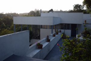
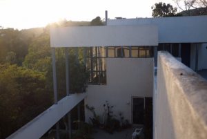
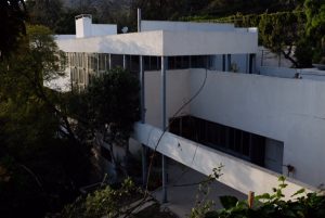
Mark Daniels, Villa Aurora, 1928, 520 Paseo Miramar, Pacific Palisades

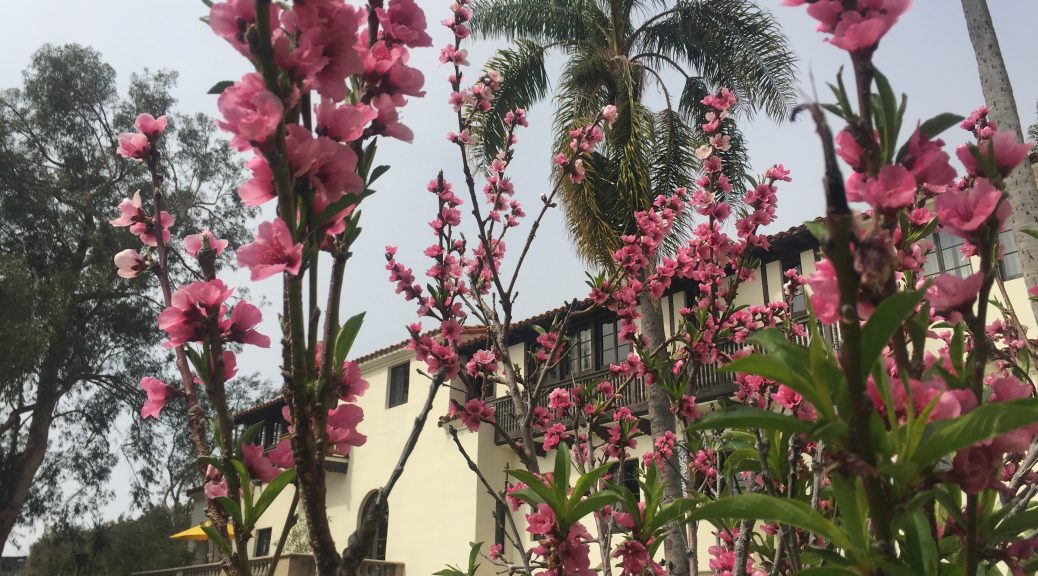
Visiting Villa Aurora was the ideal contrast to the vibrant modernist architectural landscape of Los Angeles. Located in the hills of the Pacific Palisades on the outskirts of Los Angeles, the house lays very private and secluded with scenic views of the Pacific Ocean. Since the mid 90s the residence serves as a retreat for artists making use of the isolated location in a creative working environment far away from the city. Villa Aurora awards artists working in film, visual arts, performance art, literature, and composition who pursue artistic projects during their stay. With the concept of an artist’s residence, the house that once used to be a central gathering place for German emigrants and their American friends maintains a venue of cultural encounters. Bertolt Brecht, Thomas and Heinrich Mann, Ludwig Marcuse, and Charlie Chaplin were among the many guests at social gatherings in the Feuchtwanger home. Today contemporary artists enliven this historical place and artworks of many forms are being created in the fruitful atmosphere of Villa Aurora.
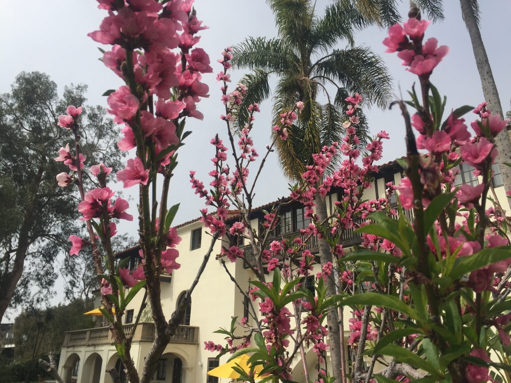
Villa Aurora, picture taken by the author

Referring to the architecture, the Spanish Colonial Revival Style Mansion completely differs from the modernist homes we have seen during our field trip. It is yet very representative for the different architectural styles arising in the early 20th century in Southern California. Beyond that a parallel can be drawn to the model of an isolated home that is only very restrictively accessible like the Sheats-Goldstein Residence or the Lovell Health House. The idea of the home as a micro empire can be found all over Los Angeles. Villa Aurora features a large garden in perfect harmony with the surrounding nature and wide open spaces from where the panoramic sea view can be enjoyed. The Spanish Colonial Style home is an architectural example of a private space that is included into the natural environment and offers the spacial qualities to serve as a place of retreat for its residents.

Josefine Rauch

John Lautner, Silvertop, 1957, 2138 Micheltorena St; Richard Neutra, Neutra Colony, 1948-1961, Silver Lake Blvd, Neutra Place, Earl St; Rudolf M. Schindler, Droste House, 1940, 2025 Kenilworth Ave, Los Angeles, CA

Upon our arrival at Silver Lake, right after we had parked our cars in front of Neutra’s Van Der Leeuw (VDL) house, we wandered across a lawned recreational area right by the reservoirs shore. To our surprise the water level appeared to be extremely low. We later learned from one of the residents that due to an effort by the municipality the lake was emptied. The home owners of Silver Lake neighbourhood had successfully fought the city on the resolution. The reservoir is now planned to be refilled by summertime in 2017. This is only possible thanks to the end of a seven-year long drought in California.

After observing many runners, picnickers, young families with toddlers roaming about the lake’s pathways we started out on our own adventure around their neighbourhood. Walking along Silver Lake Boulevard we turned unto Glendale Boulevard heading toward Neutra’s former office building. By the large sign up front, today, it appears to house the Neutra Institute Museum of Silver Lake.

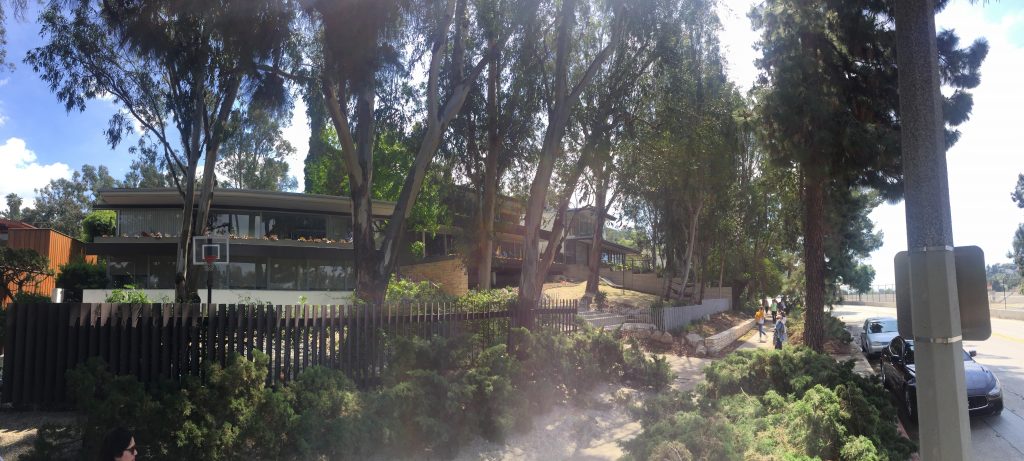
Neutra Institute, Museum of Silver Lake, photo by the author

From street level just one storey is visible but as we wondered down the driveway along side the building it revealed two levels on the back. In Neutra fashion it is a flat top roof house dominated by rectangular forms. Long, horizontal window strips as well as sun shields decorate the sides and the back. The building was poorly maintained.

As our group continued on Glendale Boulevard we then turned on to Earl Street. Walking downhill Neutra Place came up on our left side. The cul-de-sac revealed several homes designed between the years of 1948 and 1961. Returning to Earl Street we then continued to discover the second part of the Neutra Colony on Silver Lake Boulevard.

Overall, the homes seemed well taken care of, appeared to provide every owner with individual housing design and secluded living space. In conversation, most of us concluded the houses to be similar to each other in the overall design theme. Nonetheless every home featured a different structural set up. Placement of stairways, doors and window fronts helped differentiate.

Neutra Colony on Silver Lake Boulevard, photo by the author

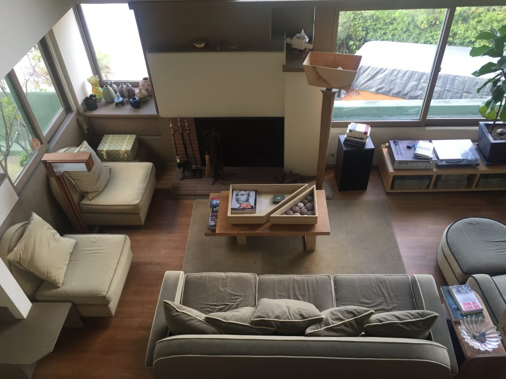
After a quick lunch break our group decided to meander through the West side of Silver Lake hoping to catch a closer glimpse of John Lautner’s Silvertop (1957) as well as Rudolf M. Schindler’s Droste House (1940). As we ascended Kenilworth Avenue the Droste House made an appearance as the road took a turn. Gazing at the architectural sight from street level suddenly the very friendly couple owning and living in the home opened the door and welcomed us in. Excited, we followed their invitation. As they guided us through their well cared for home our group marvelled at the many details Schindler added to the design: invisible storage space, air circulation strategy, window placements et al. All of us were very appreciative of the family’s openness to share about their experience of living in and owning a Schindler designed home.

Droste House living room, photo by the author

Upon our drive leaving the neighbourhood we managed to view Lautner’s Silvertop from the distance. The shiny, curved structure clearly stood out among all the homes on Silver Lake’s West Side.

Strolling through Silver Lake left me with a furthered understanding of the neighbourhoods quality. Neutra’s, Schindler’s, Lautner’s, among many other renown architects’, homes are situated within Los Angeles’ urban context and their individual design is powerful because of it. Having previous to our visit only viewed photos and read about Silver Lake this experience led me to comprehend its and the architects‘ home architecture.

Talitha Breidenstein

Santa Monica

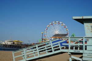
Santa Monica Beach, photo by the author

During our Field Trip we stayed in a Hostel in Santa Monica which was a good chance for us to explore this city by feet. As I informed myself before, this is a place where many active, laid-back and healthy people live.

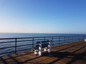
Santa Monica Beach, photo by the author

In the morning before our official appointments we had the chance to enjoy the beautiful sunrise at the beach. Luckily the beach was less than 5 minutes by feet away from the place we stayed at. Most of the people we saw were jogging at the beach sometimes also in bigger groups. For people who don’t like to walk, there were also bikes that you can rent for a reasonable fee.

Santa Monica Beach, photo by the author

The Santa Monica Pier was also not crowded in morning which was probably a good chance to take pictures. It is definitely a sight that you should visit even though the Pacific Park is not as big as a regular amusement park.

Santa Monica Pier, photo by the author

Although we only had the chance to take a look at this city in the morning and in the evening because of our busy schedule, we saw that this is a very popular destination for many different people. Furthermore the city is also a place for street artists and performers in general. In the evening there were street performers who caught the attention of the public.

Moreover it is also important to mention that the cost of living is a lot higher in Santa Monica than in Germany which would explain the high number of homeless people around the city.

Next there are also many famous buildings in Santa Monica that we got to see like the open-air shopping center Santa Monica Place and Gehry Residence by Frank O Gehry, the City of Santa Monica Parking Structure #6 by Behnische Architekten and Studio Jantzen, the Ocean Ave. Towers by William Krisel and many more.

Lien Liane Nguyen

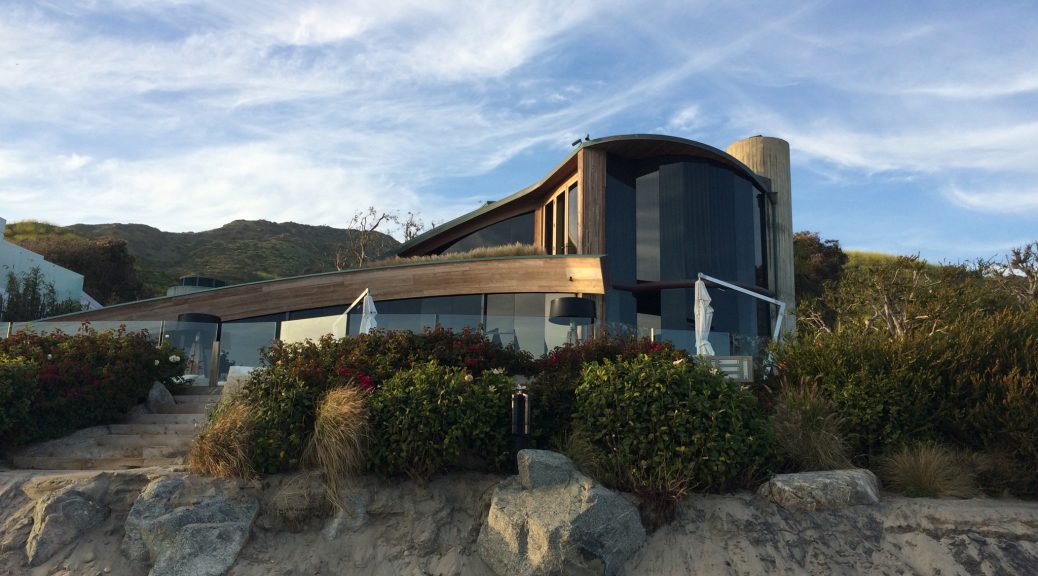
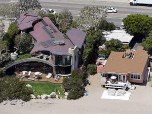
John Lautner, Segel House, Malibu, 1979

Segel House by John Lautner

John Lautners Segel House is situated directly on the beach in Malibu.

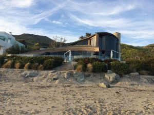
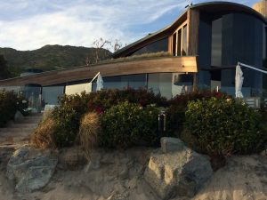
Segel House, View from the beach

The entrance of the privately owned home is on the Pacific Coast Highway making it difficult to view the house, due to constant traffic on the road.

Through a public beach access visitors can view the back of the house, which opens onto the ocean. The stretch of beach onto which the house looks has only been open to the public for a short time.

http://www.ncmodernist.org/lautner.htm
Segel House

The length of the house is hidden from view by trees and the homes on neighboring properties. The size of the house, which is placed diagonally on the lot, is only imaginable when viewing it from above.

John Lautner’s Segel House seems to mimic the waves of the ocean it looks upon. The curved form of the roof and the mirrored windows literally reflect the oceans movements. The windows open large views of the beach and ocean, but do not allow gazes from the outside to enter the private living area of the home.

View of the ocean from the Segel House

Seeing the building in person it appears much larger than in photographs. The curved form seems very organic. The beach is on a level lower than the house.

Segel House

The house is not open to tours from the public which makes a visit to the site a rather frustrating endeavor.

Visiting the house did not give me a much better understanding of the building as all that was visible was the same view one sees in photographs.

Despite not seeing much of the building, photographing it during our sunset visit was satisfying as the different materials of the building reacted to the light in interesting ways. The glass front reflected the light, while the wood seemed to glow and the concrete and metal seemed immune to the warmth of the sunset. Do to the low level of the beach as compared to the level of the house it is quite difficult to get a picture of the entire building.


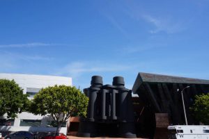
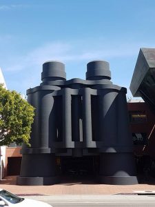
Frank O. Gehry , Binoculars Building, 2001, 340 Main Street, Venice, Los Angeles

Binoculars Building, photo by the author

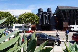
On our Frank Gehry day, right after going to the private Gehry Residence, we luckily got to see the iconic Binoculars Building with two adjacent buildings, that are used as office space on each side. The building is located in the Venice neighbourhood of Los Angeles. It is a building that you cannot overlook when you are driving by it. On that day, we were the only tourists to take a closer look at the building while other people casually were walking by. After we had parked on the side of the road across the street we took the chance to observe the exterior of this building to take pictures. From the other side of the street it was a lot easier to take picturesshoot of the whole complex.

Binoculars Building, photo by the author

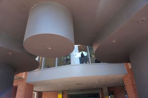
The centerpiece is the entrance with a pair of matte black binoculars which is symmetrical compared to the other parts of this building since we are not used to see something that we use daily in this size. In my opinion it is not easy to guess that there is a parking lot behind the entrance from afar. It is a creative entrance that looks surreal in person as well as in pictures. The shape and size of this building, makes it an eyecatcher that you can instantly recognize.

Binoculars Building, photo by the author

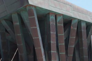
On the right side of the binoculars is a brown and green building which is asymetrical. It doesn’t have any similarities to the other buildings. To me it looks like something it is randomly built together, which is not really done yet. Most of the beams look disarranged which make these look like branches of a tree but at the same time like antique columns which give support or serve decorative purposes. The building that we are seeing in these pictures, make it seem like it is reddish brown and green. Since the paint of this building looks like it is not evenly distributed, it gives the building something natural. As I got closer to the right part of the building, I noticed that the reason for it is assumedly corten steel or rust, which spread and gave it a green colour.

Binoculars Building, photo by the author

Whereas on the left side I would confirm that the white building does look like a ship or even yacht. It is slightly curved and the first storey only has long cabin like reflecting window panes. The other stories have balconies that are also similar to those of ships and yachts.

Binoculars Building, photo by the author

Behind the binoculars we can see a brick wall which is not as noticeable on the pictures, which I found in the internet before our trip. This is probably an office, music room or lounge. It is possible to look through the windows as you are nearing the gigantic Binoculars. Unfortunately we didn’t get the chance to enter the building.

Binoculars Building, photo by the author

Lien Liane Nguyen

Rudolph M. Schindler: Schindler House (Kings Road House), 1921/22, 833 North Kings Road, West Hollywood, Los Angeles, CA

The first thing one notices when entering the building, is how chilly it is in comparison to the boiling Californian heat. Right after that, a feeling of constriction settles in, which is mostly caused by the low redwood ceiling. Only after passing a couple of rooms until one finally sees the first Shoji-Screens, this constrictive sensation eventually vanishes. Interestingly enough we’ve learned about Wright’s preference for a play of oppression and relief in context of his Hollyhock House just one day before, but I didn’t exactly understand its benefit until experiencing this sensation at his mate Schindler’s house.

The gleaming daylight appeared to be even harsher in contrast to the dullness of the inside.

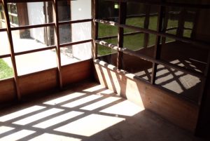
In addition to the low ceiling and it’s effects on the visitor, the strips of transparent and translucent glass actually were not capable of filling the place with daylight, causing the rooms to be quite dim. Both together these impressions intensified the feeling of relief, experienced after (finally) making it to the open walls, which let the gleaming daylight in. Furthermore, by creating this almost harsh contrast between light and dark, the alleged abolishment of the common partition of the inside and outside seemed less fluent than described in the literature.

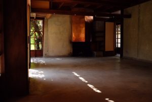
Unfurnished room with fireplace.

Also conflicting with the image created by the media – at least for me personally – was the lack of furnishings, causing the house to feel cold and almost dead. Staged as a residence for plenty of contemporary avant-garde people and a place of refined conversation, the current state of the Schindler House misses most of its previous liveliness. On the other hand though, the unfurnished rooms highlighted the architect’s intention to create universal spaces, being fully adaptable to the resident’s needs.

Unfurnished room with fireplace.

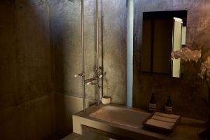
Besides the bathrooms and kitchen, the only piece of furniture that was left in the dwelling turned out to be a table-shelf-contraption with two chairs in Schindler’s room, which were both designed by him. In this light I wish there were more of his furniture to actually look at, as he devised quite a numerous amount for his buildings. Nonetheless, the concrete shower tub and sink were very impressive.

Schindler’s Bathroom with concrete sink and bathtub.
The ’sleeping baskets‘.

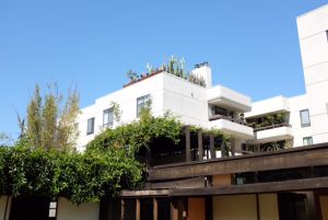
Likewise, the ’sleeping baskets‘ on the bungalow’s roof were worthwhile looking at. Overgrown with vines, which caused the most beautiful play of light and shade underneath, they lead to romanticised imaginations of sleeping under the nightly Californian sky, only emphasising the architect’s close relationship to nature and his abandonment of traditional room configuration.

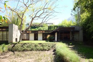
View from the garden, where the drought left visble damage.

Owned by the Friends of the Schindler House organization, which partnered up with the MAK, the Kings Road House is claimed to be restored as nearly as possible to Schindler’s intentions. Sadly, the reality proves itself to be different: With plenty of cracks in the concrete walls, weathered window frames and a garden composed of patchy lawn and muddy ground the Schindler House seemed to urgently require general renovation works. Even though it is inherently acceptable to allow signs of aging, the overall look of the house appeared to be decay as opposed to persistence.

To conclude this revision of the Schindler House – and although it may not sound like I personally enjoyed the visit – I honestly think the building is worth spending your time at while staying in Los Angeles. Eventually the absence of furnishings and the noticeable signs of aging are unable to deprive the essence of the Schindler House, leaving it to be one of the most memorable stops on our fieldtrip for me.

M. E. N.

Richard Neutra: Lovell Health House, 1927-29, 4616 Dundee Lane, Los Angeles, CA

Driving up the Hollywood Hills for quite some time before finally arriving at our destination made me understand why it was so difficult to plan and build houses in this area. Personally, when reading about ‘difficult subsoil’ and ‘steep slopes’, I was not able to conceive the real size of this architectural problem. Naturally, the on site experience made me appreciate the innovative techniques even more than before and left me excited to finally see Neutra’s Lovell Health House, due to its pioneering construction technique.

Accessibility of the house through the top floor.

It was known prior to the trip: there was no public viewing available for this house and thereby limiting the real life experience to an observation from street level, as the property was private and trespassing was permitted. Consequently, the top floor was most of what was to be seen. Even though knowing about the house being build downwards from the street level because of the difficult subsoil, the visual experience alternated quite drastically from what was shown on Shulman’s photographs. Most of the images were taken looking up to the building and thereby presenting and emphasising its monumentality. From street level however, it appeared much less imposing. Additionally, this experience leaves one to reflect about the accuracy of images in books. As I do not recall one that actually showed the view from the street level, highlighting the fact, that the so-called ‚bel étage‘ was in exception to the norm found to be downstairs.

Outside view of the famous staircase.

Sadly, as our view was limited to the exterior, we were only able to catch a glimpse from the outside at the famous staircase with its out of context Ford headlights. And there is no way for me to comment on any of its interior, except for the fact of its subsequently added wheelchair-accessibility.

The closest we could get to Shulman’s images.

It furthermore seemed to be not taken care of at all, as the plaster was coming off and generally was in a very poor condition. All this leads me to the conclusion, the Lovell Health House is in the hands of a person who either is not capable of restoring the building or – even worse – does not see its historical and artistic substance.

Retrospectively the visit to Neutra’s famous house for the Lovell family turned out to be quite disappointing, as it could not hold up to the expectations made prior to the visit. Nevertheless is it an exceptional piece of architecture and definitely worth a short visit. Besides the building itself you’ll be rewarded with an exeptional view  of the Hollywood Hills and the Griffith Observatory. If you keep your expectations low, you’re not going to be disappointed, even though what you’ve seen on Shulmans images is nothing close to what you’re actually going to encounter.

M. E. N.

Richard Neutra, Landfair Apartments, 1937, Westwood LA

After we visited the Schindler House in Kings Road in West Hollywood, we made our way to the Landfair Apartments by Neutra. The building complex is still inhabited by students and it is near the UCLA campus. It is barely visible from the street, because large trees obstruct the view. Further the surrounding densely populated and also it is enclosed by other modern buildings that put the exemplary architecture of Neutra in the background. We were lucky that a student of UCLA was able to give us a tour of the building and so we were allowed to have a look into the inner space. The building is located on a hill on the corner of Landfair Avenue and Ophir Drive in Westwood.

Viewed up close it looks dilapidated. We went with the student to the first floor of the one-story living quarters in the east and unfortunately here also everything looks neglected. On that floor the rooms of the students were located. From the steps on the right side you were able to access the backyard, where you were able to better view the staggered configuration of the row houses, that give the effect of separated living. Here the impact of the aesthetic of Neutras architecture was clearly visible through the uniform formation and the clarity of surface expresses itself.  Below the first floor was an expansive living room with a large window front, which gives the room light. The for Neutra so typical metal window frames were unfortunately all painted over in white. Through the living-room you entered a balcony that spanned the whole east side of the building.

The student who gave us the tour told us that the majority of the students do not realise that they are living in such an important and exemplary building. Even so the building was built in 1937 it is still one of the great examples of International Style and it‘s hard to comprehend that it is now in such a neglected state.


Mona El Amir


John Lautner, Chemosphere / Malin Residence, 1960, LA

After we visited the highlight of our trip the Sheats-Goldstein Residence, we went on our way to visit another famous building of Lautner The Chemosphere. It reminded us of a flying saucer and was visible to the naked eye from afar and we could see it from the Mulholland Drive. We parked our vehicles on the lower level of the Torreyson Drive and walked up to have a better view of The Chemosphere. Unfortunately we did not get a reply from the owner Benedict Taschen to visit the inside of the house, so we could only view it from the outside.

The in 1960 built dwelling still distinguished itself from the surrounding dwellings. It seems like it sits enthroned with complete peace and amenity above Los Angeles. On one side we were lucky that everything was green on the other side the lush green vegetation obstructed the view of the pillar and the view of the platform, which is located under the octagonal ground plan, as well as of the small cable car that leads to the entrance of the building.

Despite the exclusive architecture of the building it blends into it‘s environment. Through the previous visit to the Sheats-Goldstein Residence I became a fuller understanding of Lautners architecture and his genius, which until then i only knew from theory. Because of that I could visualise the inner space even so I could only see it from afar.

It seems to me that Lautner dwellings integrate their surroundings but still distinguished them from the outer space through the materials that he used. He created structures in which he materialises space and room and makes it noticeable for the inhabitants. In other words it is what is „Between“ what Lautner manifests in his architecture: that being between inside and outside that harmonise at the same time, the connection between heaven and earth and the play of opaque and translucent architecture. So is the Chemosphere an imposing building not bound by time and which exists without comparison.


Mona El Amir

John Lautner, Sheats-Goldstein Residence, 1963, Angelo View Drive, Los Angeles


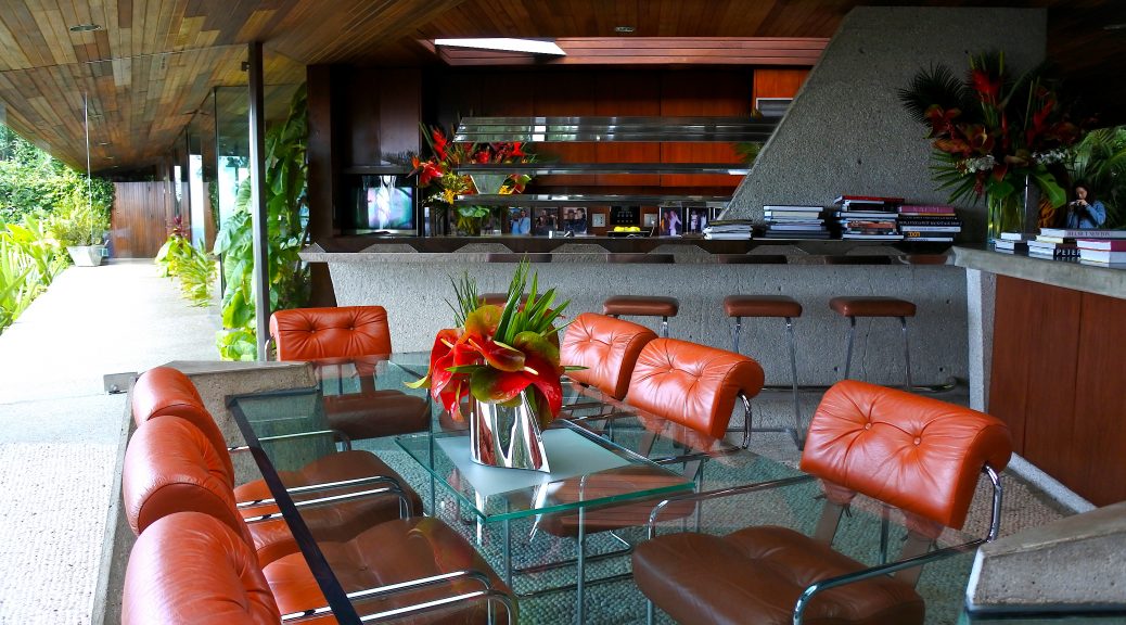
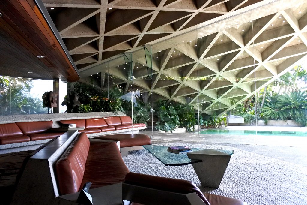
Actually, being at the site didn’t disappoint any of my expectations. Everything is readily identifiable of still having Lautner’s handwriting. The objects in the house — be it the entrance gate, the dining table or the ashtray — are all cornered and furnished with sharp endings. They appear to be constructivistically styled — like precisely designed splinters. The ceiling is the only part of the architecture in which not a lot of wooden materials are integrated. Nonetheless, everything just fits, the natural and technoid are perfectly synchronised. The most commonly used materials are concrete and high-grade steel. Cushions are bright-brown coloured, dividers between the inside and the outside are made of glass and also the ground is made of bright stone. This causes a clean and straight modernist appeal. Lautner succeeds in realizing the ideal of structural purity. Moreover, one could argue that the house clearly exposes baroque opulence due to its rich reference to expressive metaphors, as in the eye, or the connotation of the sky, or the cave.

Sheats-Goldstein Residence, photo by the author.


It is my intention to make clear how traditional ideas of buildups and aligning the house’s sides was completely diced. The simplest question concerning a private home cannot be answered easily: Where is the front? Where is the rear? I simply underestimated Lautner’s accomplishment to hide the house’s privacy completely in midst the botanical thicket. I looked for any perspective from which the house’s external shapes themselves are visible, in vain. Such a complex structure can merely be compared to the constructions of ancient Roman imperial villas.

To access the entrance of the house you have to follow a densely forested narrow driveway. At this point the feeling arises that you’ve reached the house’s back. But at the same time, it presents itself as the entrance with that distinctive American parking area to be found in front of every home. Moreover, there is no front. There is no noticeable front gate, only low and narrow walls outside which lead you into the building, creating a maze-like effect. After crossing a little fishpond there is a glass slide door, after having gone through which you’re inside. But there is no sentiment whatsoever that you’d associate with being inside a house. The huge glass walls permanently cause you to look outside. A multitude of ivy creeps along the sloping wall which is partly outside, partly inside, is placed on the top. At second sight, you realise the ivy merely crosses the glass divider unimpeded, ensuring a strikingly natural touch.

The Sheats-Goldstein Residence is an absolutely shy masterpiece, due to its struggle against denuding. Simultaneously, due to the owner’s known obsessions and strategies, the house is surrounded by an exhibitionistic aura. Even standing on its own tennis court, which is located on a slightly elevated level, one cannot catch a glimpse of any front. It’s a real cave, a social exile. It’s a safe haven for L.A.’s celebs who are drowning in attention during the day and thus escape into their private hideaway during the night. Sheats-Goldstein only allows us to have a proximal look at the iconic steep slope — the property’s décolleté — from the pool’s side, which we know thanks to the photos is the forefront — the media forefront, to be exact. The user forefront — where the entrance to the house is — is vis-à-vis with the latter. And as one can see, Lautner solved both issues, being the retention of the resident’s privacy on the one hand as well as the suspense between in- and outside on the other hand with a single solution: both aspects could be considered as crucial for modern outdoor living.

Alexander Nebrass Eyber

Photos by the author.

Sources

Lubell, Sam and Douglas Woods, Julius Shulman Los Angeles. The birth of a modern metropolis, New York, 2011, S. 20-29.

http://jamesfgoldstein.com/?page_id=881