Schlagwort-Archive: Los Angeles

Beach Houses in Los Angeles


The beach is one of the Four Ecologies of Los Angeles as described by Banham. He states that the Angelenos like to spend a lot of time by the water. Banham compares the surfboard with the, for Los Angeles crucial, automobile. He writes that the Angeleno is ‘most himself’ when he is either on the Freeway or on the beach[1].

Needless to say, there are quite a few dwellings near the seafront of the Pacific Ocean, where people wanted to settle.

Some of the wealthier citizens might even own multiple houses. One on the beach and one in another part of the city. Like the physician Philip Lovell who commissioned a house near Griffith Park in the foothills by Richard Neutra and a Beach House by Rudolph Schindler, located in Newport Beach, California. Sadly we could not visit the latter on our trip.
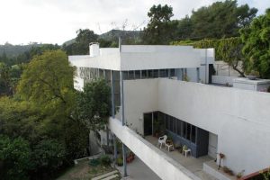
 

Richard Neutra, Lovell Health House, CC by Viola Menzendorff

During our stay in Los Angeles we got to see some examples of life on the beach. The houses in – and around – Los Angeles show a lot of diversity. We stayed in Santa Monica, in walking distance to the beach. To get there we had to cross the well-known Pacific Coast Highway, which starts at approximately the middle of Santa Monica’s coastline.

When following the little Ocean Front Walk, heading north from Santa Monica Pier, one finds a few small houses. Those only grow bigger further down when the California Incline joins the Highway. This is where the jumble of people – mostly tourists – gets less bundled.

The Highway leaves Santa Monica behind at that point, and the beaches turn narrower, until there are only public beaches, lookouts and cafés or restaurants to be found.

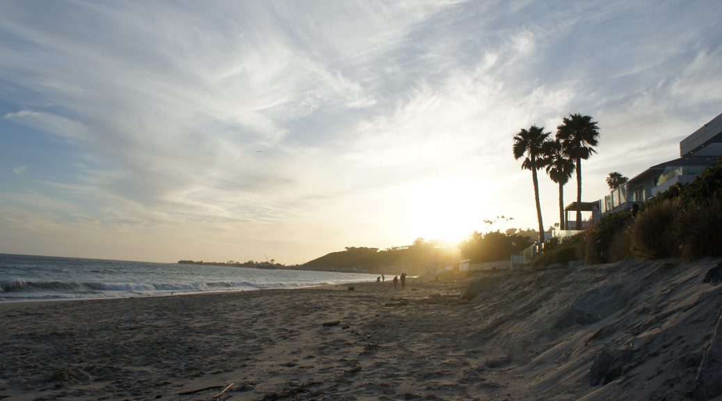
Following the Pacific Coast Highway further, one reaches Malibu. This is where the famous ‘Billionaire’s Beach’, or Carbon Beach is located. House prices there are high and there is a good chance to be living door to door with a celebrity. There, the estates sit directly on the beach, with private exits through the backyards. The beach has only been open to the public for a short period of time.


Malibu Beach, CC by Viola Menzendorff

The individual sites are a lot larger than the slightly packed ones in Santa Monica and the houses are more spacious. Most of the properties seem quite plain when passed by on the highway, where one can only make out closed up façades and front doors. The buildings open up towards the sea though, with huge windows and glass doors, impressive façade designs and backyards.

One of those is the Segel House by the architect John Lautner, which is being discussed in its own blog entries.
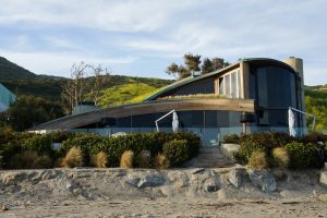
John Lautner, Segel House, CC by Viola Menzendorff

If you head the opposite way from Santa Monica Pier, down south, you will find more story buildings, mostly occupied by restaurants and hotels. Adjacent to Santa Monica is Venice. Here, one can visit the well-known Venice Beach, where Muscle Beach is located next to alternative shops, and people sitting on the foot walk vending DIY products and junk goods. Behind all the touristy bustle there is a closely-built row of one family houses. The design and layout of which vary a lot, fitting into the alternative and experimental environment of Venice Beach.

The architect Frank O. Gehry uses this as a site for one of his most salient designs. Oddly, this little Beach House does not even stand out a lot, but rather matches the surroundings.
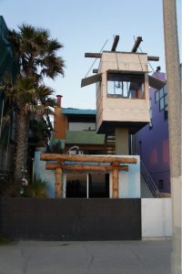
Frank O. Gehry, Beach House, CC by Viola Menzendorff

[1] Banham, Reyner: Los Angeles. The Architecture of Four Ecologies, University of California Press, Los Angeles, 1971, S.203.


Viola Menzendorff

Richard Neutra, VDL Research House I / II, 1932/1966, 2300 Silver Lake Blvd, Los Angeles

Thrilled finally to examine the VDL Research House by perceiving it through movement and intensify the theoretically acquired information by our own experience, we ran into a big disappointment. Due Spring Break, the house was closed. Currently the VDL House is supervised by students of the Cal Poly Pomona College of Environmental Design and unfortunately we weren’t informed in spite of reservation, that just at that weekend as spring break began, we would stand in front of closed doors.

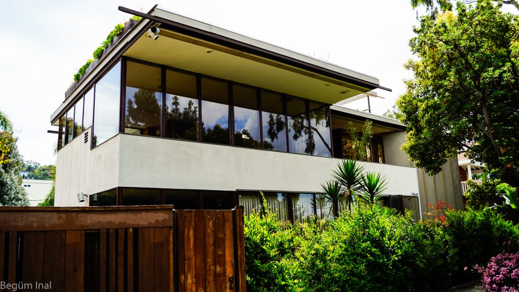
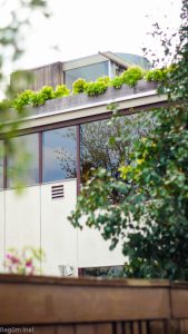
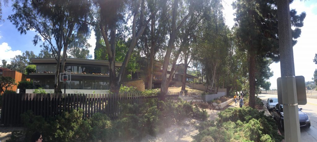
VDL Research House, View from Silver Lake Blvd.

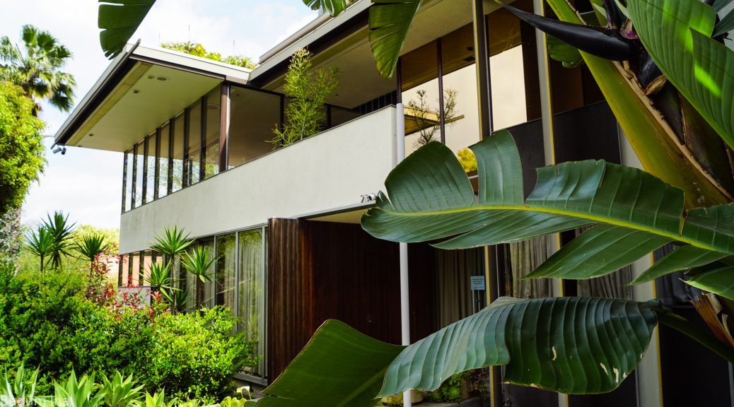
The environment of the VDL House is a quite silent neighbourhood at the famed Silver Lake. Honestly, I wasn’t expecting such an impressive piece of architecture in such an inconspicuous street. Hidden between houses with tall fences and green bushes and trees, the VDL House guardedly appears with its narrow entrance.
Adorned by many bushes, dainty banana trees, huge palm trees and several aloe veras to count a few, the entrance resembles an oasis compiling examples of the typical Californian flora.

Landfair Apartments by Richard Neutra, view of the yard

In contrast to Neutra’s Landfair Apartments, which are currently used as a student housing, I was glad to see that the VDL Research House was in a much better condition than other works of famous architecture. Other famous buildings  which aren’t privately owned were in similarily as badly conserved as the Landfair Apartments. The window frames in particular seem to fall apart because of their neglected wooden structure. In general, very distinct conditions of preservation could be observed, depending if the architectures were in private or public ownership.

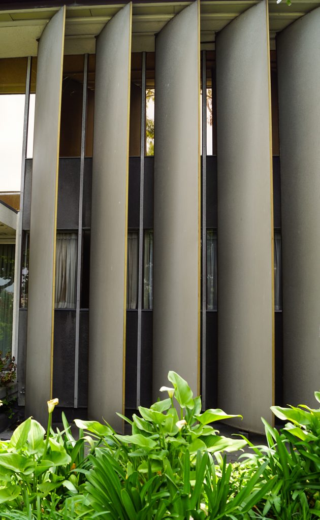
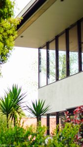
The first part of the construction that caught my eye were the vertical shades in metallic optic, which react to the sunlight. The shades adapt to the falling sunlight and move autonomously. They reach out from the ground to the roof of the building.

Detail of the vertical sunshades

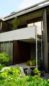
The Facade of the VDL House can be structured into three areas: the high shades, the entrance area and the window facade.

Detail of the entrance

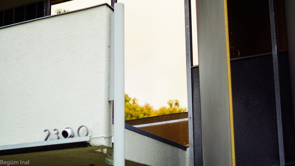
The glass panels of the window facade are embraced by wooden frames in a brownish steel optic. A quite interesting part of the house is the balcony right above the entrance. It seems as if the balcony was open-ended on its left side. In combination with the shattered glasspanels it creates an illusionist effect where the differentiation of inside and outside becomes blurry.  If you take a look at the photographs it is not clear where the line between the inside and outside of the house intersects, so the limit becomes indistinct.


Detail of the balcony

A beautiful detail is hidden in the crossing roof elements. The concluding wood ceiling joists don’t end up in clean edges, they form fine crossing structures that provides a lightness to the building. A more dramatic look the ceiling might get at night time due to the discreet light slates and light spots which are embedded inside of the ceilings joists.

Detail of the crossing ceiling joists

The crossing element can also be found internally. During our visit at the Getty Research Center we were lucky to be supervised by some former students who worked at the VDL House. They told us some exciting aspects, like the continuation of the crossing elements in the inside of the house. They also told us that Neutra had tried to rebuild the original VDL House after the fire, as an homage to the original structure, but unfortunately there were new rights which didn’t allow him to construct it 1:1. That’s why he was urged to make some differences in the declaration, called the guest house as a garage e.g.. An added element are the steel pillars which ground the house. It’s the only structure of the house where he could used steel. This element has a similarity to his piano in the inside the house which he had transported originally from Austria and which also stands on steel feet.

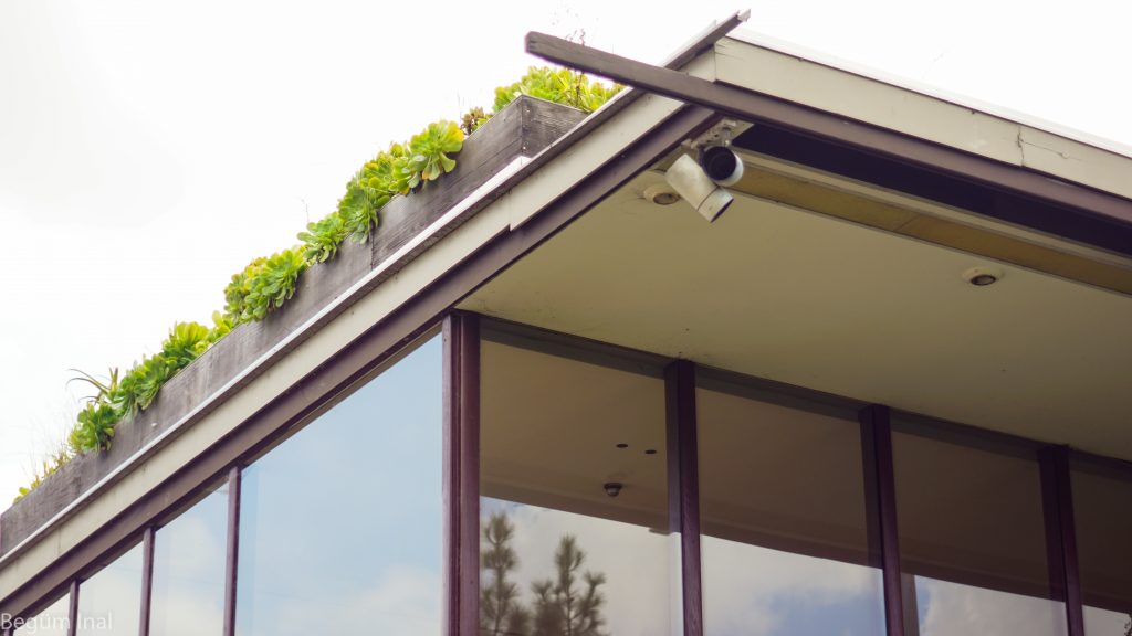
Detail of the rooftop

At our meeting with the architecture class of the Pomona College we gained further information about the perception of the inside of the building. The inside of the building is sensually perceived as quite cool and continues with the play of the visual unclearness between the tension of outside and inside. Neutra also included natural phenomenons into the structure of the house. For example there’s a small pond on the roof of the building, which awakes the impression of an infinity pool.

I’m still disappointed about the fact, that we couldn’t experience the building ourselves, and also the fact that I have nearly no further leading information about the guest house. But I’m grateful to have met such interesting persons with the same passion for architecture in special for the VDL House and Richard Neutra Architecture. Particularly to have had the chance to exchange our thoughts and information about the VDL House, including their subjective impressions about the house which are really precious to me.

Detail of the facade

To sum up the comparison between the impressions we had before we saw and gained additional information about house and after, the main difference lies in the atmosphere of the house. I hadn’t had any feeling for the dimension and effect of the house until I stood in front of it. It’s discreetly enclosed by the breath taking Californian flora with which it is in perfect harmony. If you take a step further and stay right on the small gateway of the entrance it plays with the opposites of lightness and mightiness. The house possesses a strong occurrence which is underlined by its interest-stimulating fine details. It automatically leads to questions like ‚how do the shades work?‘, ‚are the frames made of steel or wood?‘, ‚how can this dominant building look so light and open?‘ and takes your time while you try to clarify those points. Unfortunately, pictures aren’t enough to relive these precious experiences.

All pictures taken by the author.

Begüm Inal

Richard Meier, The Getty Center, 1997, 1200 Getty Center Drive, Los Angeles, CA 90049, USA

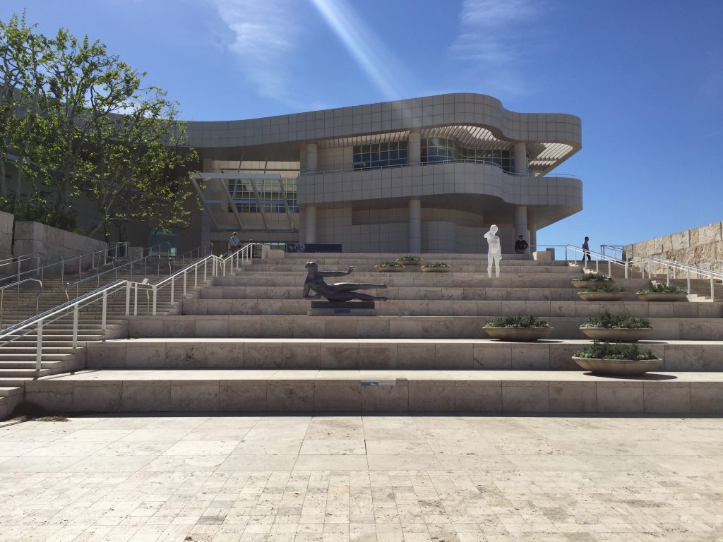
On our second last day of the field trip we left Santa Monica early in order to be in time for our full day at the Getty Centre on top of Santa Monica Mountains. After parking at street level, we journeyed to the Campus by tram. Upon our arrival we were greeted by a wide set of stairs leading up to the main access point. From here all the different parts of the Centre are walkable.

The Getty Center, photo by the author

The off-white travertine and the baked aluminium panels of Richard Meier’s design glistened in the sun as we made our way to the Getty Research Institute. Our group received the warmest welcome by one of their curatorial staff. In the commencing two hours we were given the opportunity to study a various number of plans, architectural sketches and photos from the Getty’s archives. With amazement we discovered many details in the sketches and plans as well as gained a greater understanding of how many of the buildings we went to see earlier on our trip came into existence and were structured. The architecture of John Lautner, Richard Neutra, Rudolf M. Schindler, Franklin D. Israel, William Krisel and Frank Gehry, photographed in many instances by Julius Shulman, was easier to comprehend thoroughly because of the material we were allowed to study. Engrossed in these treasures, we greatly enlarged our understanding of the houses history, structure, functioning and design. The development of each architect’s idea suddenly became much more coherent.

The session followed a guided tour through the building itself. While we were introduced to five different architectural models, exhibited in various spaces of the Institute, we gained a grasp of its departments. Architecturally, the library especially revealed itself as a fascinating space to us. In decadent clarity rooms and hallways sit within the building while the orchestrated flow of sun rays constantly permeates the visitors view.

After a short lunch break at one of the local restaurants we joined an officially guided tour through the Getty Center’s architecture and garden. Gaining knowledge about Richard Meier’s artistic intentions as well as the history of the Getty itself made this an intriguing event. We were made aware of intricate details like the grid which Meier arranged all across the outside design. Continuous, straight lines dictate the entire surface of the building.

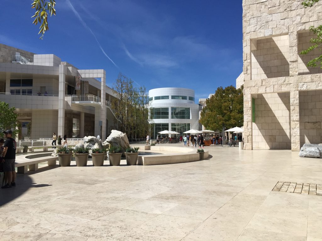
The Getty Center courtyard, photo by the author

The manufactured look of the Aluminium panels is contrasted with the natural travertine. Handpicked feature stones were selected by the architect to display the inlayed fossils, directing to the materials origins. Walking along the outer museum’s walls we were able to observe the textured surface of these feature stones. Meier, responding to the Californian weather, also integrated outside rooms to the outdoors area. These are an expression of his grander architectural philosophy.

After our tour, we spend the following two and a half hours exploring the campus on our own. Many of our group investigated the various exhibition wings of the Getty Museum, enjoying all of the collections treasures. The Getty’s garden lend itself to a few refreshing minutes in the Los Angeles sun.

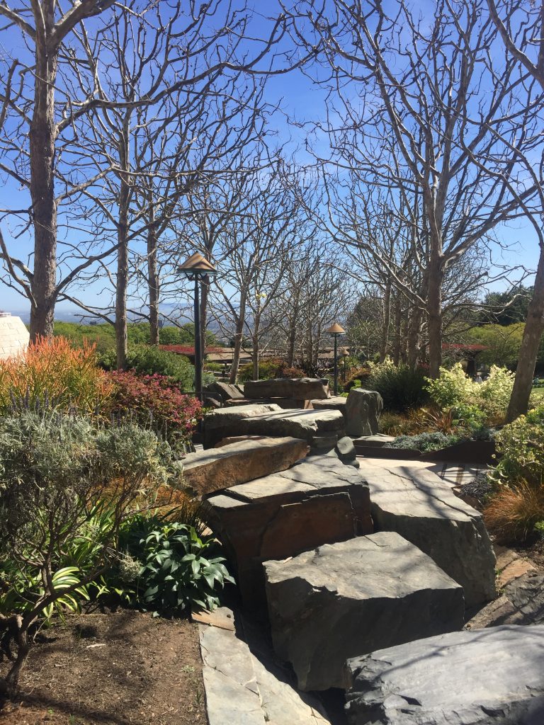
The Getty Centre Garden, photo by the author

After an art-filled day our group returned to the peace and quiet of Santa Monica by the beach, full of new impressions and inspirations of how research in the field of history of art potentially could unfold itself. Our expectation towards the Getty Research Institute and the architecture of the Getty Center were superseded.

Talitha Breidenstein

John Lautner, Silvertop, 1957, 2138 Micheltorena St; Richard Neutra, Neutra Colony, 1948-1961, Silver Lake Blvd, Neutra Place, Earl St; Rudolf M. Schindler, Droste House, 1940, 2025 Kenilworth Ave, Los Angeles, CA

Upon our arrival at Silver Lake, right after we had parked our cars in front of Neutra’s Van Der Leeuw (VDL) house, we wandered across a lawned recreational area right by the reservoirs shore. To our surprise the water level appeared to be extremely low. We later learned from one of the residents that due to an effort by the municipality the lake was emptied. The home owners of Silver Lake neighbourhood had successfully fought the city on the resolution. The reservoir is now planned to be refilled by summertime in 2017. This is only possible thanks to the end of a seven-year long drought in California.

After observing many runners, picnickers, young families with toddlers roaming about the lake’s pathways we started out on our own adventure around their neighbourhood. Walking along Silver Lake Boulevard we turned unto Glendale Boulevard heading toward Neutra’s former office building. By the large sign up front, today, it appears to house the Neutra Institute Museum of Silver Lake.

Neutra Institute, Museum of Silver Lake, photo by the author

From street level just one storey is visible but as we wondered down the driveway along side the building it revealed two levels on the back. In Neutra fashion it is a flat top roof house dominated by rectangular forms. Long, horizontal window strips as well as sun shields decorate the sides and the back. The building was poorly maintained.

As our group continued on Glendale Boulevard we then turned on to Earl Street. Walking downhill Neutra Place came up on our left side. The cul-de-sac revealed several homes designed between the years of 1948 and 1961. Returning to Earl Street we then continued to discover the second part of the Neutra Colony on Silver Lake Boulevard.

Overall, the homes seemed well taken care of, appeared to provide every owner with individual housing design and secluded living space. In conversation, most of us concluded the houses to be similar to each other in the overall design theme. Nonetheless every home featured a different structural set up. Placement of stairways, doors and window fronts helped differentiate.

Neutra Colony on Silver Lake Boulevard, photo by the author

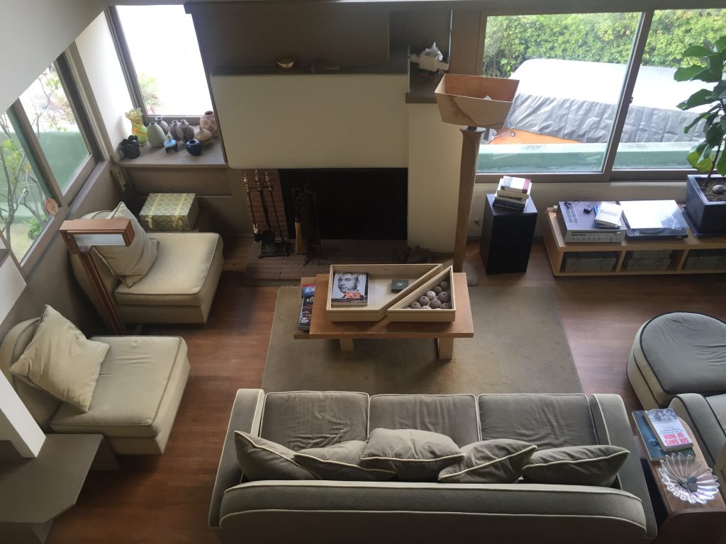
After a quick lunch break our group decided to meander through the West side of Silver Lake hoping to catch a closer glimpse of John Lautner’s Silvertop (1957) as well as Rudolf M. Schindler’s Droste House (1940). As we ascended Kenilworth Avenue the Droste House made an appearance as the road took a turn. Gazing at the architectural sight from street level suddenly the very friendly couple owning and living in the home opened the door and welcomed us in. Excited, we followed their invitation. As they guided us through their well cared for home our group marvelled at the many details Schindler added to the design: invisible storage space, air circulation strategy, window placements et al. All of us were very appreciative of the family’s openness to share about their experience of living in and owning a Schindler designed home.

Droste House living room, photo by the author

Upon our drive leaving the neighbourhood we managed to view Lautner’s Silvertop from the distance. The shiny, curved structure clearly stood out among all the homes on Silver Lake’s West Side.

Strolling through Silver Lake left me with a furthered understanding of the neighbourhoods quality. Neutra’s, Schindler’s, Lautner’s, among many other renown architects’, homes are situated within Los Angeles’ urban context and their individual design is powerful because of it. Having previous to our visit only viewed photos and read about Silver Lake this experience led me to comprehend its and the architects‘ home architecture.

Talitha Breidenstein

Griffith Park, after 1896, Los Angeles

Griffith Park, after 1896, Los Angeles

This short insight of our trip to Griffith Park concentrates on the Observatory, opened 1935. Unfortunately there was no possibility to go and see the inside of the Observatory and visit other architecture in Griffith Park.

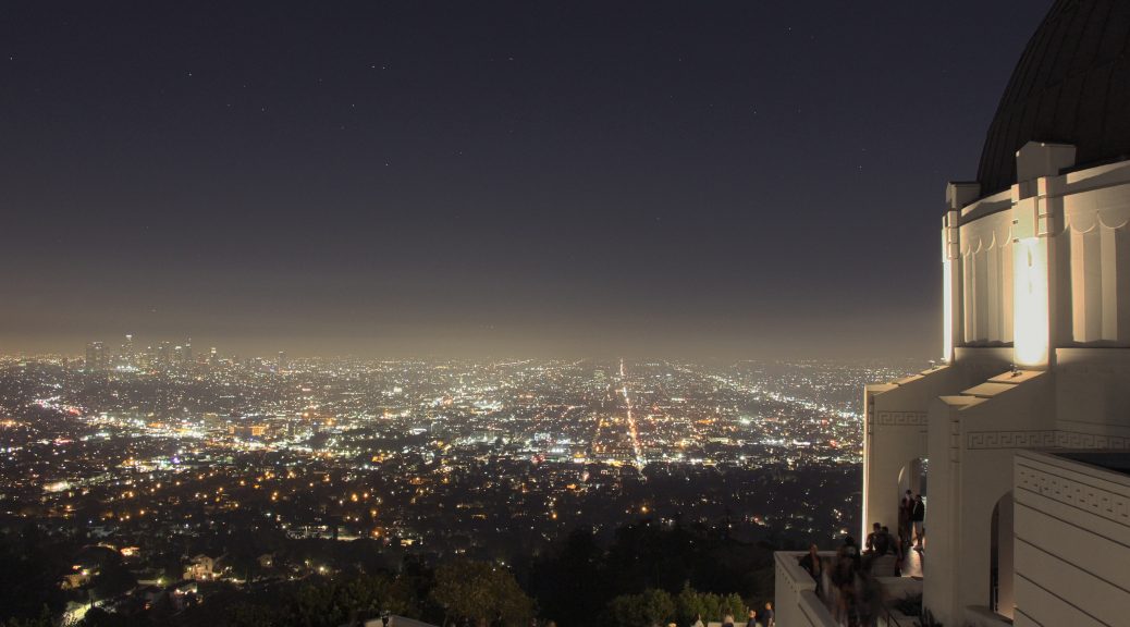
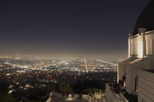
Los Angeles city skyline at night with the Griffith Observatory in the foreground by Dancorna21

We saw Griffith Park, especially Observatory a few times during our stay in Los Angeles. It was possible to have a look at them from the basin far away and relativley close at Hollywood Hills . The fact that this park is visible from a lot of different parts of the basin underlines the signifiance of the park for the city.

Arriving at the Observatory we parked our cars at a car park 15 minutes footpath away. We walked a curvy path which directed our attention towards Observatory. The far reaching view over Los Angeles basin opened up while walking around the Observatory like a curtain. This view differed from those we saw in other architecture in the fact that it was framed by nature. Most of the lookouts we had over Los Angeles were framed by buildings from neighborhoods. Compared to the environment of Griffith Park there were no buildings that are on the same level like the Observatory. This framing cause that the observer may feel like he is the only one looking at the city, what indicates a romantic motive. Of course there are a lot more viewpoints in the area with different directions where one find these conditions. Taking the perspective from the basin of Los Angeles one can interprete that the Observatory is enthroned on the peak of Los Angeles. This peak may also be interpreted as a boat which is anchored in front of Los Angeles to invite their inhabitants to have a good time and relax, which was the ambition of Griffith, as well as his desire to make science more accessible to the public. Although this place was more touristic then any other place we visited  the last evening watching the sunset was calm und peaceful. Unfortunately  it is not possible to come to a decision according to the thesis about the mysticism in Griffith Park. Despite that the atmosphere during dusk and sunset can be interpreted as spherical.

Jasmin Roth

http://www.griffithobservatory.org/about/history.html


Santa Monica

Foto: © JCS / Wikimedia Commons / , via Wikimedia Commons

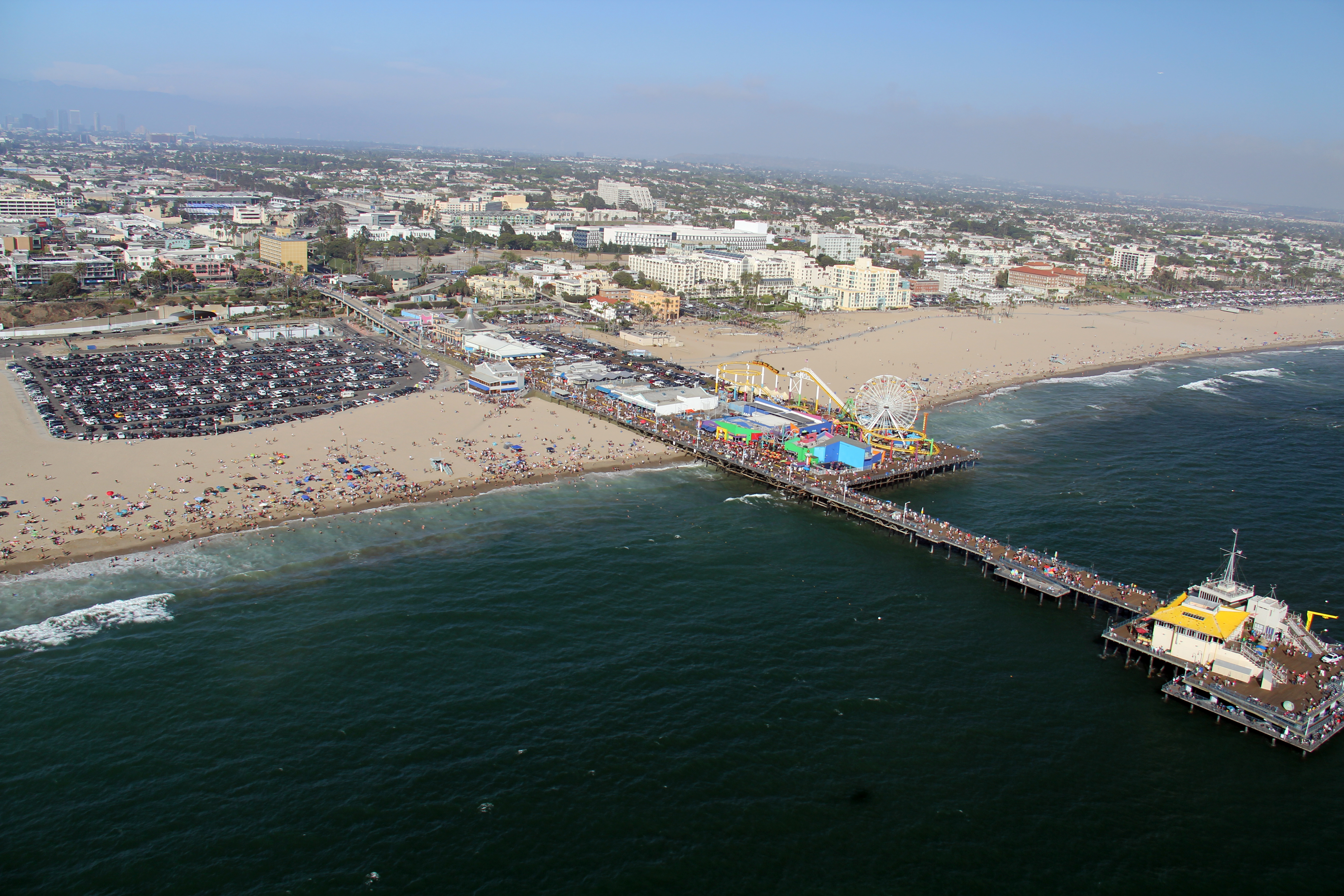
Santa Monica is a renowned beach city in Los Angeles with a mediterranean climate. During our field trip at the end of March we can mainly expect to have moderately warm weather. We will stay at the „Hostelling International Los Angeles in Santa Monica“, which is situated in downtown Santa Monica and only a few blocks from the beach.

Aside from the beach, the famous Santa Monica Pier which used to be the western end of Route 66, at the end of Colorado Avenue contains an aquarium and a little amusement park with a red and yellow ferris wheel, a roller coaster, a historic carousel and more.

Movies, TV series and music videos that have been set in the Santa Monica Pier as well as the beach, show that this place is one of Southern California’s most popular filming locations. Some movies already gave us a slight insight in the lively, expensive atmosphere of this city. In combination with free time activities, Santa Monica offers shops, cafes, restaurants, farmer markets, theatres, cultural events and entertainment which attracts a wide variety of locals as well as tourists.

In order to explore the city we will not have to rely on a car too much to get around, since the city is rather small. Public transportation such as the „Big Blue Bus“ also provide bus service to the westside of the Los Angeles basin if you don’t have a car. Furthermore it might be more convenient to rent bicycles to get to the car-free 3rd Street Promenade where you can go shopping.

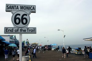
Another option is the 26-Mile Bike Path that parallels Santa Monica Beach and that might give you the chance to enjoy the beautiful scenery. The Santa Monica Yacht Harbor Sign at the entrance of the Pier and the sign at the end of the Santa Monica Pier which marks the end of the legendary American highway, have become an additional must-visit place to take obligatory pictures or selfies for many travelers.

Route 66 – End of the Trail -Santa Monica
from Prayitno, Los Angeles, USA (ROUTE 66) [CC BY 2.0 (http://creativecommons.org/licenses/by/2.0) oder CC BY 2.0 (http://creativecommons.org/licenses/by/2.0)], via Wikimedia Commons

During our trip we are going to take the chance to take a look at the architecture of a Googie-styled restaurant called “Swingers Diners“ and o have dinner there at the same time.

Furthermore another place in Santa Monica, that we’re going to visit is the world-renowned Gehry Residence which was redesigned to its owners liking. It was bought by Frank Owen Gehry and his wife Berta Gehry and looks like a house that is still under construction.

If you want to explore other beach towns which are nearby, you can go to Malibu, Venice, Beverly Hills, Pacific Palisades and many other places with different attractions.

Lien Liane Nguyen

Griffith Park, after 1896, Los Angeles

Griffith Park, after 1896, Los Angeles

To conclude the last evening of our excursion we will visit Griffith Park in the northeast of Los Angeles. Due to its staggering sight this park might be a great place to review the experiences we made during a week and to catch one last view over Greater Los Angeles.

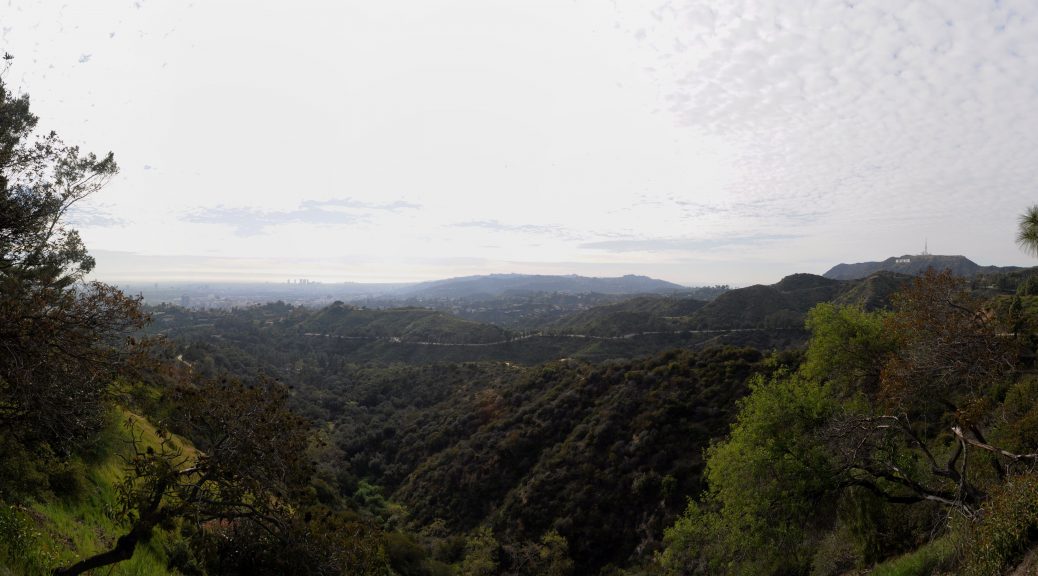
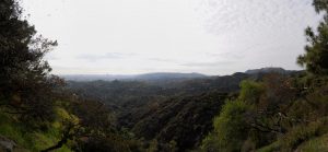
Panoramic view of the the Hollywood Hills from Griffith Park near the Griffith Observatory, Los Angeles by Joe Mabel

Griffith Park has a size of 17 km² and is one of the greatest urban parks in Northern America. It is located in the eastern foothills of Santa Monica Mountains. High up on Mount Lee the famous Hollywood Sign is located. Griffith Park is built on former Spanish ranch land which was called Rancho Los Feliz. Griffith Jenkins Griffith, an industrialist and mine operator, acquired it after the natives were expropriated. 1896 he donated a part of this piece of land to the city of Los Angeles to re-landscape into a local recreation area for the inhabitants. Griffith had the idea of a city which should become happier, cleaner and finer than it was before and the „wish to pay the debt of duty in this way to the community in which he have prospered.“ Years afterwards, in 1912 the industrialist bore the costs again for the later built Greek Theater (1929) and Griffith Observatory (1935).

A legend implies that there is a curse of the Griffith Park by a member of the original owner family Feliz called Dona Petronilla: She is told to be a ghost that is responsible for the misfortune or the death of the later owners of the land. The Ghost is described as a woman wearing a white dress. It is claimed that she stays during turbulent nights in the Paco Feliz Adobe (the oldest remaining architecture in the park). Our group will go to Griffith Park in the evening. So we can perhaps meet Dona and some other ghosts that Creepy LA mentions in “The Guide to the Ghosts and Monsters of the Cursed Griffith Park.“
To talk about something less uncanny: Griffith Park is also happily combining motifs from nature, aviation and astronomy. The seemingly untouched nature of the park, which appears wild, rough and steep, can be interpreted as an oasis which expresses the longing for the biblical paradise. One could conclude that Observatory and Aerodrome – the latter was closed in World War II – are both technical as well as natural, „back to the roots“- symbols. With motives of aviation and astronomy somebody can reach out for the stars for scientific investigation as well as for the origin of God’s creation. Griffith motivation to build this kind of architecture has been the conviction that „if all mankind could look through that telescope, it would change the world“. During our visit of the Observatory the double meaning of this look into the sky can be discussed.

Eberts, Mike, Griffith Park. A Centennial History. Los Angeles 1996.
Manuel, Bruno, Mr. Griffith donates a Park, in: Aufbau – Reconstruction, Bd. 13 (1947),  23-24.
http://creepyla.com/2016/10/04/haunted-curse-ghosts-monsters-griffith-park/
http://www.laparks.org/griffithpark/greek-theatre
http://www.griffithobservatory.org/about/history.html

Jasmin Roth

LAX – Theme Building

William Pereira, Charles Luckman, Paul Williams, Welton Becket, James Langenheim, LAX Theme Building, 1961

After an eleven-hour flight the pilot would say a few words to prepare us for the landing in Los Angeles. He would give us some information about the weather in LA and the baggage claim at the airport. After wishing us a pleasant stay, he would then will bring us back to earth. Meanwhile I would look out of the window. In case of clear sky, I would maybe have a chance to take a glance on the roll field and the terminal buildingsand a strange construction right in the center, beside the control tower. As if there were not only planes to land in LAX, but also UFOs. Is the building between the international and the regional terminals an interstellar gateway?

This could be a possible first impression of Los Angeles. And first impressions are the most important ones as there is no second chance for a first impression. They shape our view on persons and places. They are the initial point for every other judgement of impressions in the future. If the first impression is a bad one, the whole level of expectations will be low.

The fact that we will land at the airport sets the place of our first impression there. It is the first and probably the last impression we will have. This could also be a thought of Paul Williams. He and Welton Becket, James Langenheim, Charles Luckman and William Pereira are the architects who were involved in building the LAX Theme Building in 1961.[1] It is a construction between the regional terminals.

It stands secluded on a roundabout traffic. In its ground level it has a round one story building. This base of the building is hard to see, because the building is surrounded by a wall. This wall is made of bricks, which are comparable with William Krisel’s Shadowbricks in his Palm Springs houses. In the middle of the building stands a post of blue colour. On its top is another one story level. This part has a circumferential glass front and a large roof, which is connected to the arcs. These two crossing arcs support the construction .

The futuristic design of the Theme Building is probably a good first impression of the architectural Los Angeles: solitary modern architecture surrounded by traffic. If you refer o Reyner Banham’s essay on the so-called four ecologies of Los Angeles, this building is his theory in short.[2] It also fits with his burger restaurant comparison.[3] By  this, Banham describes an crucial evolution of architecture in Los Angeles. He argues, that there were buildings, which also functioned as landmarks, especially restaurants. Their architecture was extravagant and draws the attention of the pedestrians to the building. They needed no signs or lights. This changed in Banhams opinion. The architecture became more and more simple and the restaurants began to put signs in their front, which overlaid the architecture. For Banham, the Theme Building would probably be a good example of detached architecture which does not need any signs and lights to draw somebody’s attention to it.

Beside this theoretic aspect, there stands also an architectonical reference in the Hollywood Hills: the Malin Residence, the so-called Chemosphere, by John Lautner from 1960,[4] finished just one year before the Theme Building. Its structure is kin to Williams’ restaurant building. Lautner also conceived a round, one-story house on a post . But the construction site and the use of supports instead of arcs is quite a difference. Both seem very futuristic and give the impression of an UFO.

The Theme Building is therefore not only a landmark for its own, but a symbol of the architecture of its time and place. So, if Paul Williams’ aim was also to create a good first impression of his city, it might be accomplished.


[1] Gazey, Katja: Architektur A-Z, 2010, p. 404.

[2] Banham, Reyner: The Architecture of Four Ecologies, 2001.

[3] Ebd., pp. 93.

[4] Campbell Lange, Barbara Ann: Lautner, 2005, p. 45.

Julius Emmel

Expectations

Expectations

Between mountain ranges and the Pacific beaches, Los Angeles is embedded in a sort of paradisiac garden. A place where the earth is soaked with creativity and the minds can bloom. Where ideas can rise, and become something more than just illusions . The finish line of the western, modern final frontier seems to be the essence of civilizing development . All the cultural accomplishments of mankind are represented here and it could come to your mind that there is no further level to be reached. That there is only one step for us to take before bringing our science fiction fantasies to earth and space . But we must overcome ourselves to reach it. It’s an escape for those who seek for a new kind of freedom and a room to let their spirit fulfil itself, some might say . This all sounds too much for one place to be real and we are willing to proof these words right or wrong.

We, students of the art historian faculty at the Goethe University in Frankfurt am Main, have dedicated ourselves to this place of desire in the past semester. We searched for the trails of modernist architecture at the shores of the pacific and the slopes of the foothills. Our ledgers were architectural masterminds like Richard Neutra, Rudolf Schindler, John Lautner and Frank Gehry. During our studies one main statement was frequently repeated by many architects: Los Angeles is an ugly place.[1]  And it seems to be true when also Reyner Banham describes the metropolis as dictated by the automobile and divided by its freeways.[2] But this statement doesn’t really fit in our idea of Los Angeles. The place of palms, beaches, beautiful, creative and rich people. So, for us there is still the question, if we could picture us the city correctly, when we are only looking on singular buildings – as those in Julius Schulman’s photographs . Do we require the aspects of mobility, reality and three-dimensionality, to understand the city of angels completely?

There is only one way to get some satisfying answers: boarding a plane.

So, we will follow the example of two European exiles and leave our continent: Richard Neutra and Rudolph Schindler, two Austrian architects, were attracted to the United States from hearsay of a place where they could fulfil their architectural dreams. As their new mentor, they had chosen Frank Lloyd Wright.[3] After stops in New York and Chicago, where they first met their idol, they found Los Angeles as their place to be . There they laid the fundament for modern architecture and following generations of architects. John Lautner and others followed and conquered the foothills by planting extraordinary structures, opening new sights on difficult sites.[4] But modernism seemed to be just a privilege for upper classes. Till the Case Study House Program was announced and tried to find forms which could be replicated for everyone.[5] While the program stuck in theory, some architects took on practical, often in suburbs or new settlements: William Krisel for example experimented in big scales, in the desert town of Palm Springs, to bring modernism to the masses. Another approach for modern architecture in everyone’s everyday life is, to build  in a modernist way not only in the housing sector. Franklin D. Israel and Frank Gehry tried to think factories and cultural institutions modern. They were not the first, but especially Gehry managed to put this commercial architecture to a new level.

Like Banham we will drive on the freeways through architectural space and time. Neutra and Schindler are the starting point, followed by John Lautner. We will search for the starting point of modernism  for the people in the Case Study House Program and practical approaches by William Krisel. Franklin D. Israel and Frank Gehry then will be the finish line for our excursion, but not for modern architecture in Los Angeles

[1] Olsberg, Nicholas, Between Earth and Heaven, 2008, p. 18.; James Steele and Franklin D. Israel, Interviews, 1994, p. 13.

[2] Banham, Reyner: The Architecture of Four Ecologies, 2001.

[3] Hines, Thomas S., California Calls You, 2010, p. 273.

[4] Campbell Lange, Barbara Ann: Lautner, 2005, pp. 19.

[5] Announcement, The Case Study House Program, Arts and Architecture, January 1945, p. 37-38.

Richard Neutra, VDL Research House I / II, 1932/1966, 2300 Silver Lake Blvd, Los Angeles

Located in proximity of the popular Silver Lake, the house benefits from a tranquil and nature-bound location inside the city. [1]
The VDL house is named after Richard Neutra’s Dutch benefactor, Dr. Van der Leeuw. At the same time, the building is an embodiment of the architectural perception of his architect. The architectural concept combines living with working space in one building serving as the residence and office of Austrian-born architect.

Richard and Dion Neutra VDL Research House II, 2300 Silver Lake Blvd. Silver Lake

VDL House, via Wikimedia Commons

The VDL Research House (I) was the first architecture which Neutra conceived after his return from Europe in 1931 [2]. European influences are obvious: Neutra, who had worked for the Austrian Werkbund in Vienna the same year, was strongly inspired by the Dutch industrial architecture of Brinkman & Van der Flugt. The two architects of the Rotterdam Van Nelle Fabriek had been employed by the Van der Leeuw-family [3]. Their avant-gardist concept of space permits daylight to flood into the factory building. A continuous filmstrip-like window penetrates the facade and allows the sunlight to brightly illuminate the inner space of the building.

Rotterdam van nelle fabriek

Van Nelle Fabric, via Wikimedia Commons

This parallelism is often interpreted as an honouring gesture of Neutra to C.H. Van der Leeuw who advanced a considerable sum to the architect so that he could build his house. [4] According to certain sources, Van der Leeuw was horrified after visiting Neutra’s former residence in Echo Park. So he pulled out his check-book and wrote down a sum of $3000 as an inducement to build a new, more suitable home. [5] Neutra completed the remaining sum to cover the total costs of $8000. [6] The VDL Studio and Residences (I and II) comprise in fact of three phases of construction: The first original constructing phase of 1932, a second phase of 1939 – 1944 in which a smaller construction the garden or guest house, and the rooftop ’solarium‘ were added. [7] The third (re)construction phase became necessary because of a devastating fire in 1963 which broke out in absence of Richard Neutra. The house burnt down to its foundation. Luckily the construction and soil of the ground floor was made of concrete beams with suspended floor structures which prevented the fire from burning through right into the cellar where the essential archive of Neutra’s work was located. [8]

On a lot of 18 x 21 m, the VDL Research House occupies a space of 214m² spreading over three floors. The H-shaped building consists of two parallel main buildings, a private building and a guest house. As an attachment, a narrow connecting building is placed between them which include a rarely used room and two children bedrooms. The free space between the two main buildings was used as an enclosed patio garden. The ground floor of the private tract was mostly used as an office including rooms for the secretary and employers. The first floor was where the private rooms were located. [9] The bright, former known as ‘solarium’ completes the building with a third floor. Over time it was converted into an ordinary bright room. [10]

A special feature of the building is the use of new materials, for example aluminum, rock wool, solid insulation boards, [11] cork floors, e.g.. They were sponsored and produced according to Neutra’s demands. [12] He also imitated materials: Neutra tried, for example, to evoke the effects of steel construction which was too expensive to afford. He used painted wooden frames instead of steel window frames. The wooden frames were joined continuously like a filmstrip and were fitted with steel windows to achieve the desired visual effect of the modern European steel constructions. Other remarkable features of the house were sliding steel doors saving indoor space. The functional modern European aesthetics was quite uncommon by that time in the U.S. For Neutra, it included theoretical aspects as well. He investigated the aesthetic or sensual effect of the combination and apparition of materials in building. He also meditated or the benefits of architecture for the human-being by involving nature in the planning and realization of architectural landscapes. [13]

Barbara Lamprecht describes the sensual effects of the VDL House as follows: The characteristics and the combination of the used materials, rooms painted in dark and silver tones and the low sill height affect the sensual perception with lustrous moments which evoke a unique so-called ‚honeymoon experience‘. [14]

VDL studio staircase

VDL House, via Wikimedia Commons

Neutra used illusionist elements like mirrors or glass panels to enlarge the space and play with the theoretical contrast pair of inside and outside. [15] He focused on creating an innovative and experimental kind of a residence combined with an office. The architecture should be flexible to adapt to varying circumstances like the changing constellations of the inhabiting families. [16] The interior of the building with its built-in furniture was conceived to be offer a maximum of functionality and to be easily maintained – perhaps another tribute to the Werkbund colonies. A residence which offers his inhabitants such flexibility and function-oriented comfort seems obviously familiar to the 1920’s/1930’s Werkbund and Neues Wohnen movements. Acting in a time with economic and social grievances, politicians and architects began to build small but functional and affordable residences in colonies for the middle and lower class to stop their exclusion from the social and economic system. [17] Neutras articles were also often featured in the journals “Die Form” and “Das Neue Frankfurt”. They delivered information on those modernist movements including topics of architecture and design. Neutra surely applied the modernist aesthetics not only because of his low budget, but also as a proponent of the idea of functionality and flexibility in architecturally enclosed space. [18]

Author: Begüm Inal

[1]Lamprecht, Barbara, Richard Neutra. 1892-1970. Gestaltung für ein besseres Leben, Köln 2016, p. 29

[2]Hines, Thomas S., Architecture of the Sun. Los Angeles Modernism 1900-1970, New York 2010, p. 367

[3]Hines 2010, p. 367

[4]Lamprecht 2016, p. 29

[5]Hines 2010, p. 367

[6]Lamprecht 2016, p. 29

[7]http://www.neutrahistory.org/home/what-is-this-building (10.3.2017)

[8]Lamprecht 2016, p. 30f

[9] Lamprecht 2016, p. 29f

[10]http://www.neutra-vdl.org/site/about-04.asp?31120177853 (7.3.2017)

[11]Lamprecht 2016, p. 31

[12]Hines 2010, p. 368

[13]Lamprecht 2016, p. 30f

[14]Lamprecht 2016, p. 31

[15]Lamprecht 2016, p.31

[16]Hines 2010, p. 370

[17]Landmann, Ludwig. Zum Geleit, in: Das Neue Frankfurt 1 (1926), p. 1f

[18]Hines 2010, p. 370