Archiv der Kategorie: Allgemein

Frank D. Israel, Frederick R. Weisman Art Foundation – 1991, Los Angeles

„Pavilion:
An ornamental building lightly constructed, often used as a pleasure-house or summerhouse in a garden, or attached to a cricket or other sports ground; also a projecting subdivision of some larger building, usually square and often domed, forming an angle feature on the main facade or terminating the wings“[1].

A quite accurate formulation of the term ‚pavilion/pavillon’ itself, if we refer words like ‚lightly constructed’ or ‚usually square’ to one of Frank D. Israel works in early 90s: The Weisman Pavilion.

It rises somewhere in the famous hills of Los Angeles, as a rectangular solide above the greens of this broad expanse of area.

Inside view, via Wikimedia Commons

Created by Frank Israel in 1991, it houses a collection of expressionate Art.

With a kind of fortress-ish Charisma, one is willing to approach this building barely carefully.
It is paradoxally studded with lightweighted elements, in order to break through its mass. Elements like as „mitered glass corner“ and „movable walls“ or „weightless stairs“[2].

Units and parts that imply influences from Japan/the Pacific Rim. Israel created links between the west coast and its Pacific equivalent/companion[3]. So in both cases, lines between inside and outside or landscape and construction are blurred[4].

Even if we speak about a fluent sence of space, we distinguish a symmetry – noticeable especially on the facade. And even if its light-flooded with open rooms, we distinguish a privacy through the thickness of its massive, stuccoed and solid walls – which is related to the privacy of the art collection it hosts.

Derya Kulatu


Sources:

[1] Fleming, John i. e.: Pavilion. In: The Penguin Dictionary of Architecture, hg. v. John Fleming, Hugh Honour, Nikolaus Pevsner, London 1966, S. 238.

[2] Steele, James: Los Angeles Architecture; Chapter VI – Architecture and Community: Divining a Sense of Place, o. O. 1993, S. 154.

[3] Steele 1993.

[4] Israel, Frank D.: Frank D. Israel. Buildings and Projects, o. O. 1993, S. 113.

Richard Meier, The Getty Center, 1997, 1200 Getty Center Drive, Los Angeles, CA 90049, USA

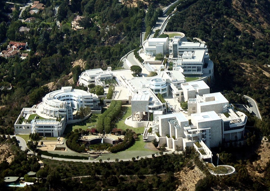
Getty Center arial view, image by Wikimedia Commons

A World Famous Institution in An Iconic Building

The Getty Center opened to the public in December 1997 and has been a fascinating impression ever since. It has become a beloved refuge from monotony to many Angelenos as well as an internationally recognised architectural icon. Designed by the renowned architect Richard Meier the Getty Center grounds house the Getty Research Institute, the Getty Conservation Institute, the Getty Foundation, the J. Paul Getty Trust and the Getty Museum.
Situated on top of a hill in the Santa Monica Mountains the complex is highly visible. The land purchased by the Getty Trust sits right by the San Diego Freeway and is therefore ever present to many as they drive by on their daily commute. The campus itself consumes 24 acres on a 110-acre site, while the entire grounds occupy 742 acres to ensure the surroundings remain in its natural state. Through this, the Getty distinguishes itself from a multitude of other Art museums as it is embedded in a natural environment. Often Art institutions are set within an urban context and the museums architecture engages with, responds to the encircling buildings.
The Getty Center’s site was specifically decided upon in order to represent a grander vision. It was imagined to be easily accessible, visible, recognisable and unique in appearance. All attributes best associated with the Getty’s institutions.
The design of the Center was envisioned to correspond with its environment; for one the unique Californian landscape and secondly the tradition of Californian modernism, in awareness of the architectural design by Schindler, Neutra et al. Richard Meier created a building that is consistent with Californian modernism and partly, because of this it oozes permanence.
The hilltop site is crossed by two ridges which Richard Meier perceived as vector lines. The lowest parallels the freeway and faces Los Angeles downtown. Here the architect placed the museum, visible and approachable. The second ridge, slightly raised, may be read as the extension to the freeway after it bends, just a little further out of the city from where it runs parallel to the museum. Here Meier situated the various institutions united under the aegis of the Getty Trust. The design process of the Center influenced the shaping of the Getty Trust programs. Concurrently the programs impacted the design process of the Center. It was built from the inside out. The desire in the early 1980s was to unite the different initiatives in one location, to further and expand the already existent cooperation and collaboration. However, at the time none of the programs, besides the museum, were established enough to state their precise requirements in regard to a building that should house them. As it became apparent that the Getty Villa’s capacity no longer sufficed the collections space it was resolved to build a new, larger site. From the initial decision to the public opening the Getty Center has been a fourteen-year project: plan, design, build and occupy.
The construction developed as more complicated and long winding than originally anticipated. Difficulties arose by the nature of the land, edifice on a hilltop, manoeuvring the building materials to the construction site and no prior installation of sanitation by the municipality. Angelenos followed the progress of construction as they commuted on the freeway over almost a dozen years. The process was very unlike Los Angeles and served as another example of the Getty’s permeance.
At the same time, the complexities of the site provided a clean slate in regard to its shape and form. Therefore, the selection of the architect was of great importance to the Getty Trust. Instead of an open call for designs, architects were invited to participate. Richard Meier’s idea was chosen because his office was deemed capable to finish a large project like this and because of the museums he completed prior to the Getty in Barcelona, Frankfurt and Paris.
The scheme is dominated by a rhythmic repetition of curves, curvilinear elements and a natural garden – all to soften the grid created by the off-white travertine and white metal panels. The 1.2 million square feet of Italian stone, cleft-cut and textured, as well as metal panels clothe the Getty Center. The garden, central to the complex, is part of the Getty’s permanent collection, a land sculpture crafted by Californian landscape artist Robert Irwin. It extends the relation to the natural environment of the site.
The entire Center is permeated by space and light. This is integral to the design. Openings in the architecture as well as the garden create space. Filtered natural light, as not to damage the Art, was used in the top floor interior galleries. The galleries were modelled by Thierry Despont.
At the Center of the Campus sits the arrival hall. It is reached by two computer operated trams, elevating the visitors from street level and parking facilities to the Art. Installed as a solution to combat accessibility of the complex, the use of the trams implements the feeling of an adventure and the out of the ordinary. The Getty Center serves as refuge from the daily, a safe haven to experience Art and enjoy a view.

Bibliography
Ragsdale, J. Donald: American museums and the Persuasive Impulse. Architectural Form and Space as Social Influence, Newcastle upon Tyne 2009
Walsh, John and Deborah Gribbon: The J. Paul Getty Museum and Its Collections. A Museum for the New Century, Los Angeles 1997
Williams, Harold M. (et al): Making Architecture.
The Getty Center, Los Angeles 1997

Author: Talitha Breidenstein

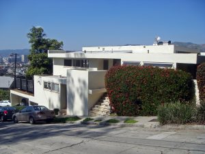
Richard Neutra Landfair Apartments, 1937, Westwood LA

Richard Neutra, Landfair Apartments, 1937, Westwood LA

Richard Neutra belongs to the architects who in America were leaders of the modern architecture and brought the modern of Europe to America. Neutra, who was born in Austria came 1923 to the USA to study architecture in NY and Chicago and learn from the organic buildings of Wright. He discovered together with his friend Rudolf Schindler South California in 1925, where he also lived in Schindlers innovative house for five years. Both from Austria emigrated architects became business-partners, but separated some time later.[1] His first big project in L.A was the Jardinette Building of 1927 and with his Lovell Health House 1929, he reached international acclaim. Because of this he was the only architect of the west coast invited to the big exposition about modern architecture in the MoMA in NY.[2]

Neutra‘s Style reached his highpoint in the thirties, where he was able through many projects to standardise his architectonic language. He worked many years on a universal form and a modular building-system. Since his years of study in Vienna, his years in Berlin with Mendelsohn and his residence in NY and Chicago Neutra worked with the problem and possibilities of multi-family dwellings. Because, since the twenties the demands of multi-family dwellings in the densely populated centrum of Los Angeles increased. The Jardinette building 1927 was the first multi-family house where there was still a traditional plan. So shows that in the 1930s completed project of the Landfair Apartments a completely modern form language delivered the future impulse for urban living space.[3] The client was Joseph Rabinovich and relatives, who invested in Landfair Apartments. The building of these complexes proofed difficult for Neutra, because part of the construction was built badly by the builder John Hudson. Nonetheless the Landfair Apartments belong to Neutra masterpieces in the 1930s construction.

The Landfair Apartment comprise of two buildings which are located on the south west corner of Landfair Avenue and Ophir Drive in Westwood Neighborhood of Los Angeles, near the west-side campus of UCLA. He decided on staggered row-houses that are always offset from the neighbor house, given the effect of separat but side by side units. The Apartment-Complex that is to the east and to the west aligned, it is comprised of two one story five-room-apartments in the east and six two story four-room apartments to the west.[4] Each apartment has a balcony and a common space that is reached from a staircase and is surrounded by a wooden fence. Built in skylights supply enough daylight in the deep rooms. He integrated his ever reappearing element of casement windows with metal frames, „a module of one meter steel swing windows determines the width of each unit“[5]. Through the universal and constant form of the front a cool aesthetic is built, which materialises in the clearity of the surface. Big windows run along the front and emphasise the horizontal orientation of the building. In addition the windows are integrated as part of the outer shell. So you can say that the landfair apartments are totally wrote in the International Style. „Here is the impact of the masses disappeared and in its place enters the effect of a clean object – or more clearly, a space surrounded by even surface.“[6]

Mona El Amir

[1] cf. Lamprecht, Barbara, Richard Neutra, Cologne 2006, p.13.

[2] cf. Lamprecht, Barbara, Richard Neutra, Cologne 2006, p.14.

[3] cf. Hines, Thomas S., Architecture of the Sun. Los Angeles Modernism 1900-1970. New York 2010, p. 365 & 399.

[4] cf. Hines, Thomas S., 2010, p. 399.

[5] Lamprecht, Barbara, 2006, Richard Neutra. p. 41.

[6] Hitchcock, Henry-Russell & Johnson, Philip, The International Style, New York 1966, p. 42.

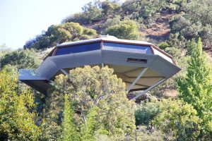
John Lautner, Chemosphere/ Malin Residence, 1960, LA
 John Lautner, Chemosphere/ Malin Residence, 1960, LA

The Malin House from John Lautner turns to an icon figure in the modern architecture of Los Angeles. He built nothing comparable in his career. It is a symbol of his architecture and materialise his architectonic knowledge of his craft. Through its innovative unequal form it reminds us of a UFO and catches the viewers eyes immediately. Until today it counts as one of the most extraordinary and unusually dwellings of the world and is located in the San Fernando Valley and the Hollywood Hills. Constructed and built in 1960 from the architect John Lautner, who immensely influenced the Modern Architecture in California.

The special thing on Lautner buildings is that for every location he found an architectonic solution which in a technical innovated construction has the appearance as well as the Chemosphere. In the year 1960 Lautner has had his office for twenty years and could unfold his original creativity in a variety of projects. The creation of an open and boundless space was Lautners central theme of his architecture. He always wanted the connection with humans and the surrounding nature that constructed a space that never separated the outer space. Illusionistic conceived and boundless space harmonises between heaven and earth. The Malin House that is called the Chemosphere, it is an example for such marriage between heaven and earth and the focus of a new quality of living. On a steep slope Lautner built a house supported by a single pole without disturbing the natural surrounding.[1]

The client of that project was Leonard Malin an engineer from the flight industry, who for 30,000$ wanted a one-family house on the steep slope above Mulholland Drive and contracted Lautner for that project.[2] Because he was employed by the flight industry and was open for new architectonic challenges, he was the right client for Lautner.[3] It was not a lot of money to build such a big house but he was open to the realisation of the project and took leave from his job for one year to assist with the building.[4]

The house is only accessible with a small tram that leads to a bridge from there you can reach the inside of the house. The octagonal foundation of the house is carried by a 8 meter high pole. The eight-sided building is constructed from steel and concrete and is protected by a flat dome. Waterpipes and septic-pipes are located in the middle of the pole. To be able to enjoy the view of the San Fernando Valley and optimise the location Lautner build a front of windows all around, so that the inhabitants have a phenomenal view.

Malin together with Lautner and John de la Vaux began in May 1959 with the building of the house. Especially by the construction of the roof you are able to recognize de la Vauxs experience in ship-building, that for the house has eight ship keels. Different as by Lautner previous buildings as example the Pearlman Cabine Lautner did not use a roof-construction that recurve back, but selected consciously a roof that bowed down all the way to the edge. Because of this bow the roof is visible from the inside and gives the eye a frame, so that you have the feeling of safety.[5] The massiv construction of the roof disappear at the endzone and leads to the glass being almost invisible. The main living space is composed of a dining-room, a built-in kitchen and a living-room, all in a open concept integrated. Closets and a sofa, which run along the outer wall are a seemless transition of the architecture and the living-space.

The Chemosphere embodies both, the innovative design and the knowledge of the craft. It was Malins idea to ask for donations for that project. Chemsfield Corporation and a variety of donas were important for this project. Besides Chemsfield Corporation the gaswerk southcalifornia donate 70,000$ in form of materials, glass and equipment. Because of this, the name Chemosphere is a combination of Chemsfield Corporation, the important sponsor and the word hemisphere for the half-dome.[6] Lautner often spoke of timeless architecture and it definetely succeeded with Chemosphere, even after 57 years after completion it still belongs to the modern houses that are timeless and stands alone. Adam Bear summarised the new living-experience when he writes: “Lautner created spaces that invite us to be primal inside them, and therefore, in some sense, to act free, even play.“[7] „They are micro worlds, open to space, with simultaneous access to the wild and shelter from it.“[8]

Mona El Amir

[1] cf. Campell-Lange, Barbara, John Lautner, Cologne 2016, p. 45.

[2] cf. Hess, Alan, The Architecture of John Lautner, New York 1999, p. 106.

[3] cf. Hutt, Dana, Experimental Jet Set. Aerospace and the modern house in Los Angeles, in: Overdrive: L.A constructs the future, 1940-1990 edited by Wim de Wit and Christopher James Alexander. Los Angeles 2013, p. 156.

[4] cf. Hess, Alan, The Architecture of John Lautner, New York 1999, p.107.

[5] cf. Campell-Lange, John Lautner, Cologne 2016, p. 45.

[6] see movie Infinite Space the Architect John Lautner. R: Murray Grigor. USA 2008.

[7] Bear, Adam, If You Were Cool, Rich, Or Bad Enough To Live Here, You‘d Be Home, Virginia Quarterly Review Winter 2013, p. 104 – 133, here p. 107.

[8] Bear, Adam, 2013, p. 124.

Frank O. Gehry , Binoculars Building, 2001, 340 Main Street, Venice, Los Angeles

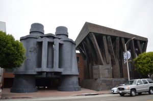
Located in the Venice neighboorhood of Los Angeles, is the Binoculars Building which is a commercial office building.

Binoculars Building
By YaGeek (Own work) [CC BY-SA 3.0 (http://creativecommons.org/licenses/by-sa/3.0)], via Wikimedia Commons
https://upload.wikimedia.org/wikipedia/commons/7/70/Binoculars_Building.jpg
It was designed by Frank O. Gehry a Canadian-born American architect who is residing in Los Angeles, in collaboration with his longtime friends Claes Oldenburg and his wife Coosje van Bruggen. The couple who Gehry collaborated with are famous for their large-scale projects in which they turn everyday objects in huge sculptures. They first made a small model for an academic project in Italy in the form of binoculars but it was built in Gehry’s office instead.

This building was constructed in 1991 until 2001 for the advertising agency Chiat/Day as one of its headquarters and was originally called the Chiat/Day Building.

Materials such as steel, concrete and cement plaster and gypsum plaster in the inside were used for this building.

The black standing pair of binoculars are only one part of a three-part complex of buildings. Gehry designed two different buildings for this project, one is boat-like and the other one is tree-like. We can see that the building on the left side does look like a piece of a white colored yacht with long cabin windows. The building on the right gives the appearance of trees because of the brown color and branches like roof pillars.

Since you can’t gain inside access to the building without having connections, you can still see how this kind of architecture is definitely an eye-catcher. The massive binoculars which are normally considered as an everyday object ties the complex together as a third structure. It turns into an unique and spectacular work space, which functions as pedestrian entrance and car gate as we can already see in videos which are posted online. You can drive through the center of the binoculars in order to get into an underground parking garage.

Today TBWA\Chiat\Day moved out of this building and the public relations group “Ketchum Inc.“ was renting a part of this building. Nowadays this place is more known for its current tenant, as one of many Google buildings.

Lien Liane Nguyen

Santa Monica

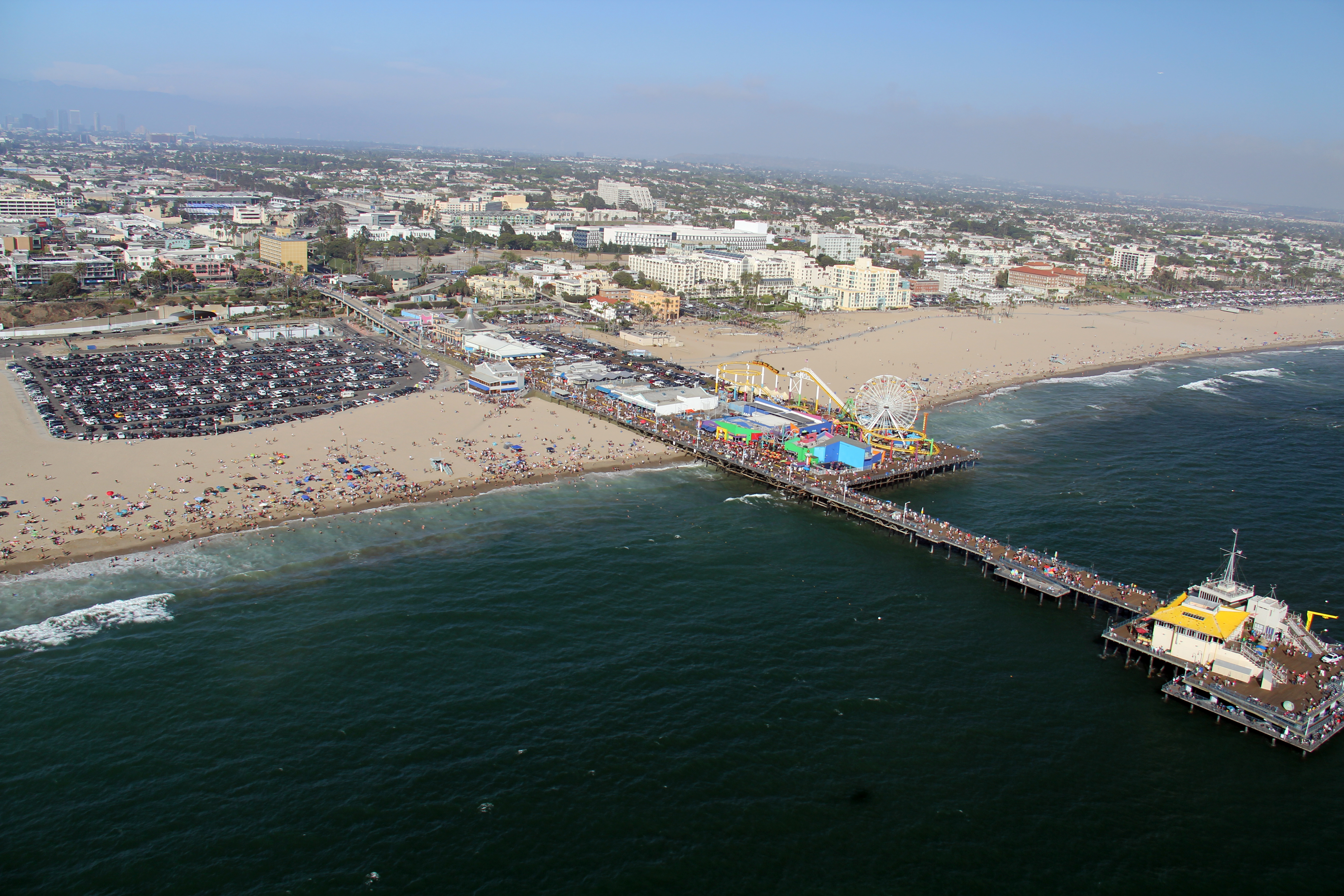
Foto: © JCS / Wikimedia Commons / , via Wikimedia Commons

Santa Monica is a renowned beach city in Los Angeles with a mediterranean climate. During our field trip at the end of March we can mainly expect to have moderately warm weather. We will stay at the „Hostelling International Los Angeles in Santa Monica“, which is situated in downtown Santa Monica and only a few blocks from the beach.

Aside from the beach, the famous Santa Monica Pier which used to be the western end of Route 66, at the end of Colorado Avenue contains an aquarium and a little amusement park with a red and yellow ferris wheel, a roller coaster, a historic carousel and more.

Movies, TV series and music videos that have been set in the Santa Monica Pier as well as the beach, show that this place is one of Southern California’s most popular filming locations. Some movies already gave us a slight insight in the lively, expensive atmosphere of this city. In combination with free time activities, Santa Monica offers shops, cafes, restaurants, farmer markets, theatres, cultural events and entertainment which attracts a wide variety of locals as well as tourists.

In order to explore the city we will not have to rely on a car too much to get around, since the city is rather small. Public transportation such as the „Big Blue Bus“ also provide bus service to the westside of the Los Angeles basin if you don’t have a car. Furthermore it might be more convenient to rent bicycles to get to the car-free 3rd Street Promenade where you can go shopping.

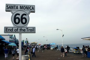
Another option is the 26-Mile Bike Path that parallels Santa Monica Beach and that might give you the chance to enjoy the beautiful scenery. The Santa Monica Yacht Harbor Sign at the entrance of the Pier and the sign at the end of the Santa Monica Pier which marks the end of the legendary American highway, have become an additional must-visit place to take obligatory pictures or selfies for many travelers.

Route 66 – End of the Trail -Santa Monica
from Prayitno, Los Angeles, USA (ROUTE 66) [CC BY 2.0 (http://creativecommons.org/licenses/by/2.0) oder CC BY 2.0 (http://creativecommons.org/licenses/by/2.0)], via Wikimedia Commons

During our trip we are going to take the chance to take a look at the architecture of a Googie-styled restaurant called “Swingers Diners“ and o have dinner there at the same time.

Furthermore another place in Santa Monica, that we’re going to visit is the world-renowned Gehry Residence which was redesigned to its owners liking. It was bought by Frank Owen Gehry and his wife Berta Gehry and looks like a house that is still under construction.

If you want to explore other beach towns which are nearby, you can go to Malibu, Venice, Beverly Hills, Pacific Palisades and many other places with different attractions.

Lien Liane Nguyen

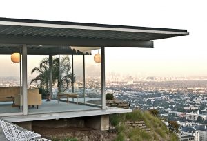
Pierre Koenig, Stahl House, 1959-1960, West Hollywood

Stahl House, via Wikimedia Commons

The Stahl House was built between 1959 and 1960 by the American architect Pierre Koenig for Buck Stahl and his family. The structure is also known as CSH #22, after its number as part of John Entenza’s ‚Case Study House Program’ and is one of Koenig’s most well-known designs. 1

The bungalow is situated in the hills above West Hollywood and is invisible from street-level viewing, thus making the house the epitome of privacy – despite its walls being made mainly of glass, a typical feature of most Case Study Houses.

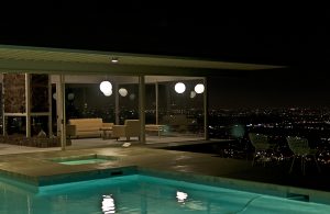
The one-story metal, glass and concrete structure builds an L-shaped frame for the house’s outdoor swimming pool – a typical feature of California ‚living’. All bedrooms as well as the living rooms face the pool, the main focal point of the building. When excluding pool and outdoor deck, the building harbors only six rooms on it’s approximately 204,4 square meter space.

Arguably most well-known for its portrayal in the architecture photography of the late Julius Schulman 2, the house is a prototype for modern living. From it’s high placement on the hillside, it features a prominent bird’s-eye view of the city’s lights below. The resident of the Stahl House thereby seems removed from the remaining inhabitants of the city – watching from a distance rather than taking part.

Stahl House at Night, via Wikimedia Commons

The view and it’s implications of grandeur and spectacular views have made the Stahl House a popular site for Hollywood movie productions and music videos, a house similar in style to the Stahl House was also used in an episode of the popular cartoon TV show ‚The Simpsons’ (Season 21, Episode 1 – ‚Homer the Whopper’)3.

The architect, Pierre Koenig, was born and grew up in California. The Stahl House is his second project for the Case Study House Program, the first being CSH #21, in West Hollywood.

Today the house is still in possession of the Stahl family, who allow guided tours through the building. This is a possibility we will be taking advantage of on our trip to L.A.


Sources:

1. Smith, Elizabeth A. T., Blueprints for Modern Living. History and Legacy of the Case Study Houses, Ausst. kat., Los Angeles 1989/1990, Cambridge (Mass.) u.a. 1989, S. 69

2. http://stahlhouse.com/

3. http://archive.blog.modernica.net/inspire-me-monday-architecture-of-the-simpsons/

Katharina Marie Steins

Rudolph M. Schindler, Falk Apartments, 1939/40, Los Angeles

Falk Apartments – R M Schindler (E) by Kansas Sebastian https://www.flickr.com/photos/kansas_sebastian/3338454940/in/photostream/ is licensed under a Creative Commons license: https://creativecommons.org/licenses/by-nc-nd/2.0/

Rudolph M. Schindler, Falk Apartments, 1939/40, Los Angeles

Rudolph M. Schindler designed the Falk Apartments in Los Angeles from 1939-40. The complex is built on a sloping, triangular site which determines the way each apartment is laid out. The site influences how each dwelling relates to the corner site and the hill.

The complex is characterized by a push-and-pull-play of cubistic elements which leads to an intense communication between the interior and exterior spaces. In contrast to the more flat, orthogonal residences Schindler did before the Falk Apartments are concentrated on a more expressionistic, sculptured front. This can be shown by Schindler’s design of the garages. On the one hand they act as brackets/placeholder, which separate street (publicity) and dwelling (privacy) and one individual privacy from another. One the other hand the garages can literally be interpreted as the formative cubistic base of a twisting and turning sculpture expanding in stages to the hill. Schindler made sure that each resident has an individual unobstructed view from the terraces and rooms. Touring the Falk Apartments one might learn how each apartment differs from another and what unifies them. What view do residents enjoy?
While investigating on this building one finds a large quantity of photographs. But it is hard to discover a picture which shows the whole arrangement of the area of Falk Apartments. To really understand how the segments of the Falk Apartments influence on each other and bind together as a coherent whole, one should absolutely go for a walk around this architecture. On our visit at Falk Apartments into which we presumably cannot enter one task should be taking the most overarching photograph as possible and identify problems while doing it.

Hines, Thomas, The Frame for a Life. Rudolf Schindler‘ Discordant Modernism, 1930-1953, in: Thomas Hines, Architecture of the sun. Los Angeles Modernism 1900-1970. New York 2010. S.316-363

Wilson, Richard Guy, Die Metaphysik von Rudolph Schindler, in: Elizabeth A. T. Smith/ Michael Darling, R. M. Schindler, Bauten und Projekte, Ausst. kat. Los Angeles 2001, S. 116-143.

Jasmin Roth

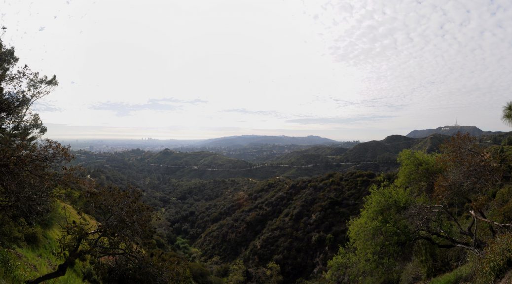
Griffith Park, after 1896, Los Angeles

Griffith Park, after 1896, Los Angeles

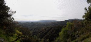
To conclude the last evening of our excursion we will visit Griffith Park in the northeast of Los Angeles. Due to its staggering sight this park might be a great place to review the experiences we made during a week and to catch one last view over Greater Los Angeles.

Panoramic view of the the Hollywood Hills from Griffith Park near the Griffith Observatory, Los Angeles by Joe Mabel

Griffith Park has a size of 17 km² and is one of the greatest urban parks in Northern America. It is located in the eastern foothills of Santa Monica Mountains. High up on Mount Lee the famous Hollywood Sign is located. Griffith Park is built on former Spanish ranch land which was called Rancho Los Feliz. Griffith Jenkins Griffith, an industrialist and mine operator, acquired it after the natives were expropriated. 1896 he donated a part of this piece of land to the city of Los Angeles to re-landscape into a local recreation area for the inhabitants. Griffith had the idea of a city which should become happier, cleaner and finer than it was before and the „wish to pay the debt of duty in this way to the community in which he have prospered.“ Years afterwards, in 1912 the industrialist bore the costs again for the later built Greek Theater (1929) and Griffith Observatory (1935).

A legend implies that there is a curse of the Griffith Park by a member of the original owner family Feliz called Dona Petronilla: She is told to be a ghost that is responsible for the misfortune or the death of the later owners of the land. The Ghost is described as a woman wearing a white dress. It is claimed that she stays during turbulent nights in the Paco Feliz Adobe (the oldest remaining architecture in the park). Our group will go to Griffith Park in the evening. So we can perhaps meet Dona and some other ghosts that Creepy LA mentions in “The Guide to the Ghosts and Monsters of the Cursed Griffith Park.“
To talk about something less uncanny: Griffith Park is also happily combining motifs from nature, aviation and astronomy. The seemingly untouched nature of the park, which appears wild, rough and steep, can be interpreted as an oasis which expresses the longing for the biblical paradise. One could conclude that Observatory and Aerodrome – the latter was closed in World War II – are both technical as well as natural, „back to the roots“- symbols. With motives of aviation and astronomy somebody can reach out for the stars for scientific investigation as well as for the origin of God’s creation. Griffith motivation to build this kind of architecture has been the conviction that „if all mankind could look through that telescope, it would change the world“. During our visit of the Observatory the double meaning of this look into the sky can be discussed.

Eberts, Mike, Griffith Park. A Centennial History. Los Angeles 1996.
Manuel, Bruno, Mr. Griffith donates a Park, in: Aufbau – Reconstruction, Bd. 13 (1947),  23-24.
http://creepyla.com/2016/10/04/haunted-curse-ghosts-monsters-griffith-park/
http://www.laparks.org/griffithpark/greek-theatre
http://www.griffithobservatory.org/about/history.html

Jasmin Roth

LAX – Theme Building

William Pereira, Charles Luckman, Paul Williams, Welton Becket, James Langenheim, LAX Theme Building, 1961

After an eleven-hour flight the pilot would say a few words to prepare us for the landing in Los Angeles. He would give us some information about the weather in LA and the baggage claim at the airport. After wishing us a pleasant stay, he would then will bring us back to earth. Meanwhile I would look out of the window. In case of clear sky, I would maybe have a chance to take a glance on the roll field and the terminal buildingsand a strange construction right in the center, beside the control tower. As if there were not only planes to land in LAX, but also UFOs. Is the building between the international and the regional terminals an interstellar gateway?

This could be a possible first impression of Los Angeles. And first impressions are the most important ones as there is no second chance for a first impression. They shape our view on persons and places. They are the initial point for every other judgement of impressions in the future. If the first impression is a bad one, the whole level of expectations will be low.

The fact that we will land at the airport sets the place of our first impression there. It is the first and probably the last impression we will have. This could also be a thought of Paul Williams. He and Welton Becket, James Langenheim, Charles Luckman and William Pereira are the architects who were involved in building the LAX Theme Building in 1961.[1] It is a construction between the regional terminals.

It stands secluded on a roundabout traffic. In its ground level it has a round one story building. This base of the building is hard to see, because the building is surrounded by a wall. This wall is made of bricks, which are comparable with William Krisel’s Shadowbricks in his Palm Springs houses. In the middle of the building stands a post of blue colour. On its top is another one story level. This part has a circumferential glass front and a large roof, which is connected to the arcs. These two crossing arcs support the construction .

The futuristic design of the Theme Building is probably a good first impression of the architectural Los Angeles: solitary modern architecture surrounded by traffic. If you refer o Reyner Banham’s essay on the so-called four ecologies of Los Angeles, this building is his theory in short.[2] It also fits with his burger restaurant comparison.[3] By  this, Banham describes an crucial evolution of architecture in Los Angeles. He argues, that there were buildings, which also functioned as landmarks, especially restaurants. Their architecture was extravagant and draws the attention of the pedestrians to the building. They needed no signs or lights. This changed in Banhams opinion. The architecture became more and more simple and the restaurants began to put signs in their front, which overlaid the architecture. For Banham, the Theme Building would probably be a good example of detached architecture which does not need any signs and lights to draw somebody’s attention to it.

Beside this theoretic aspect, there stands also an architectonical reference in the Hollywood Hills: the Malin Residence, the so-called Chemosphere, by John Lautner from 1960,[4] finished just one year before the Theme Building. Its structure is kin to Williams’ restaurant building. Lautner also conceived a round, one-story house on a post . But the construction site and the use of supports instead of arcs is quite a difference. Both seem very futuristic and give the impression of an UFO.

The Theme Building is therefore not only a landmark for its own, but a symbol of the architecture of its time and place. So, if Paul Williams’ aim was also to create a good first impression of his city, it might be accomplished.


[1] Gazey, Katja: Architektur A-Z, 2010, p. 404.

[2] Banham, Reyner: The Architecture of Four Ecologies, 2001.

[3] Ebd., pp. 93.

[4] Campbell Lange, Barbara Ann: Lautner, 2005, p. 45.

Julius Emmel